
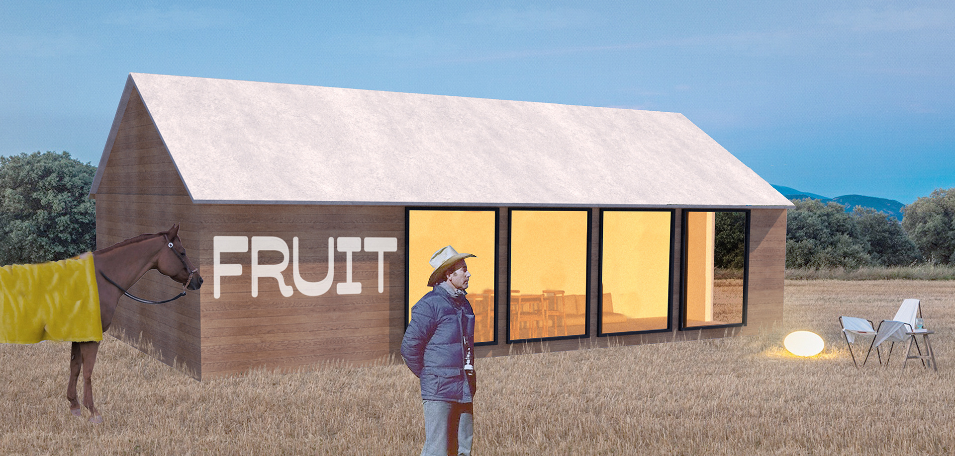
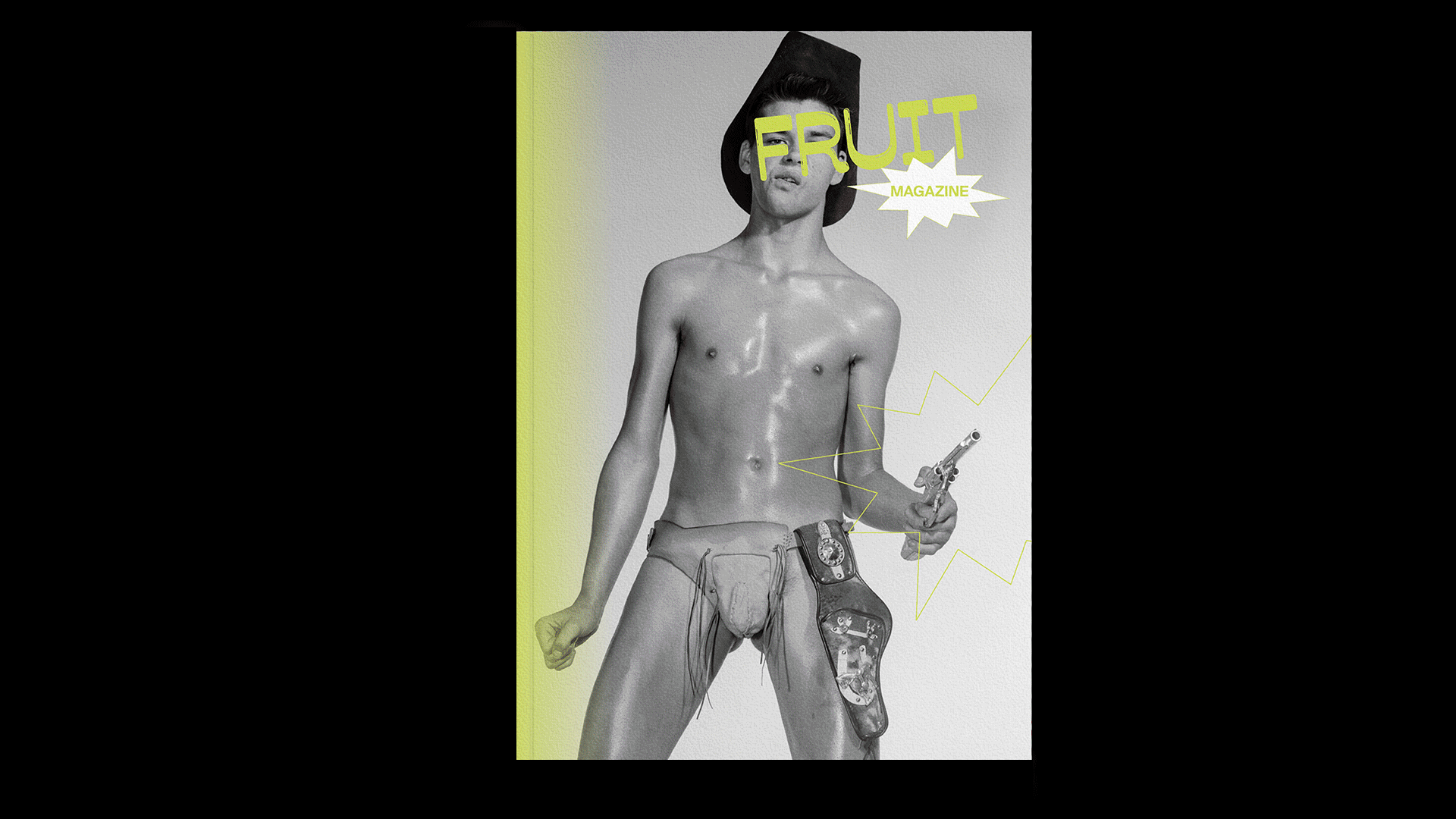
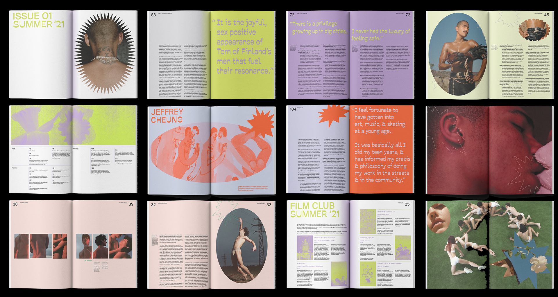
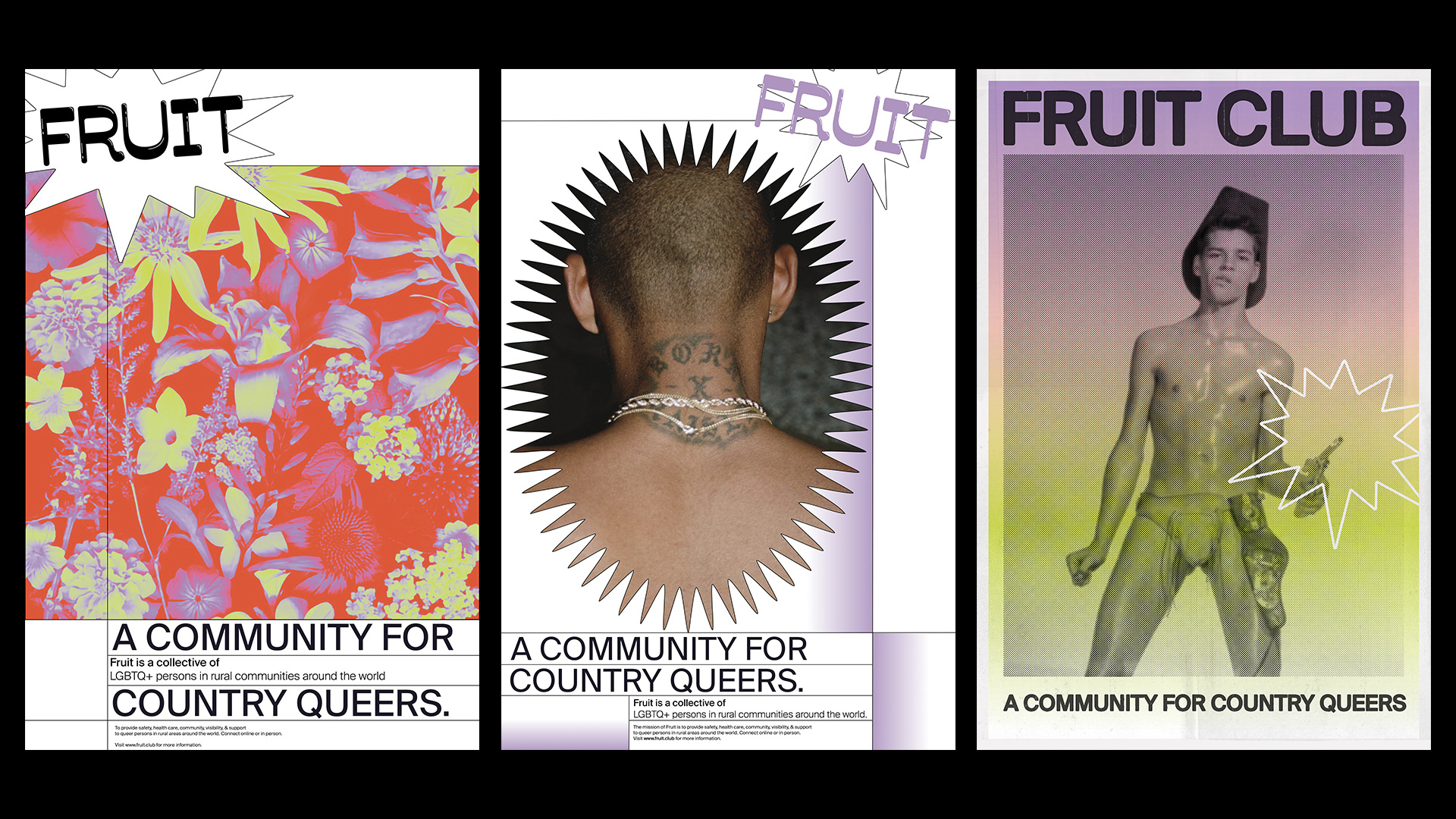
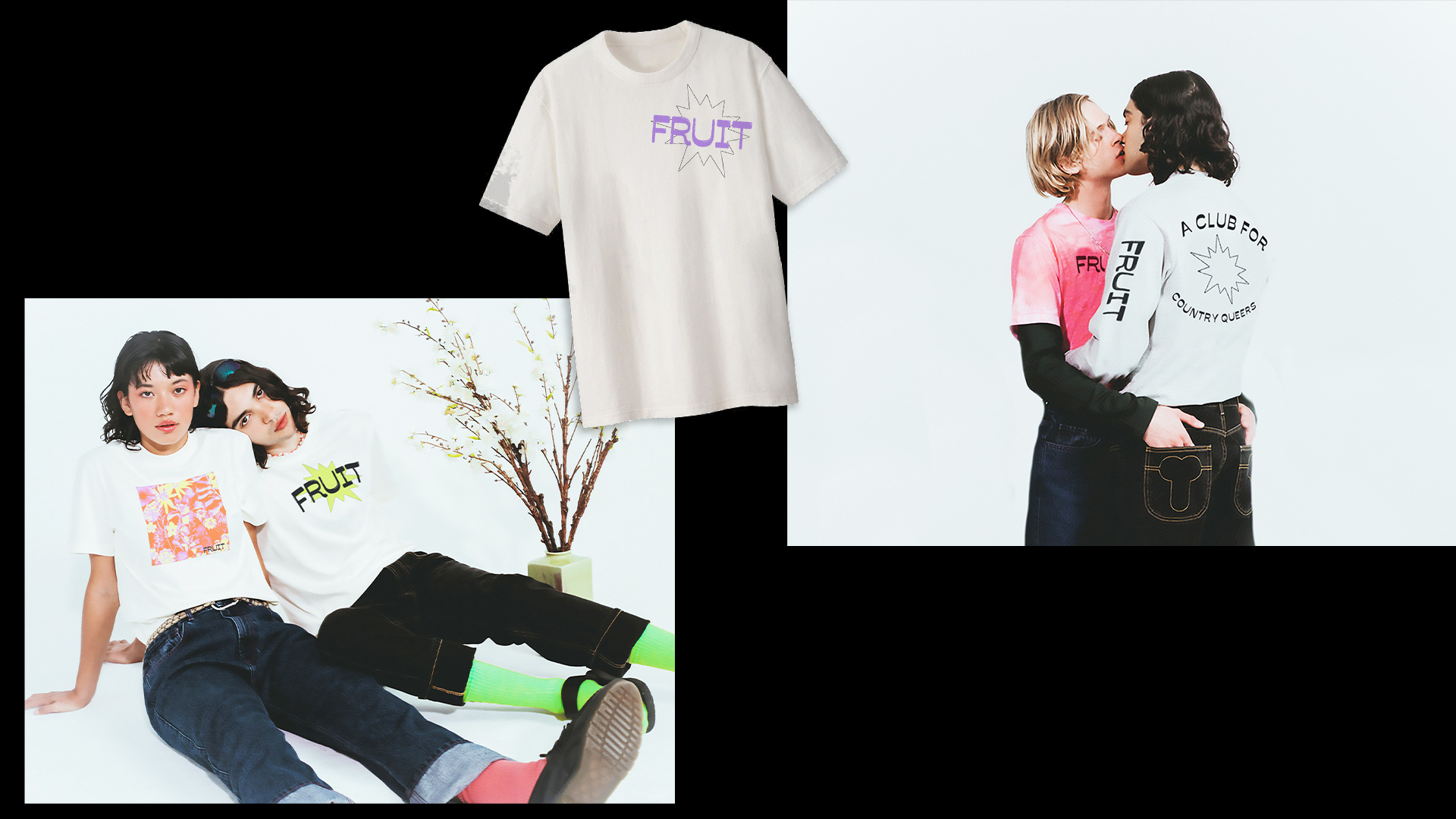
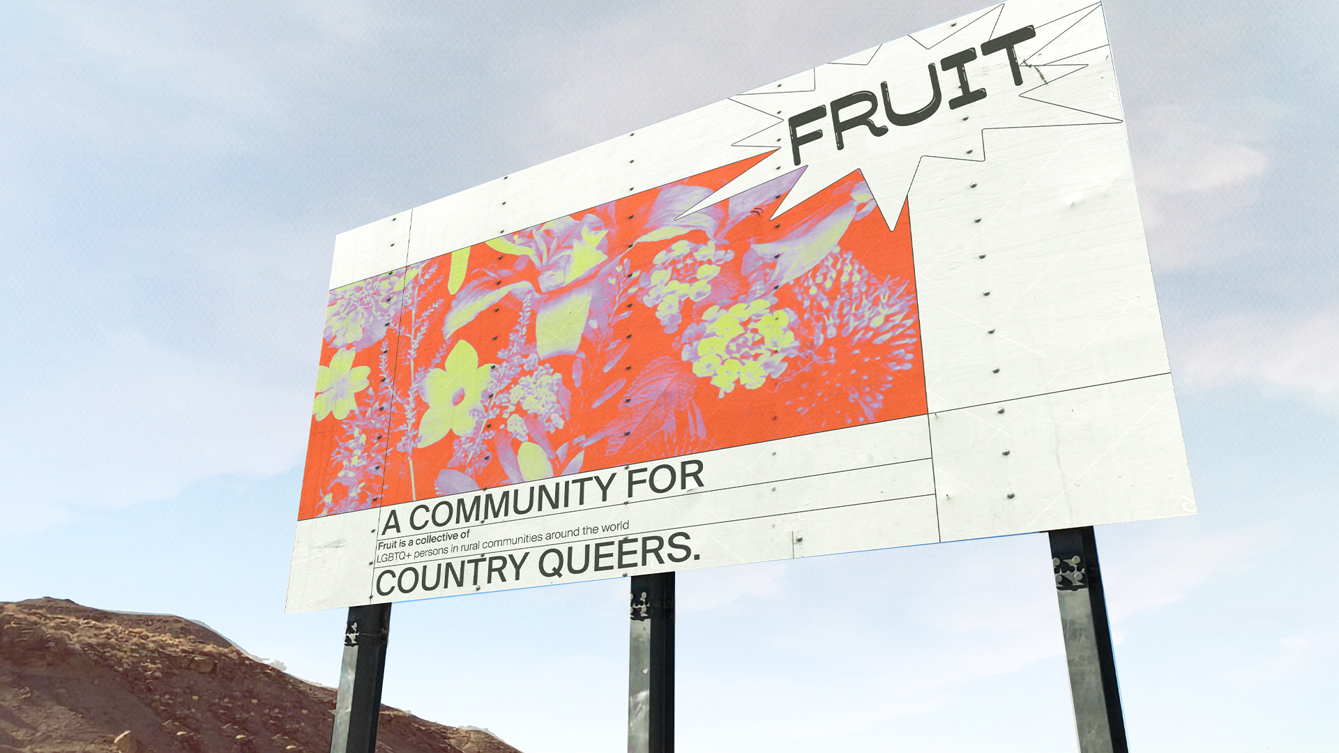
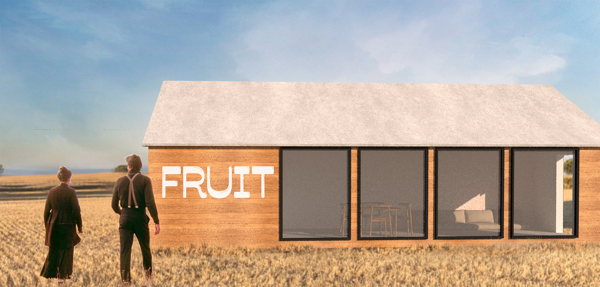
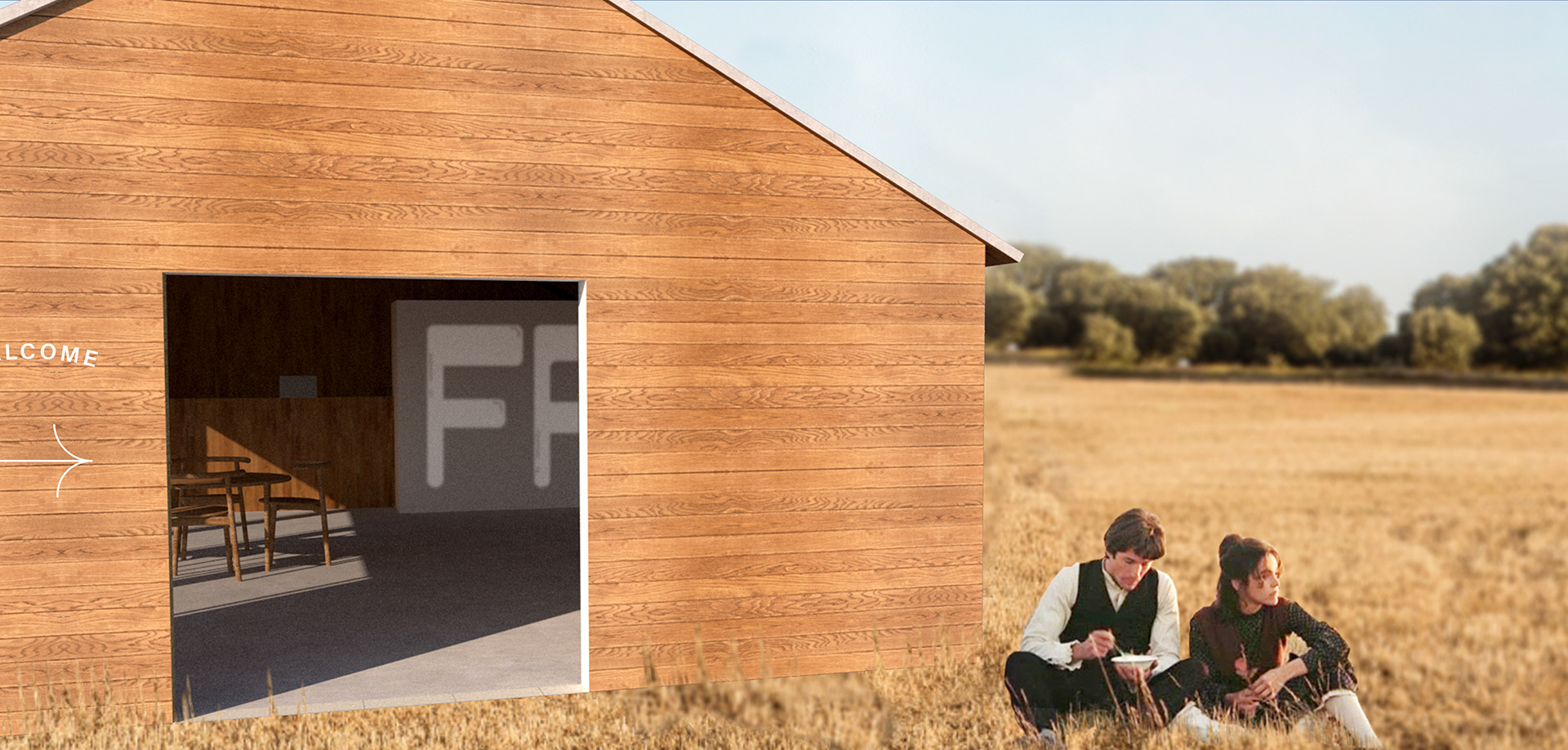
Fruit
While we do live in a time of greater visibility for LGBTQIA+ individuals and communites, many brands that cater to them largely focus on metropolitan communities and ignore their rural counterparts. Rural queer persons are exposed to a much higher threat of discrimination, violence, are prone to suicidality more frequently, and at a higher risk of HIV transmittance than queer persons living in urban areas.
Fruit is a hypothetical brand that caters solely to the unique needs of queer, rural persons throughout North America. It’s mission is to raise visibility, increase access to healthcare, form community from geographic disparity, and create a safe space for rural queers.
Full Project Page
Print, Branding, Environmental Design
2020 Instructor: Carolina Trigo
2020 Instructor: Carolina Trigo
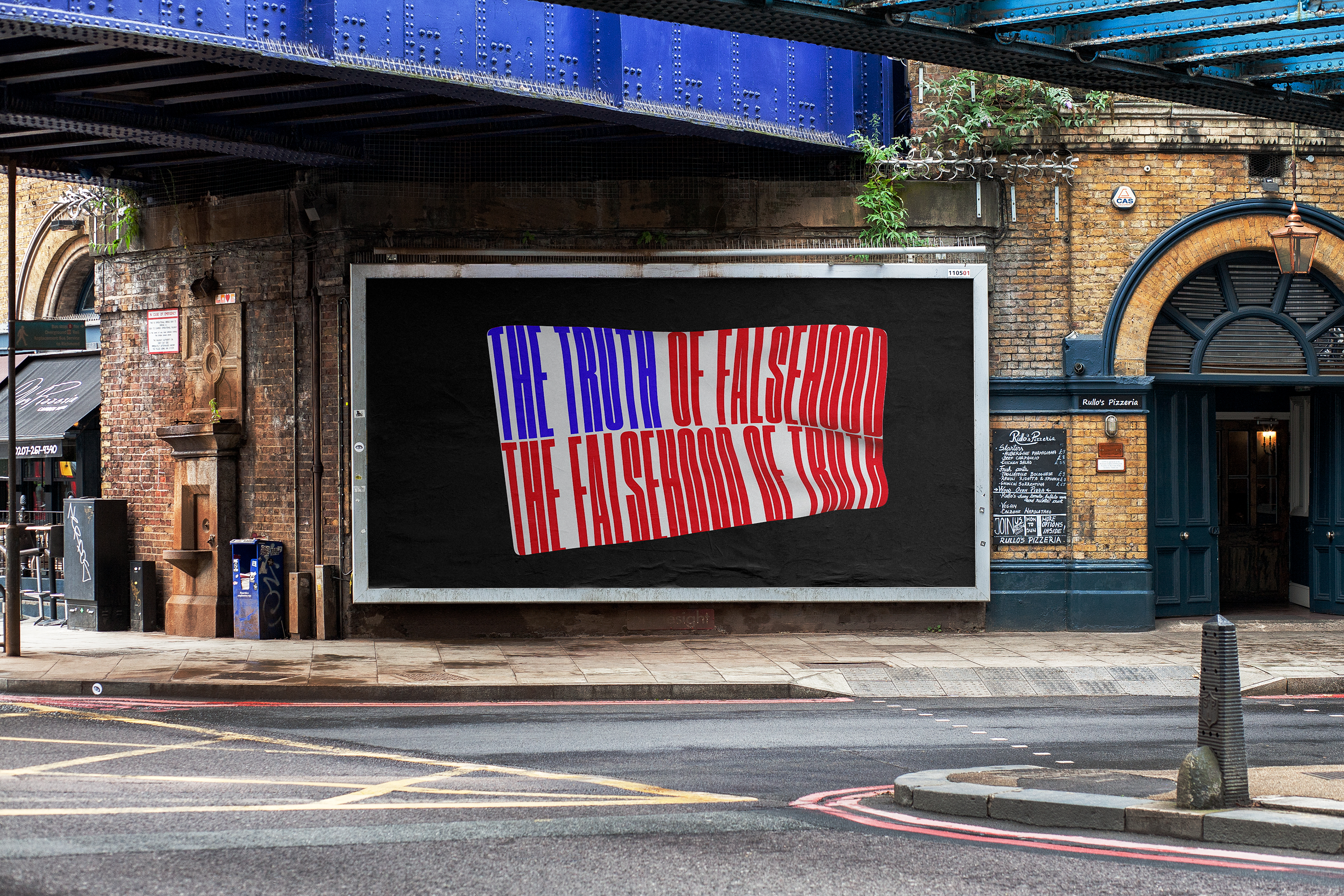
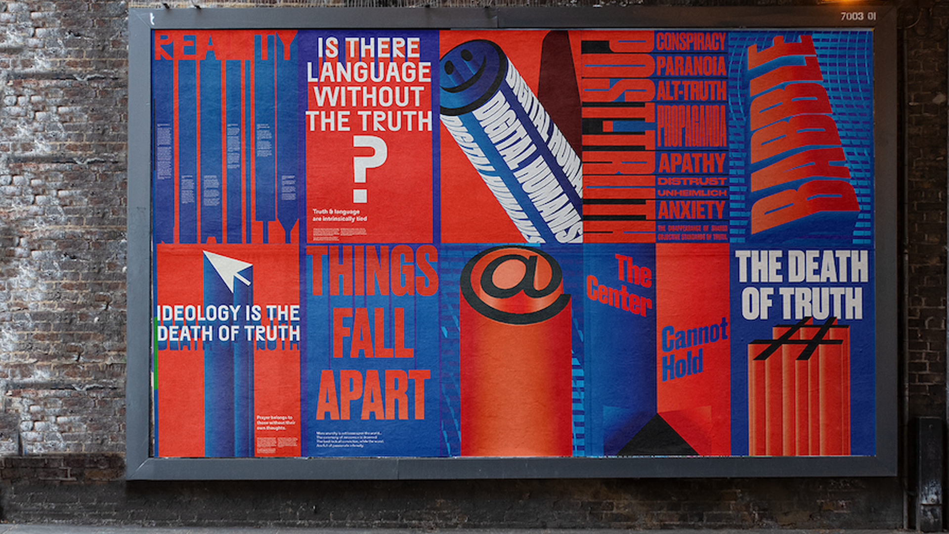

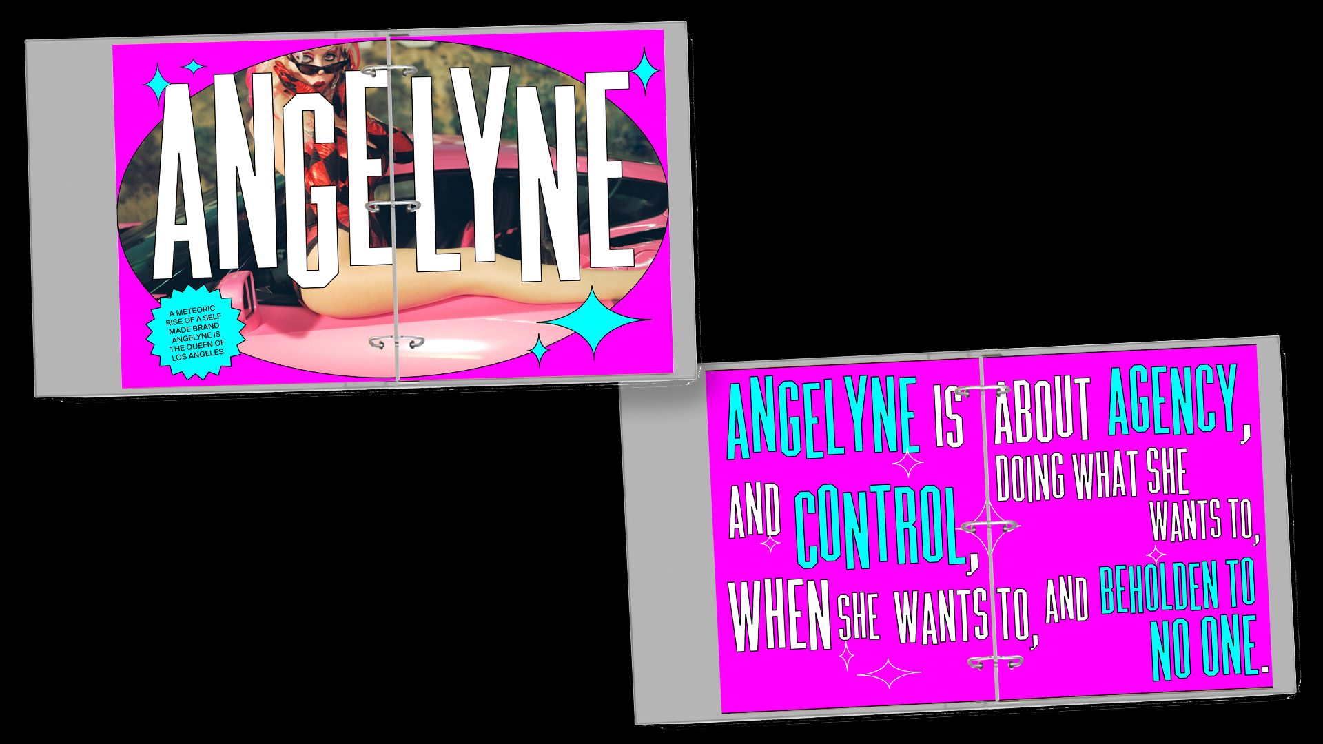
The Death of Truth
This project explores the typographic implications of a world where language is made meaningless. It will look at how it is informed by relativity, the concept of space-time, the importance of humanity or lack thereof, and the ways in which digital language (verbal and visual) has bled into reality and thus made language meaningless.
Because of this project’s inspiration by The Death of Truth: Falsehood in the Age of Trump (2019) by Michiko Kakutani, the cultural focus of this project will be around its presence in the United States, specifically how U.S. President Donald Trump has degraded the humanistic aspects of language to his socio-political advantage.
Ultimately the central question that this project seeks to answer is “what is typography when language is rendered meaningless?”
Print
2020 Instructor: Tyrone Drake
2020 Instructor: Tyrone Drake
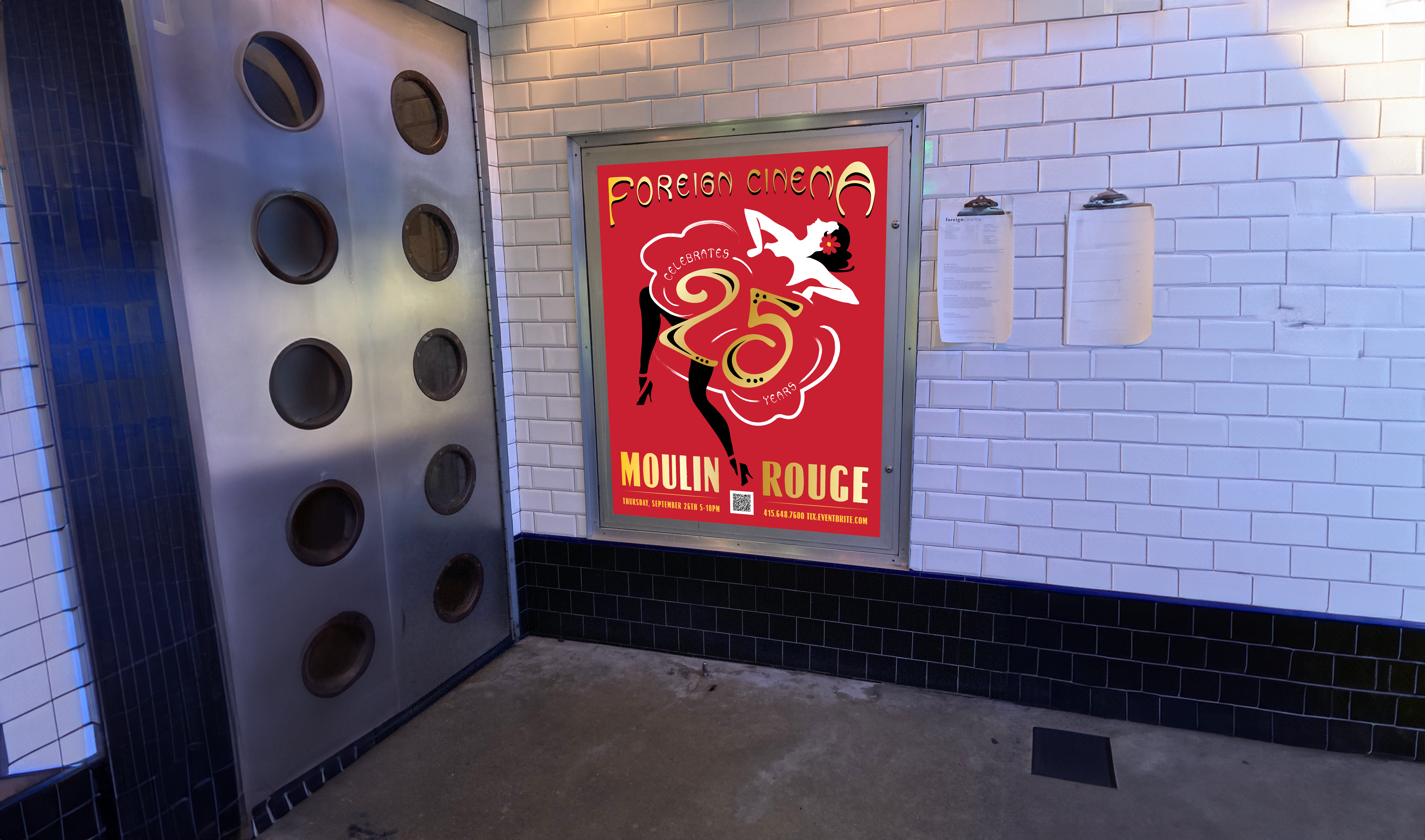
Foreign Cinema
Identity done for the 25th Anniversary celebration for Foreign Cinema restaurant in San Francisco. Drew from the party’s Moulin Rouge theme, using bistro and beaux art graphics and original illustration.
Identity done for the 25th Anniversary celebration for Foreign Cinema restaurant in San Francisco. Drew from the party’s Moulin Rouge theme, using bistro and beaux art graphics and original illustration.
Print
2024
Mende Design Creative Director: Jeremy Mende
2024
Mende Design Creative Director: Jeremy Mende
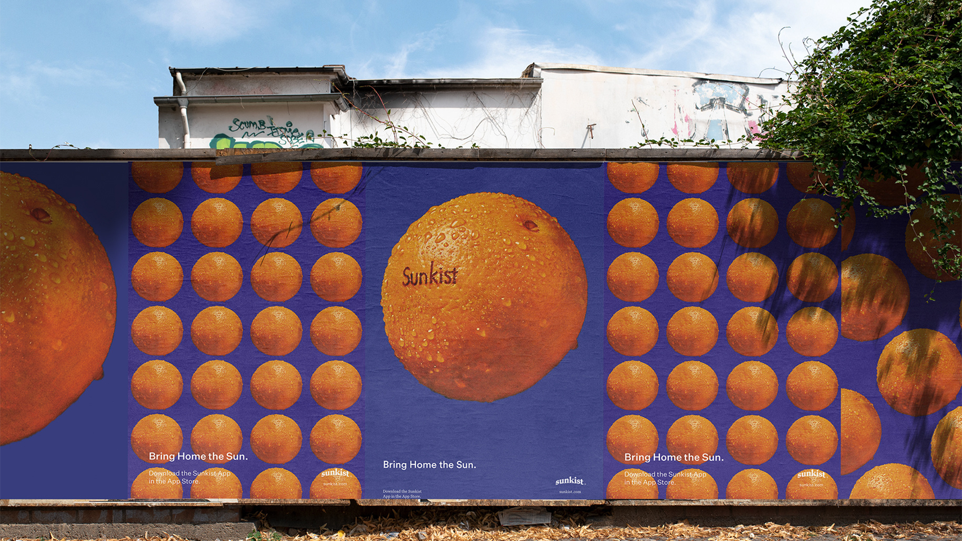
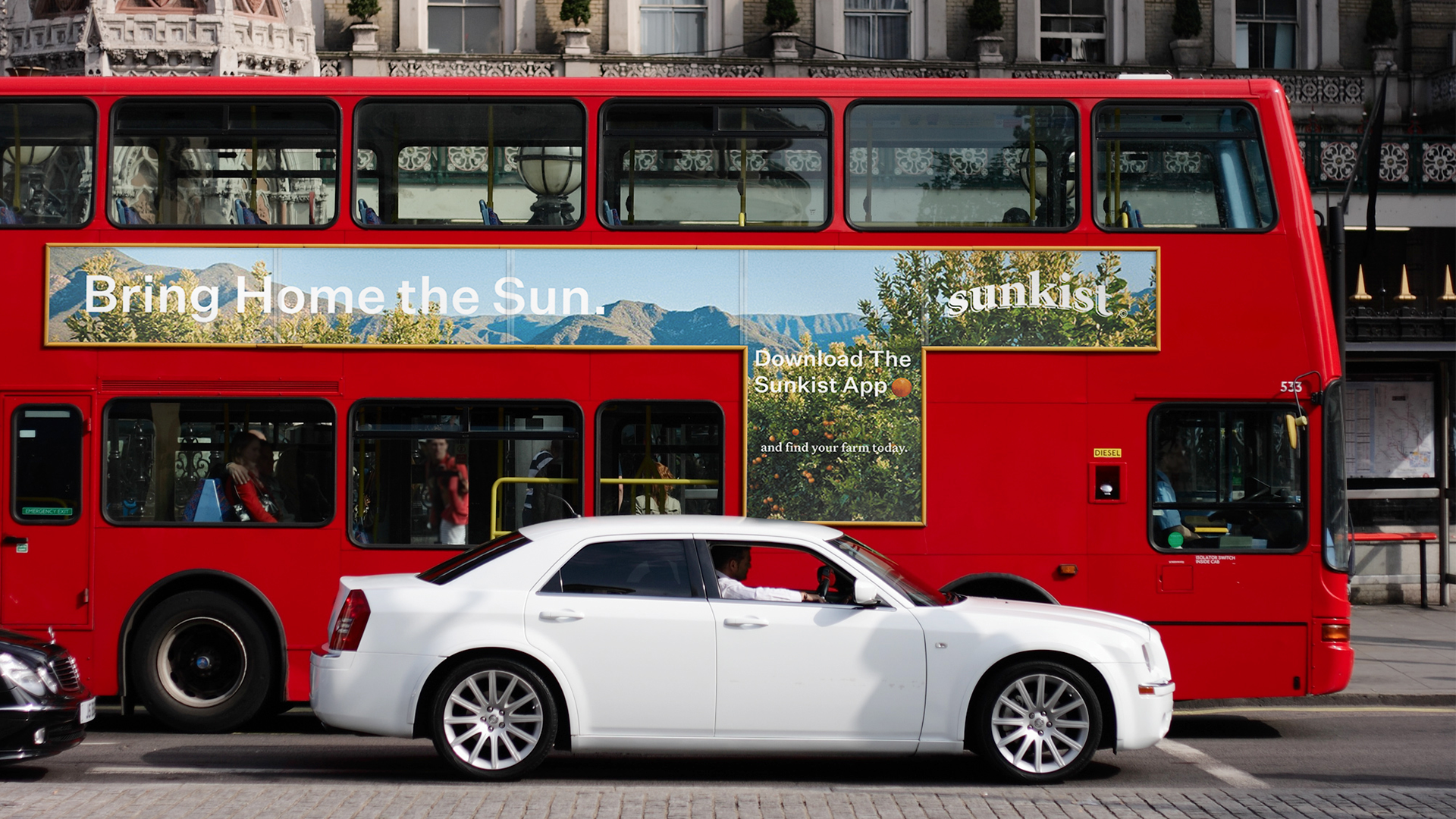
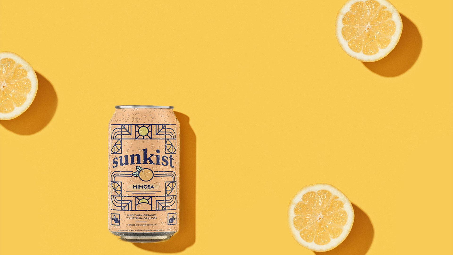


Sunkist
This project encompassed creating a comprehensive new brand strategy and redesign of Sunkist. It sought answered how to enhance Sunkist’s existing brand identity, while creating an effective and authentic strategy for a brand extension and expansion.
This project included a brand refresh to retain the brand equity of the iconic brand as well as creating brand extensions into alcohol and wellness markets.
Full project case study here.
2019
Mentors: Gerardo Herrera, James Chu
Honors:
ArtCenter Student Gallery (2019)
Graphis New Talent Annual 2021 - Silver Medal
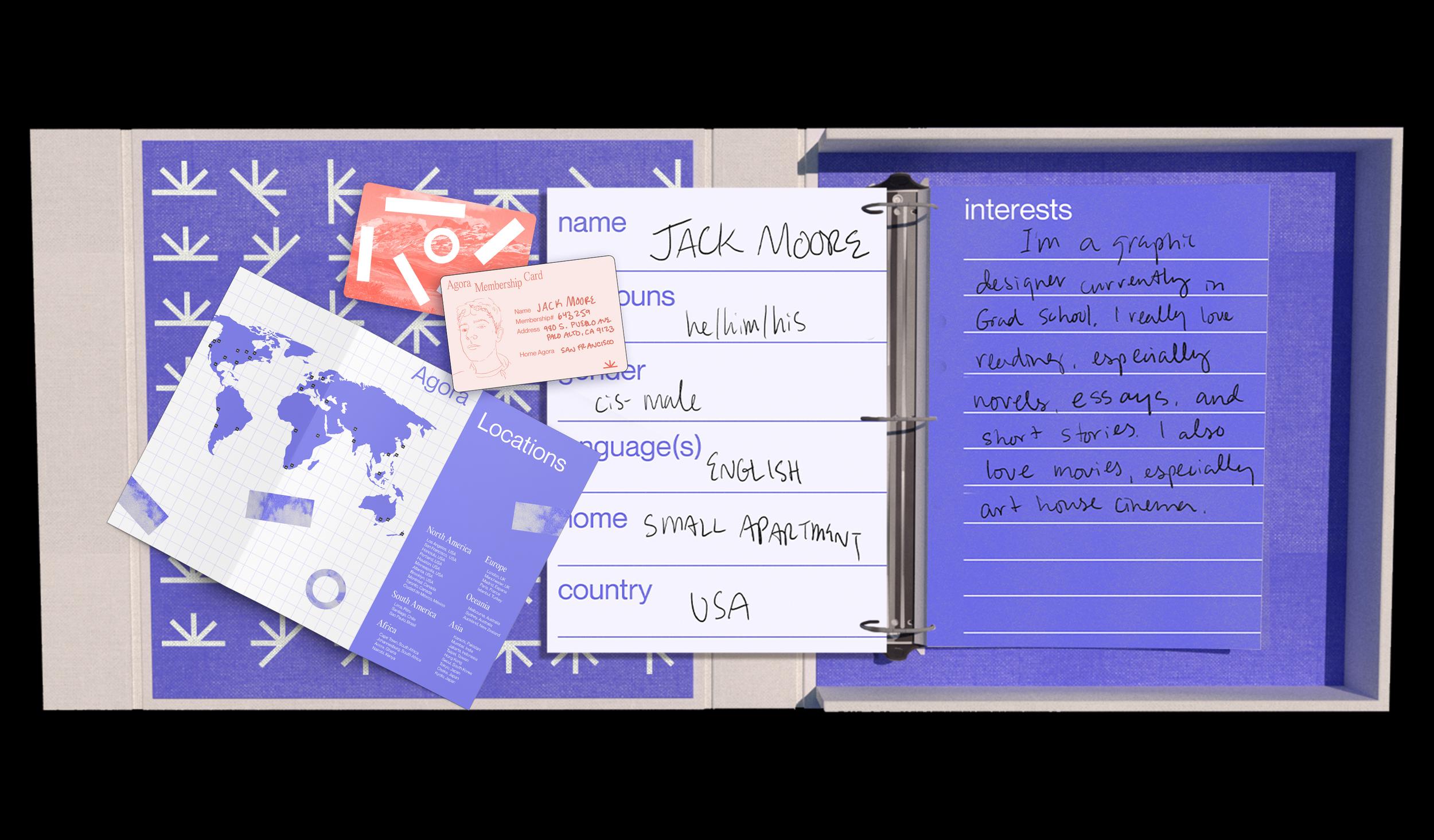

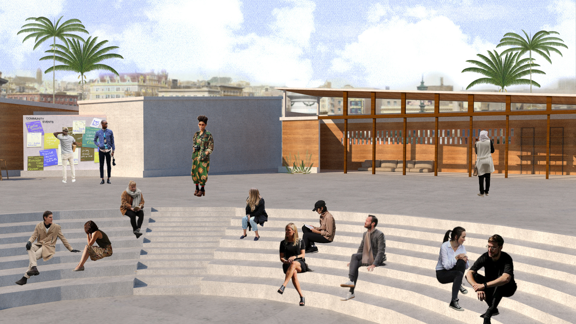
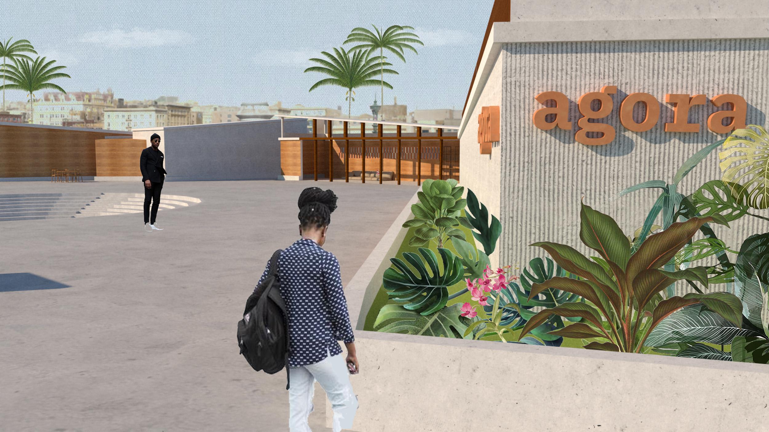
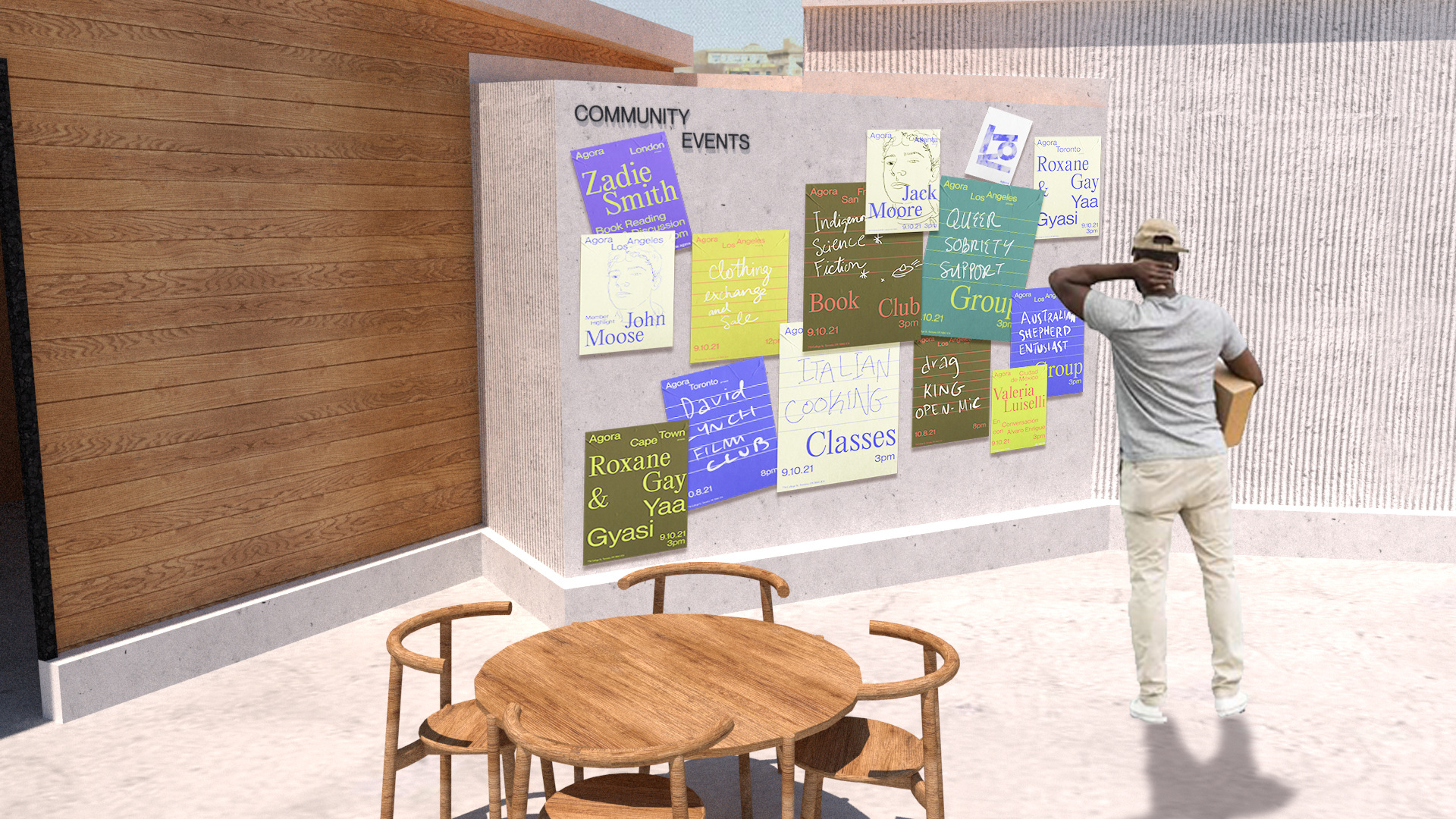


Agora
My thesis at ArtCenter’s MGx Program sought to solve the issue of the commodification of Online spaces that has led to the dehumanization of users by confusing the delineation between the individual and the brand There must be a paradigm shift in how the Internet is designed in order to prevent this confusion further.
To solve this I created Agora, a non-monetized social media that is not designed on a digital platform. Inspired by the ancient Athenian Agoras, public spaces designed for discussion and philosophical pursuit.
Agora combines both physical space to build a network, as well as an individual’s “Profile Book” which travels between members to discover new people and ideas
Full Project Here
2021
Thesis, Print, Spatial Design, UI Design
Mentors: Sean Adams, Samantha Jan Fleming, Carolina Trigo
Mentors: Sean Adams, Samantha Jan Fleming, Carolina Trigo
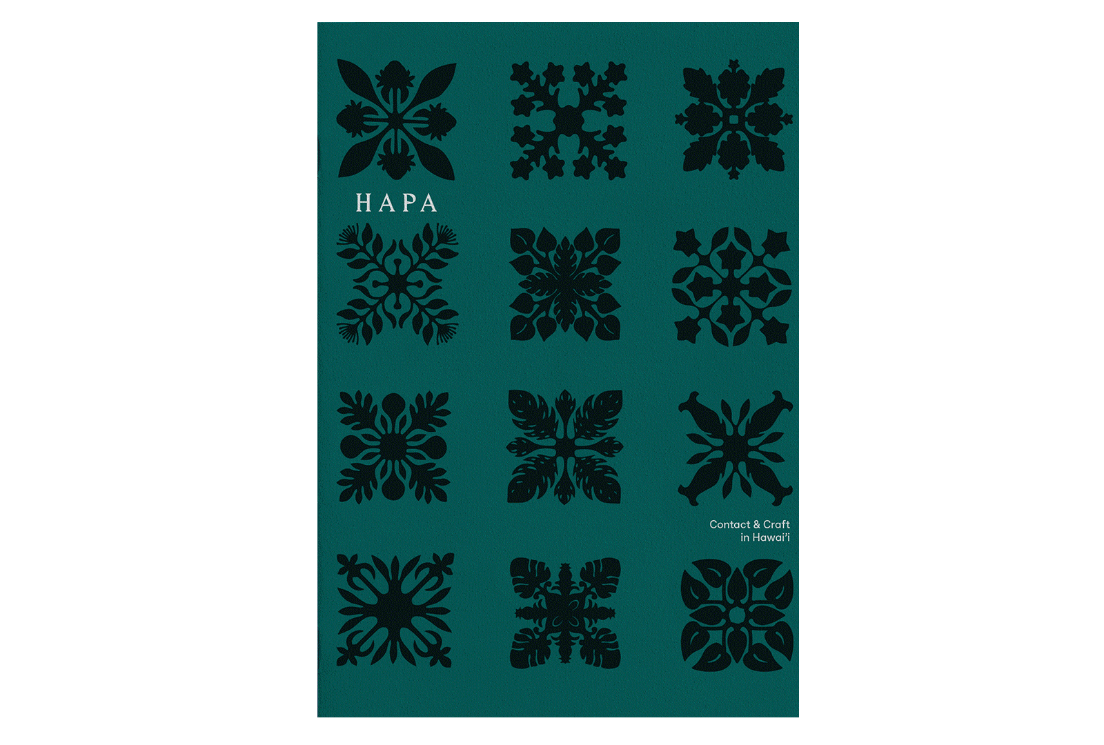
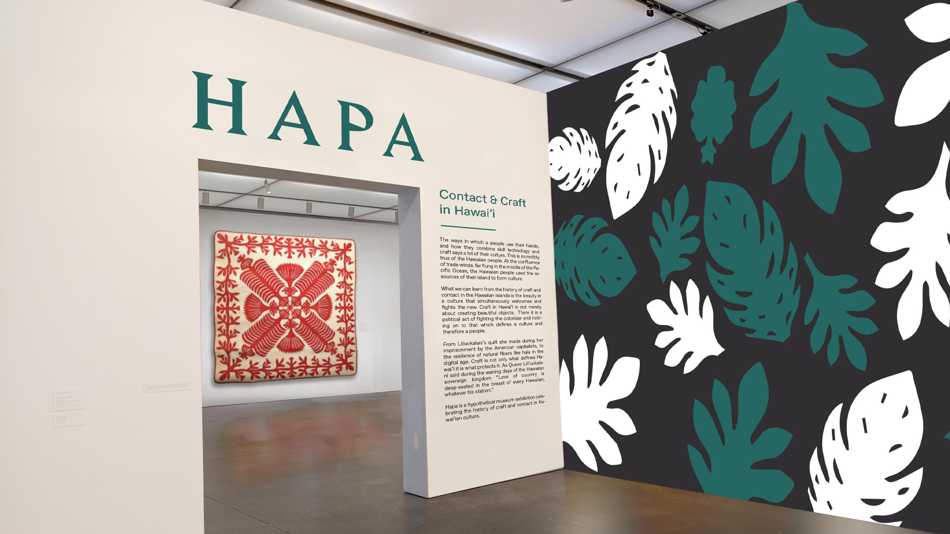
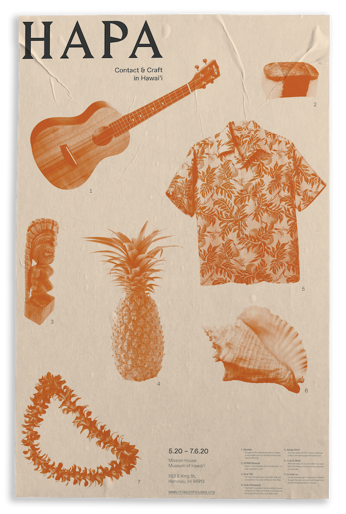
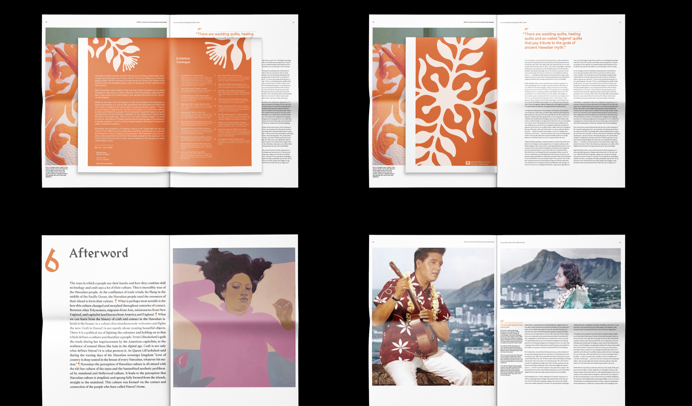
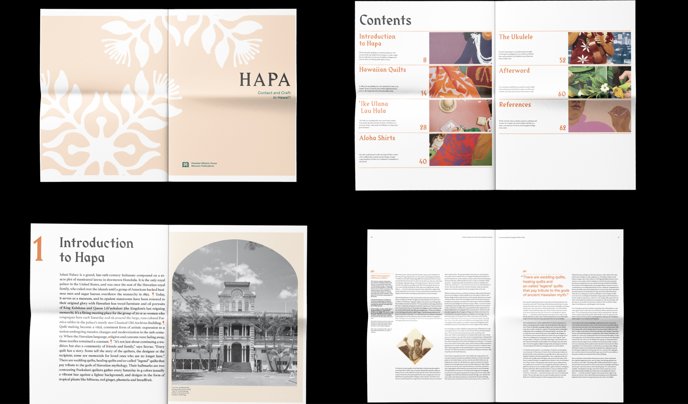

Hapa
The ways in which a people use their hands, and how they combine skill technology and craft says a lot of their culture. This is incredibly true of the Hawaiian people. At the confluence of trade winds, far flung in the middle of the Pacific Ocean, the Hawaiian people used the resources of their island to form their culture.
Hapa is a hypothetical museum exhibition celebrating the history of craft and contact in Hawai’ian culture.
Full Project Page
Print
2019
Instructor: Simon Johnston
2019
Instructor: Simon Johnston
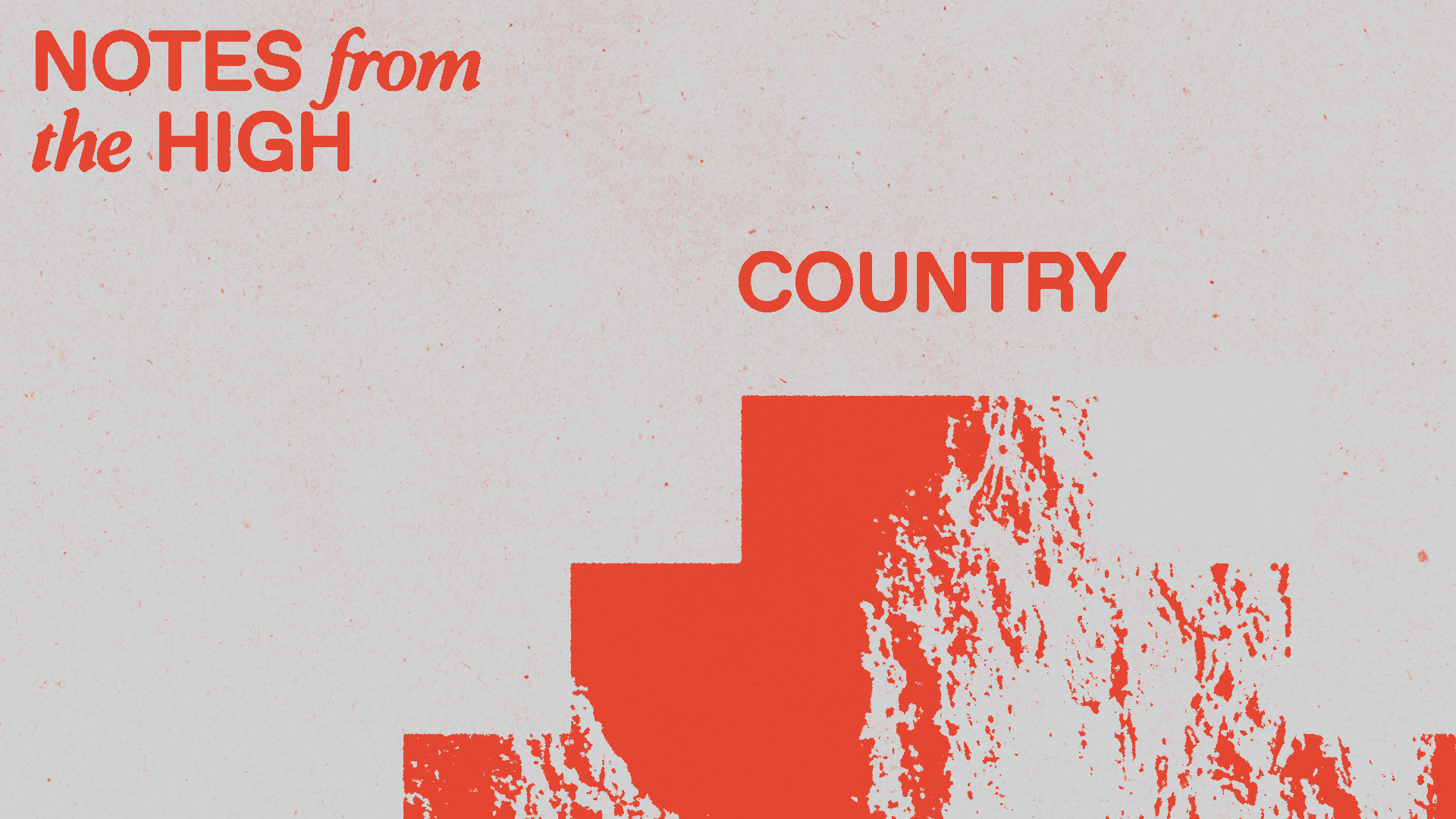
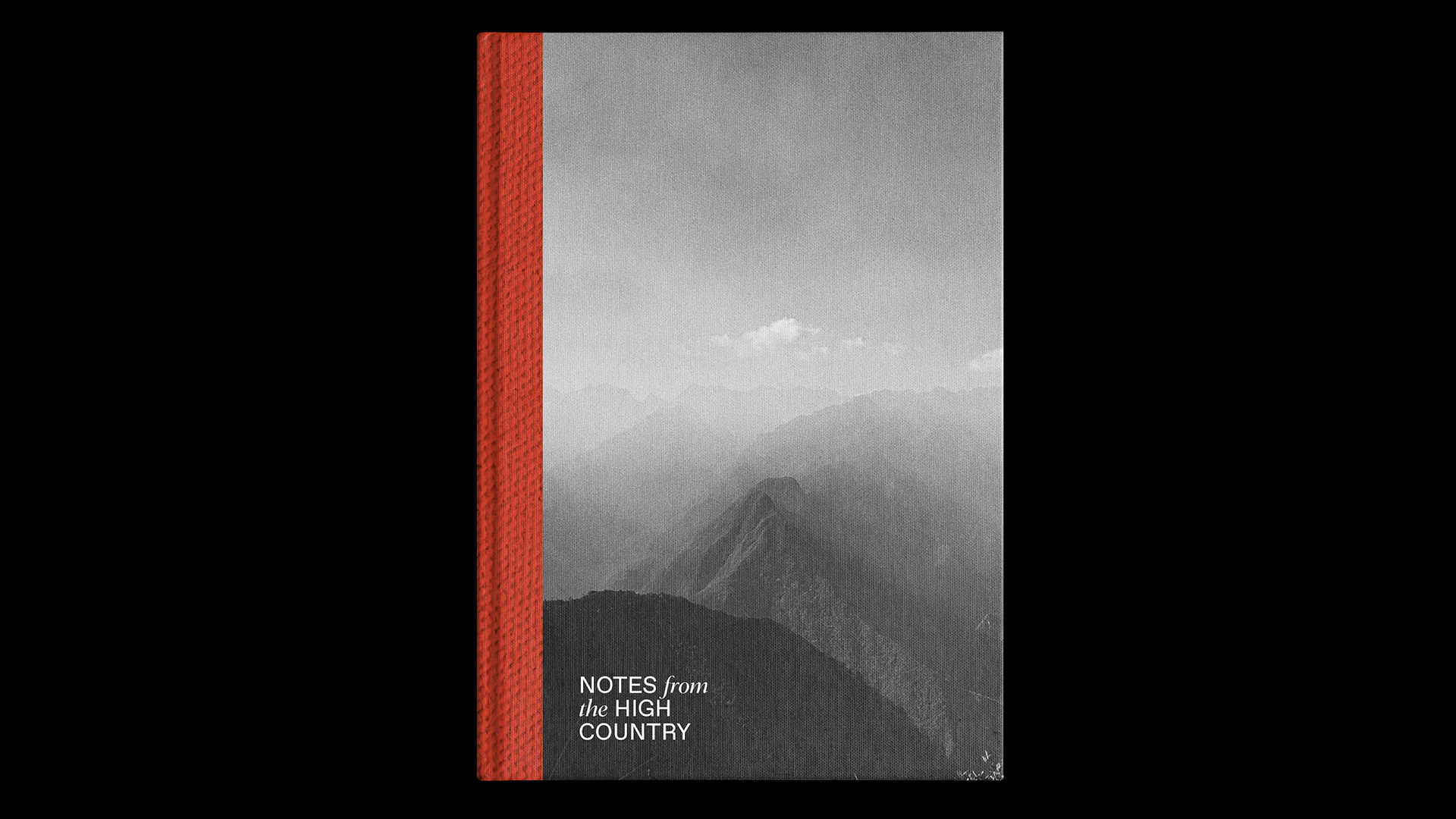
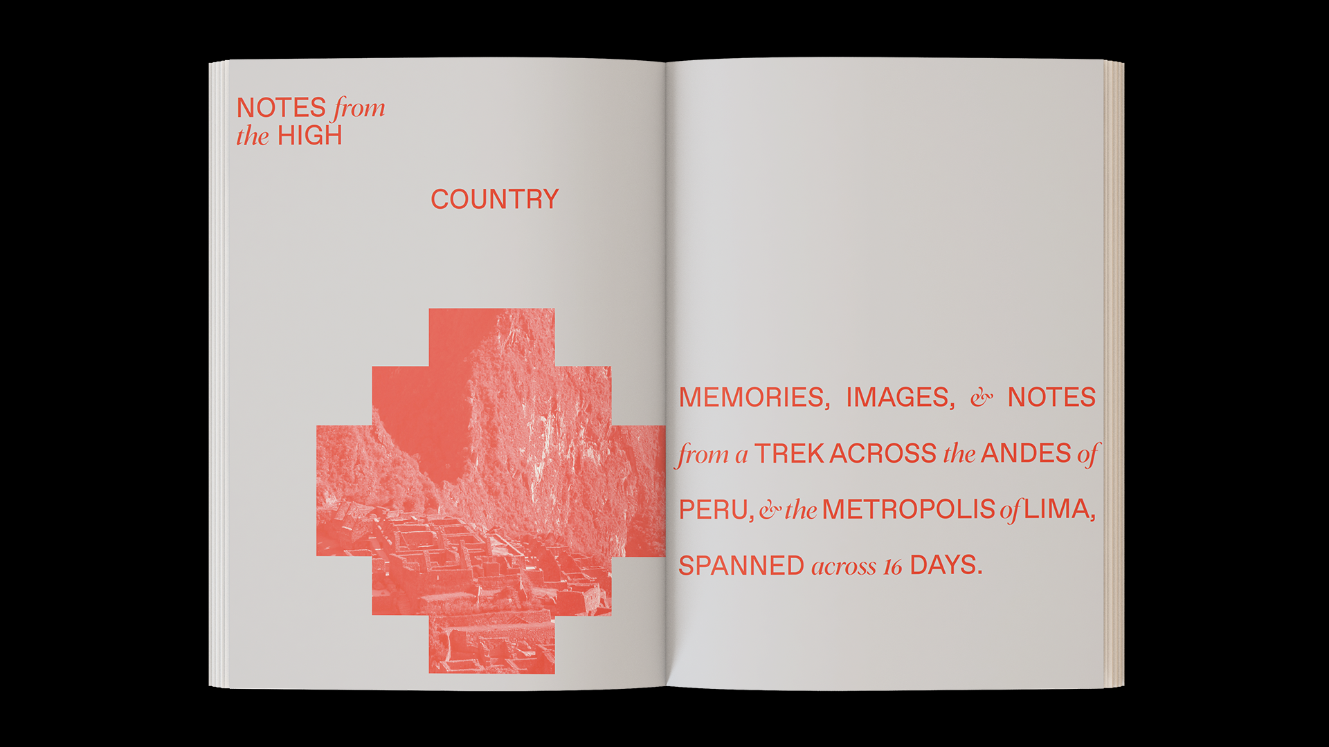
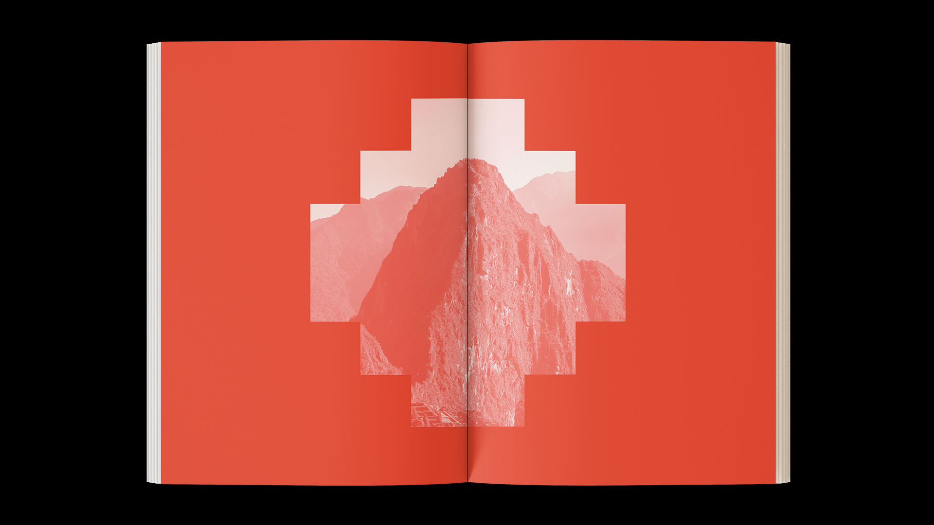
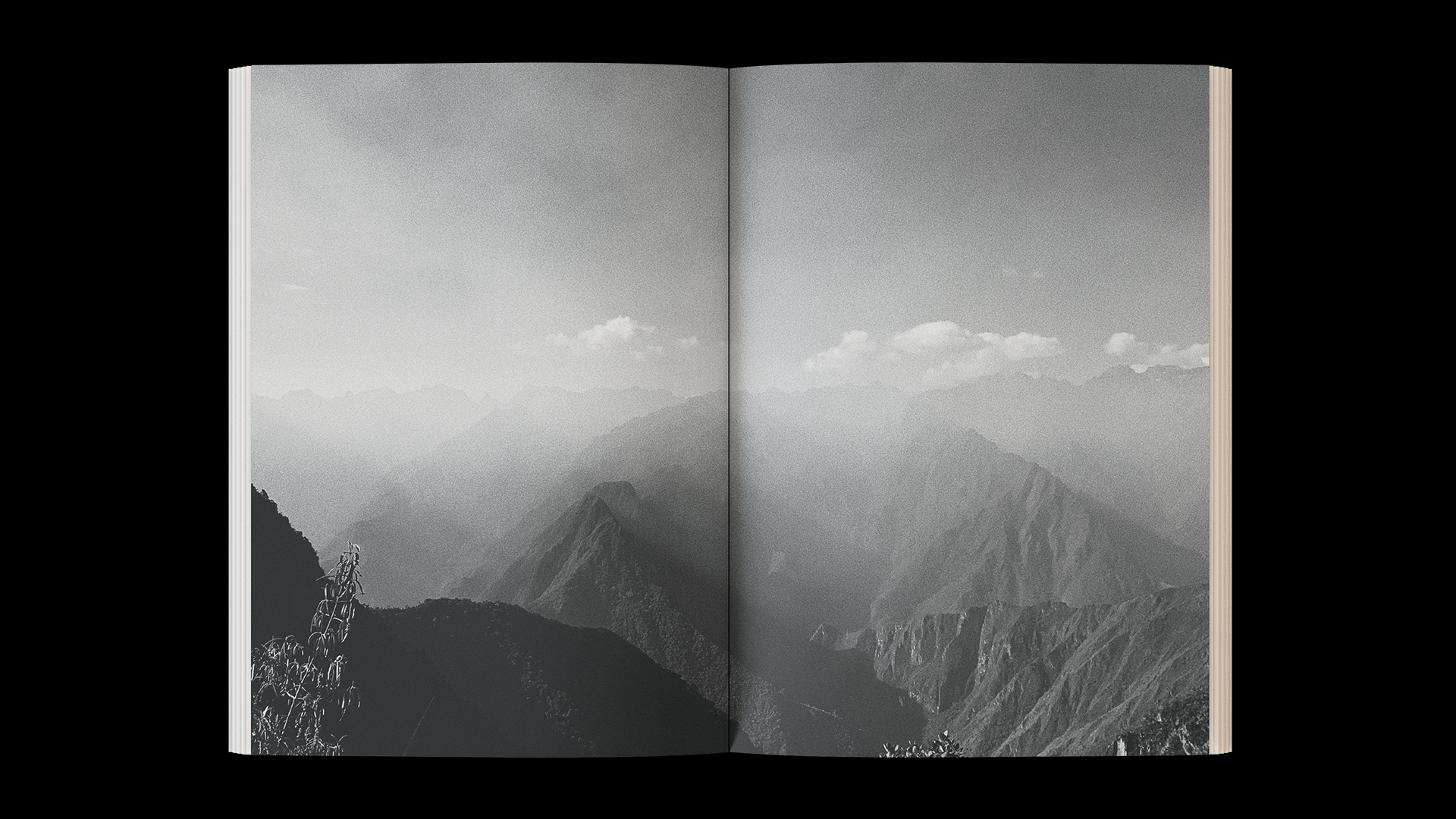
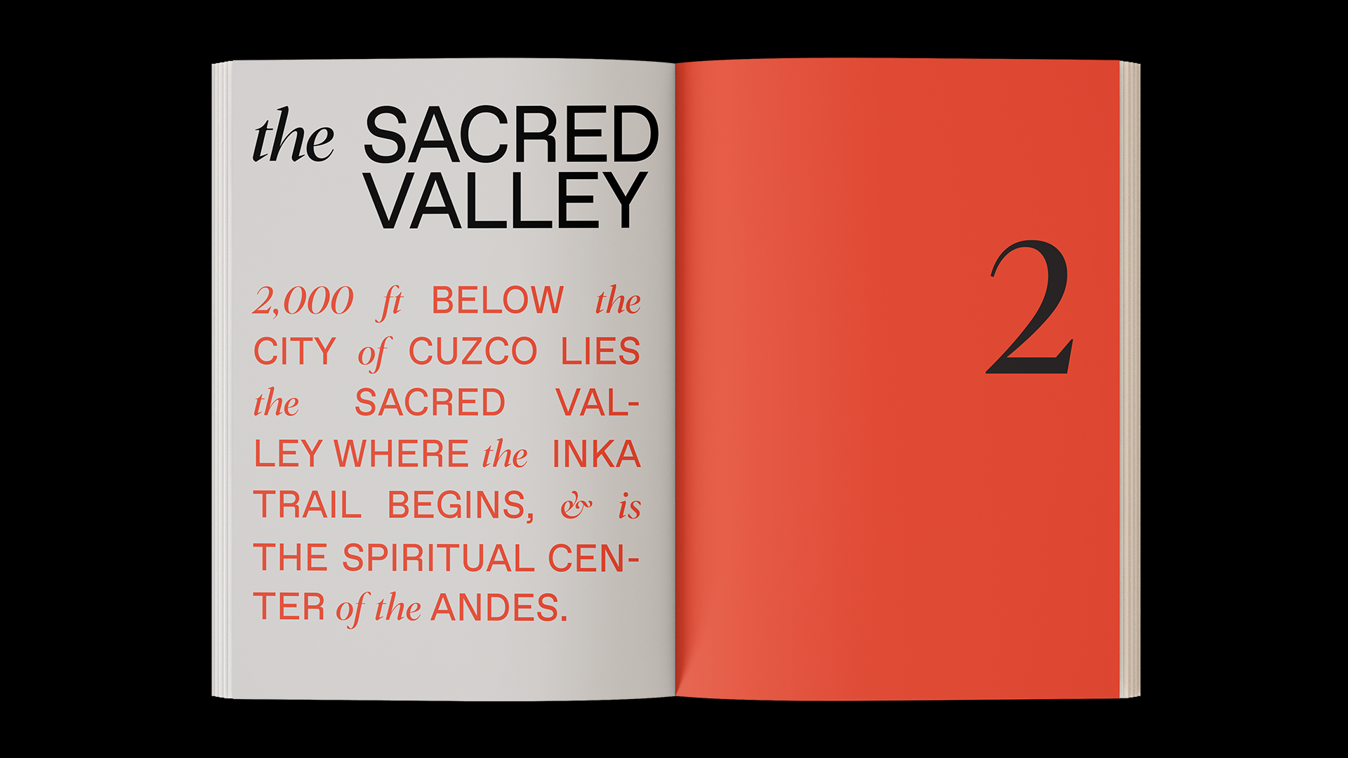
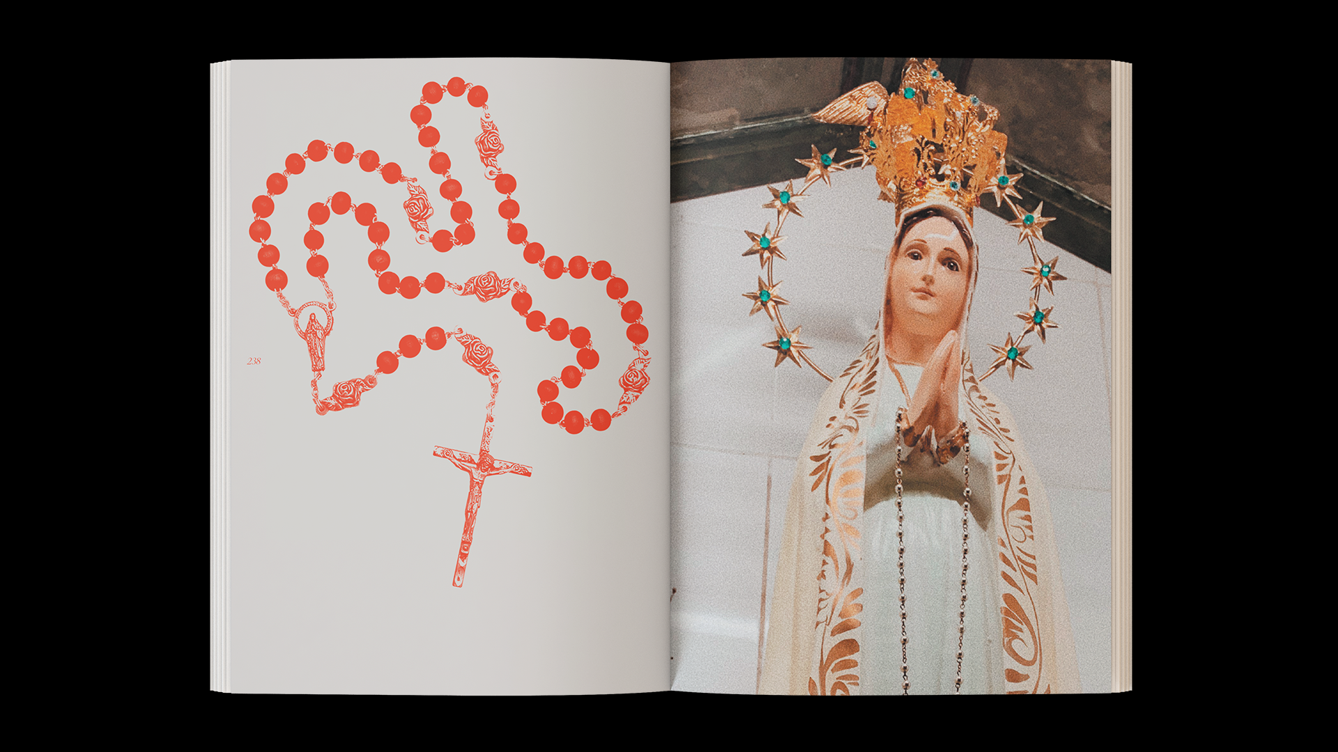
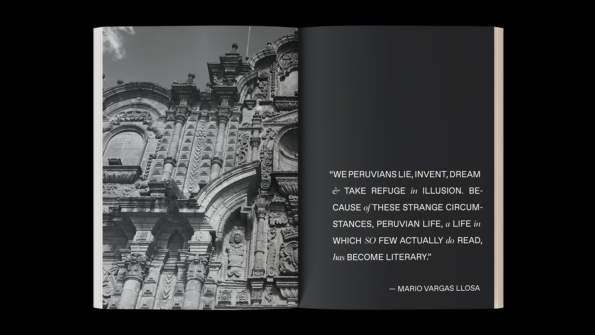
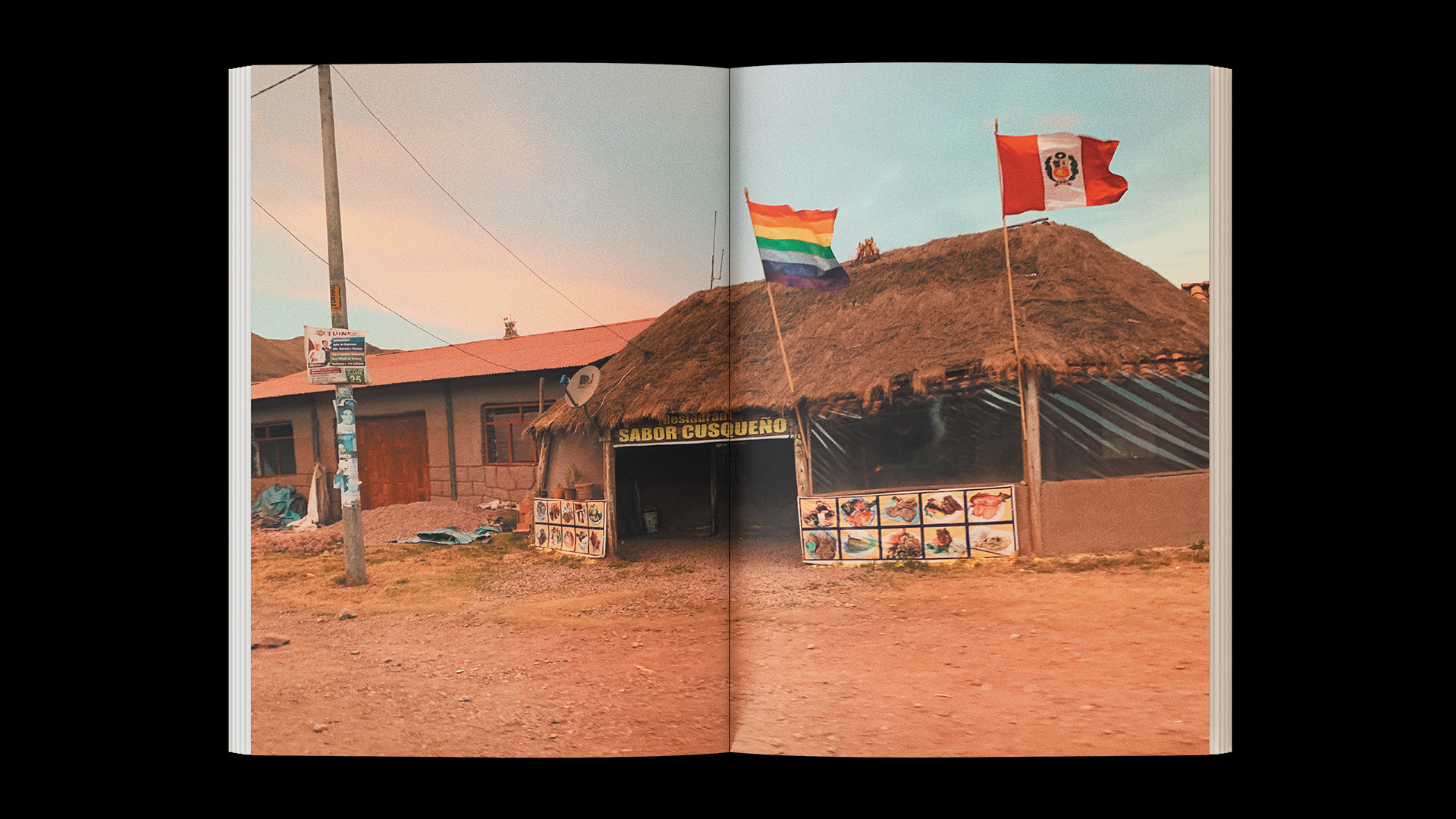
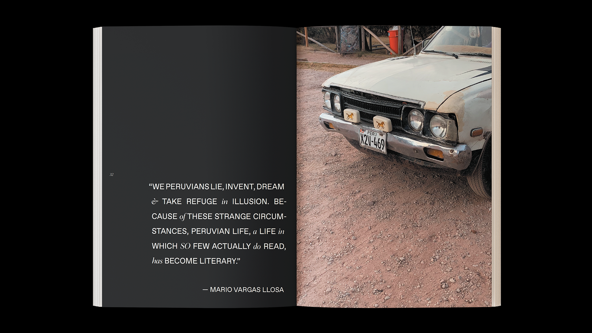
Notes from the High Country
In 2019 I hiked the Inca Trail from Ollantaytambo, Peru to Machu Picchu and documented the trek through the Andes, and the subsequent journey around Peru in this book.
In 2019 I hiked the Inca Trail from Ollantaytambo, Peru to Machu Picchu and documented the trek through the Andes, and the subsequent journey around Peru in this book.
2019
Book Design
Book Design

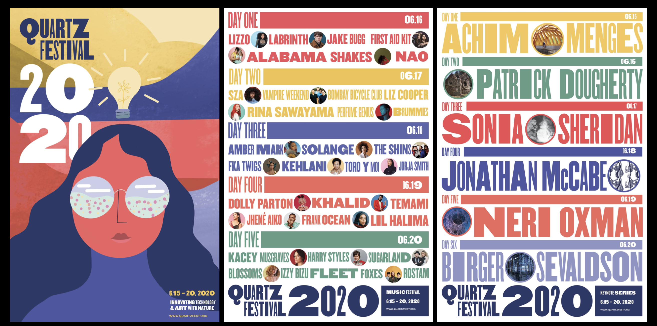
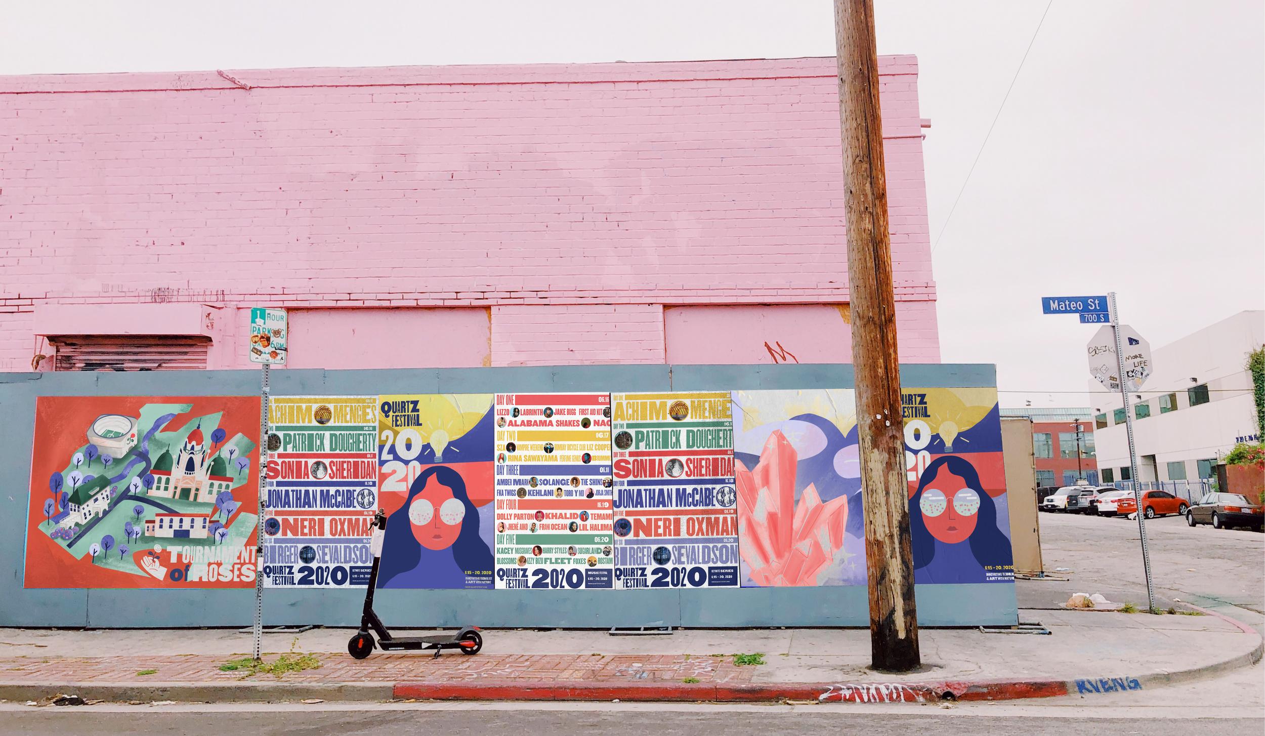


Tournament of Roses
The Pasadena Tournament of Roses is an historic organization, perhaps most notable for its annual New Year’s Day Rose Parade, and its Rose Bowl football game as well. Originally established as a foundation to create awareness of the warm Pasadena climate, for wealthy Easterners looking to escape the winter, the Tournament of Roses has developed into an iconic piece of Americana culture.
For Graduate Studio 01 at ArtCenter College of Design, we were tasked with doing a complete brand audit on the Tournament of Roses, and rebrand and extend it accordingly. Initial roadblocks included the static branding for the company, the considerations for its non-profit and largely volunteer-staffed status, and what extensions would be appropriate to create in order to elevate the core branding message, and mission statement at the heart of the Tournament of Roses.
Full Project Page
Strategy, Illustration & Branding
2019 Instructors: Jan Fleming, Carolina Trigo
2019 Instructors: Jan Fleming, Carolina Trigo
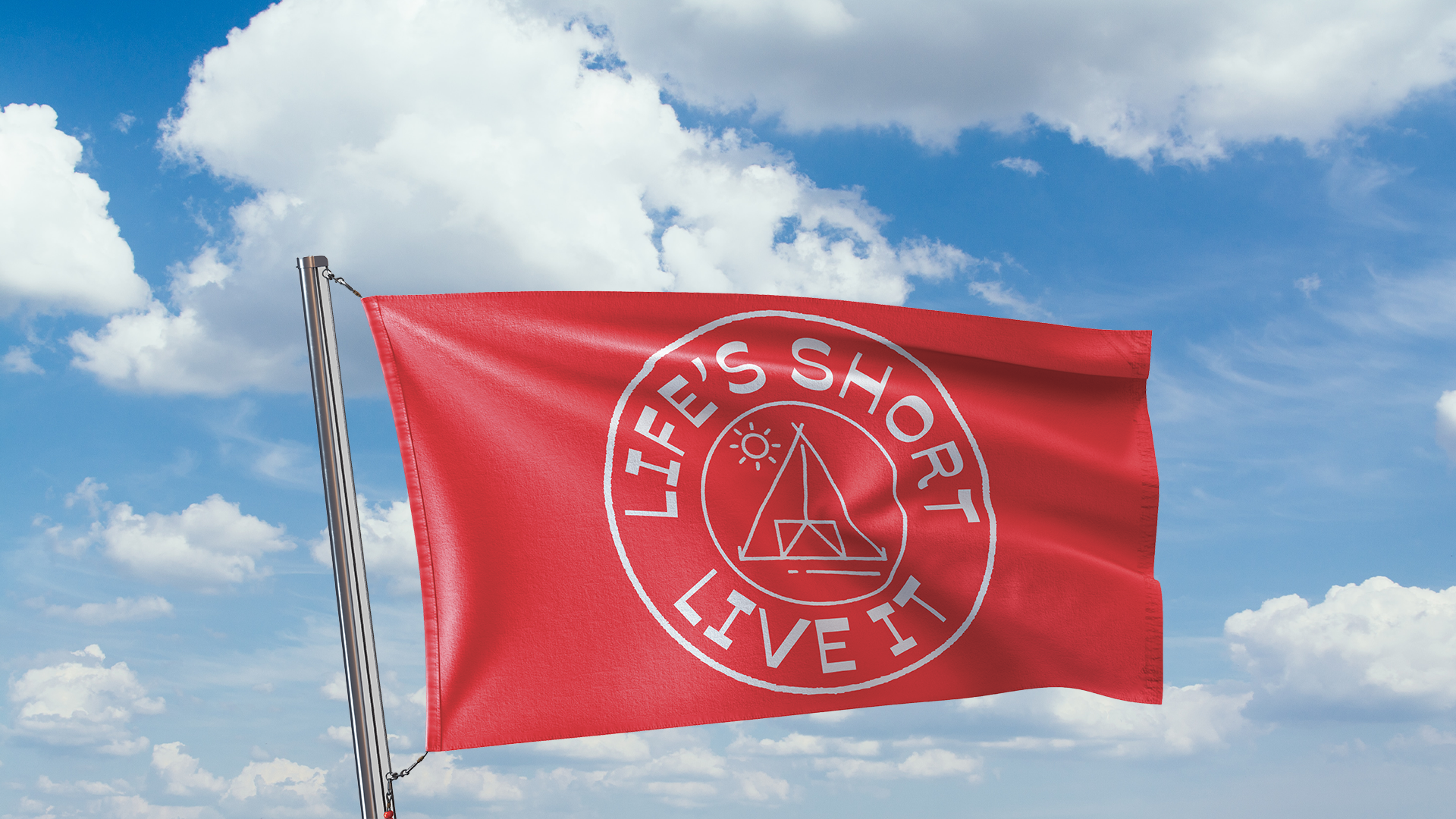
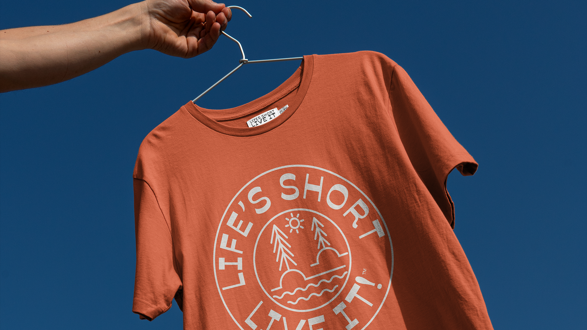
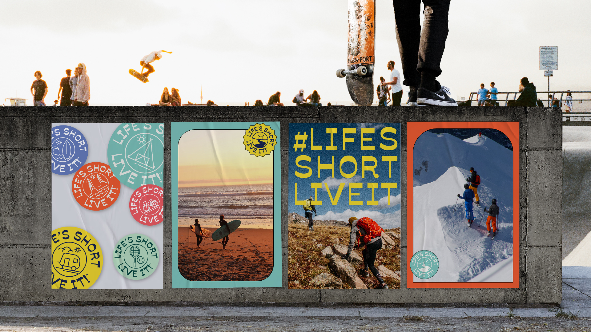
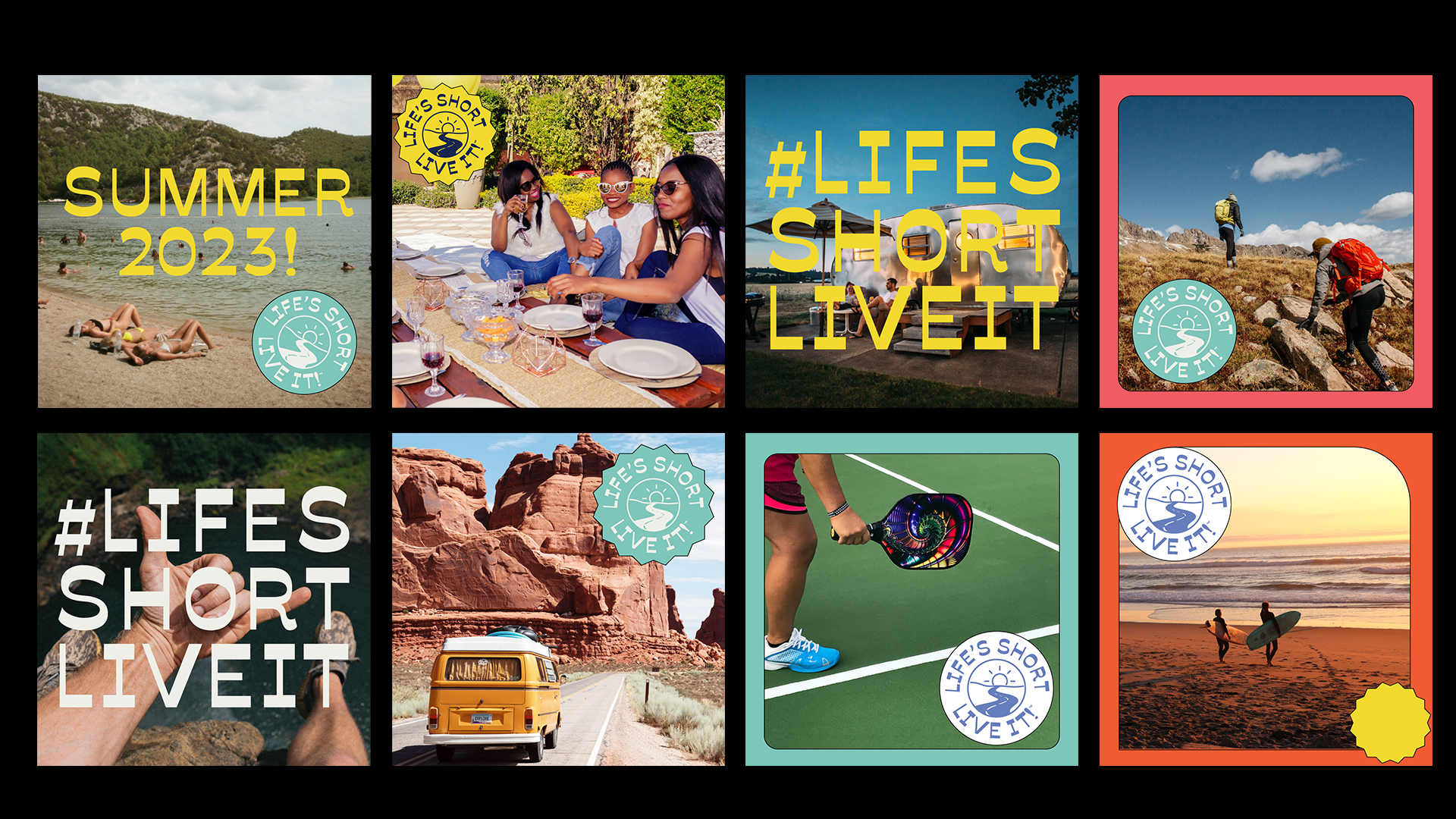
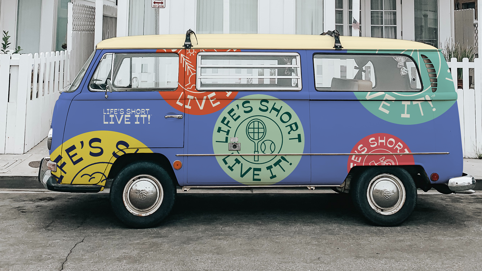
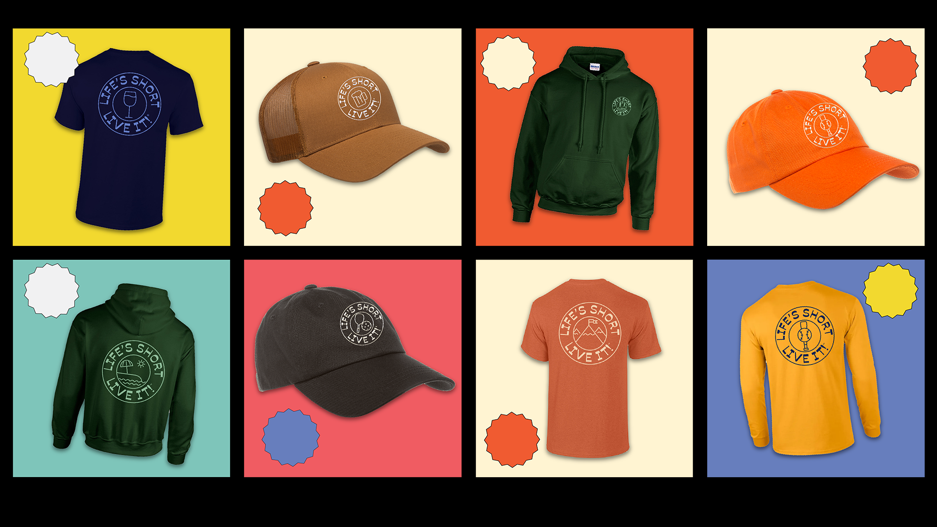


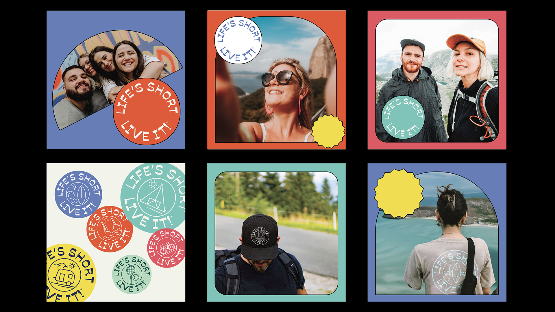
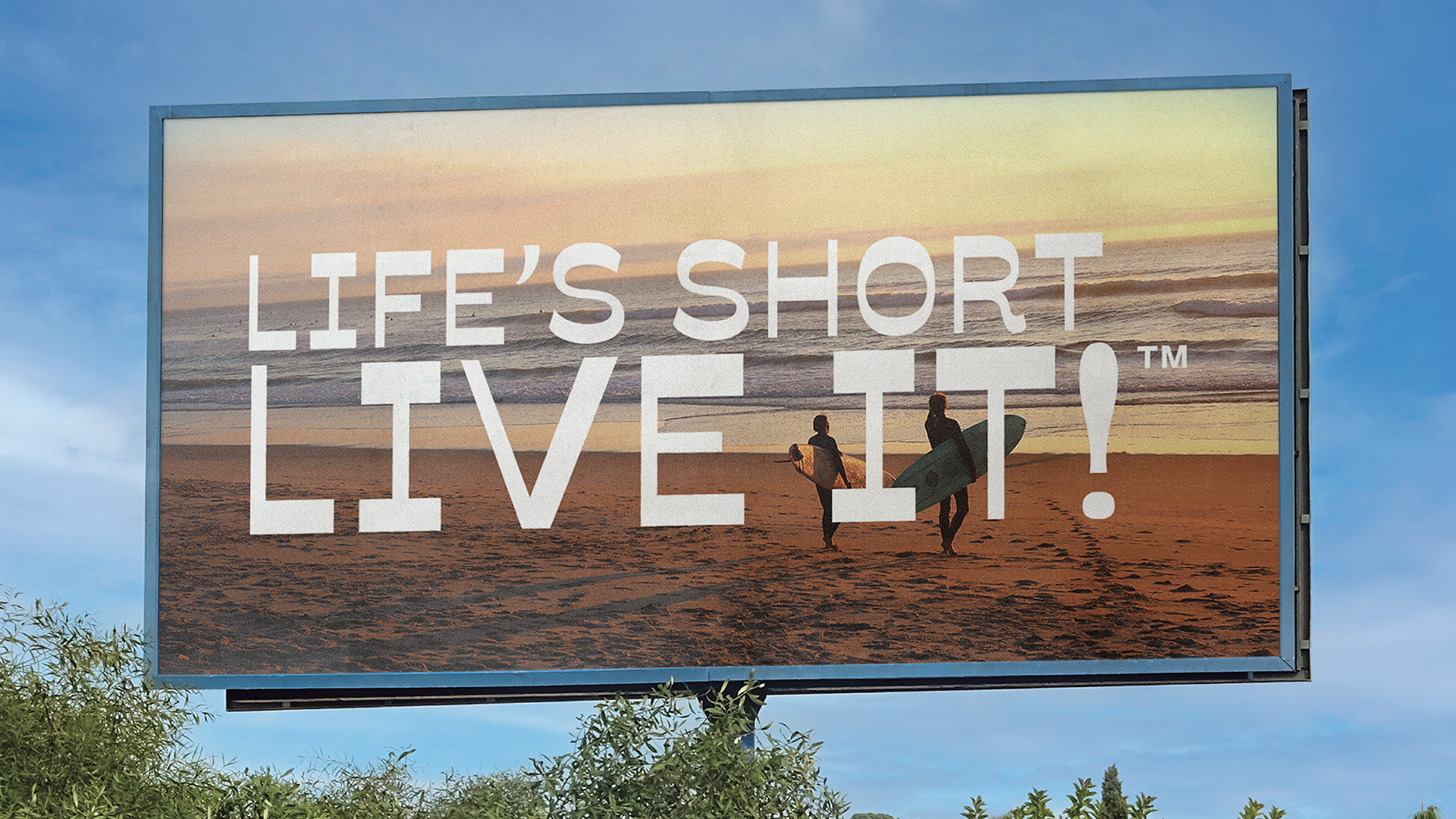

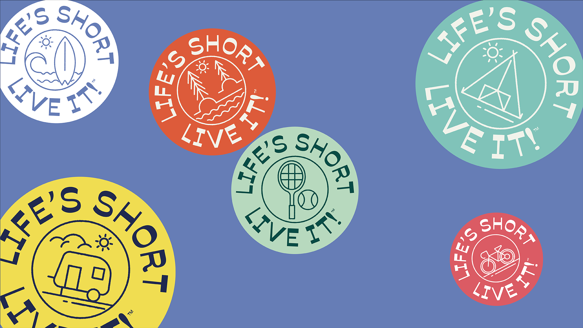
Life’s Short - Live It
Life’s Short - Life It is a lifestyle brand started by Craig and Kathleen Hostert. It was born out of their inspirational story of beating the odds and facing all of life’s challenges with a positive attitude. The message of this brand was born out of an organic movement from their travels around the United States in their camper, and inspiring others to live life to the fullest.
This project constituted a complete brand identity system, as well as web design and design of products to sell on the websight. Additionally it included a brand strategy for and brand launch strategy in the fall of 2022
Branding
2022
2022
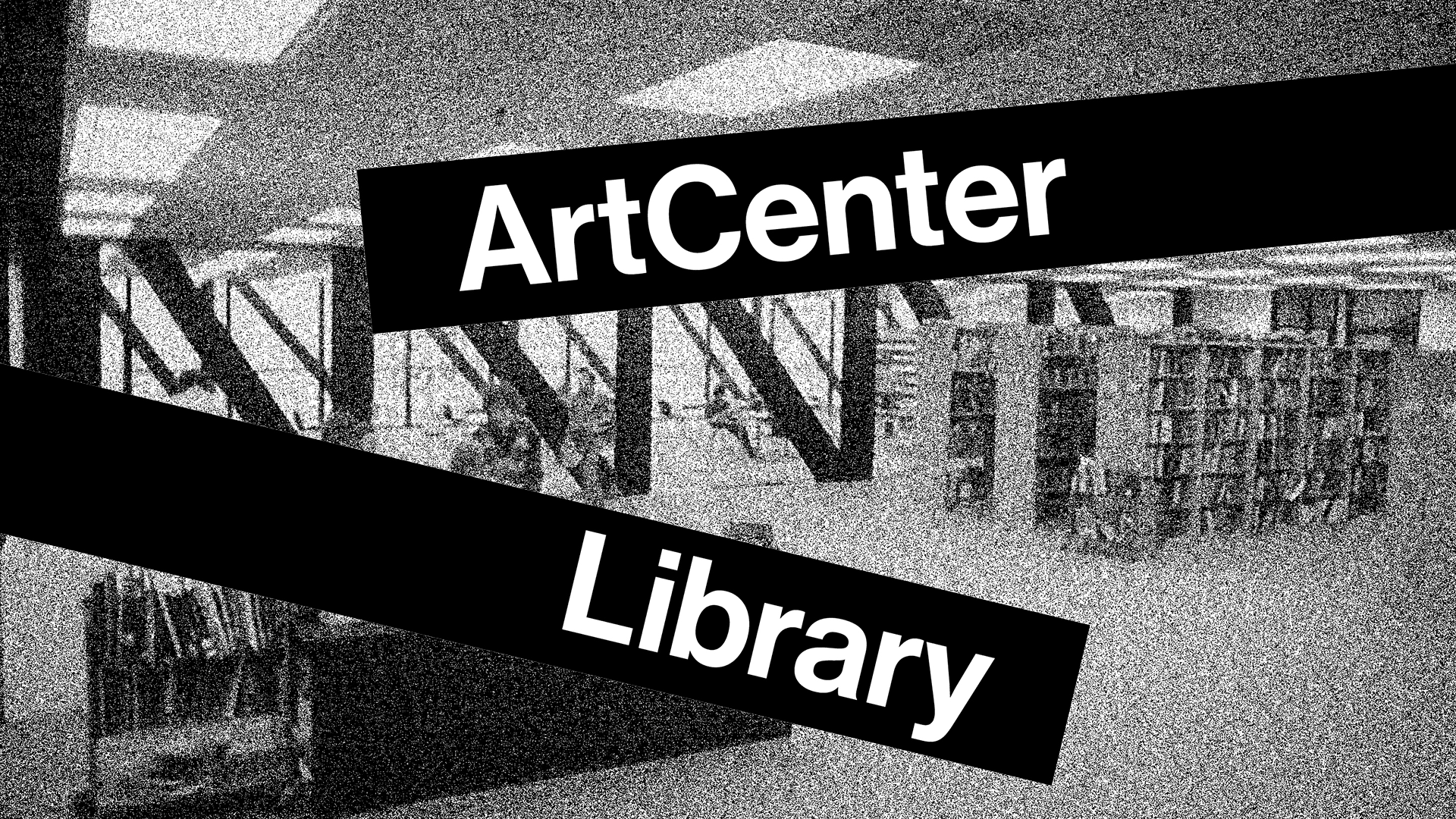

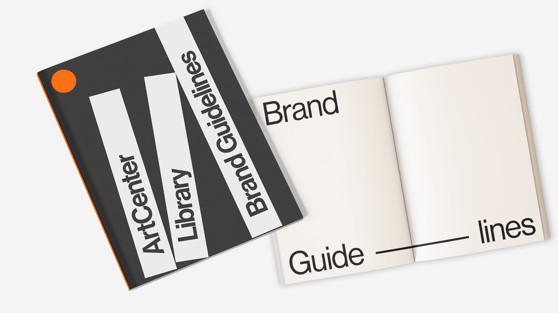

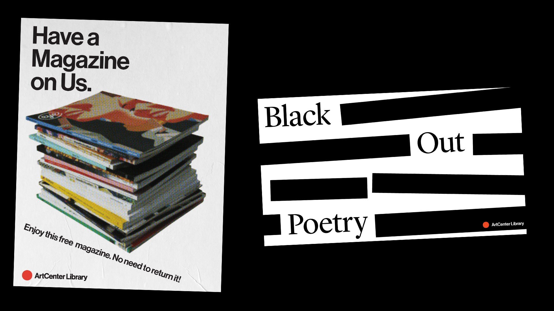
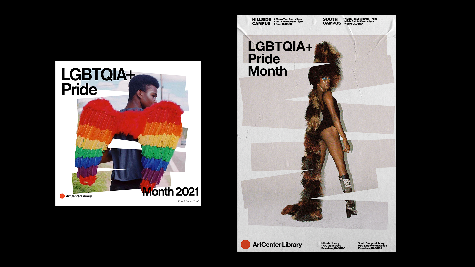


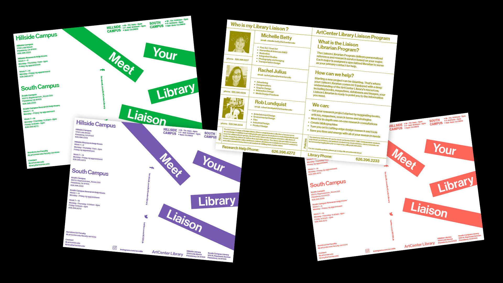
ArtCenter College of Design Library
I was asked to come onboard as the ArtCenter College of Design’s in-house graphic designer to finish their rebrand and to flesh out and define the rules of their brand guideline.
This work also included working with the marketing team across the department, developing initiatives to drive students educators to utilize the library spaces, as well as creating collateral to advertise new technological tools and events hosted by the library using this brand system as it was being finalized.
Branding
2020-2021
2020-2021
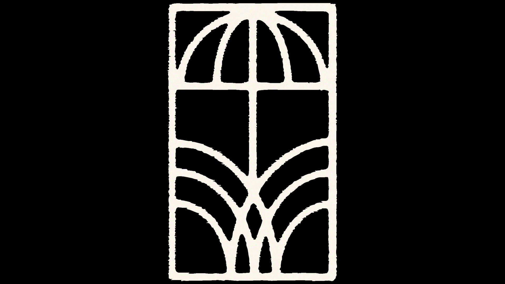
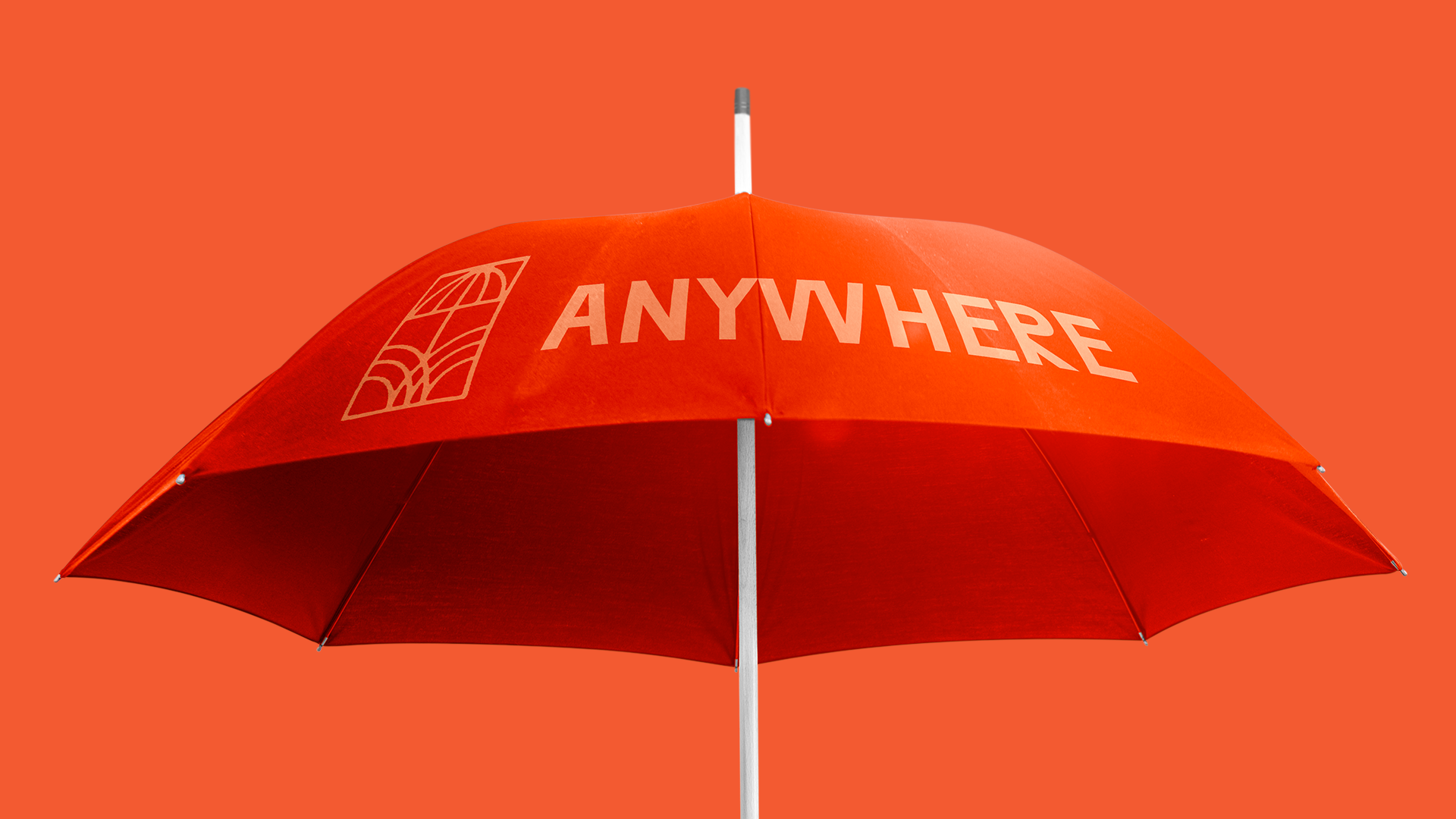
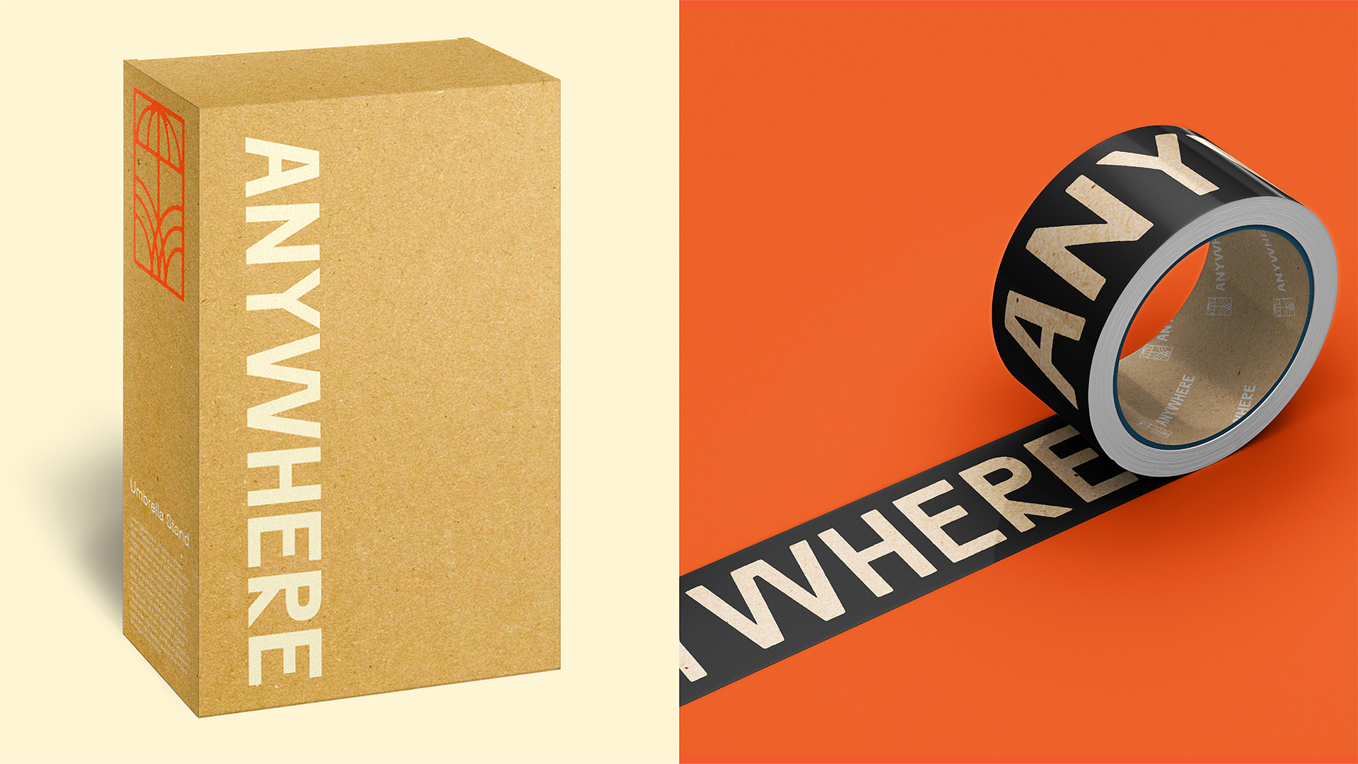

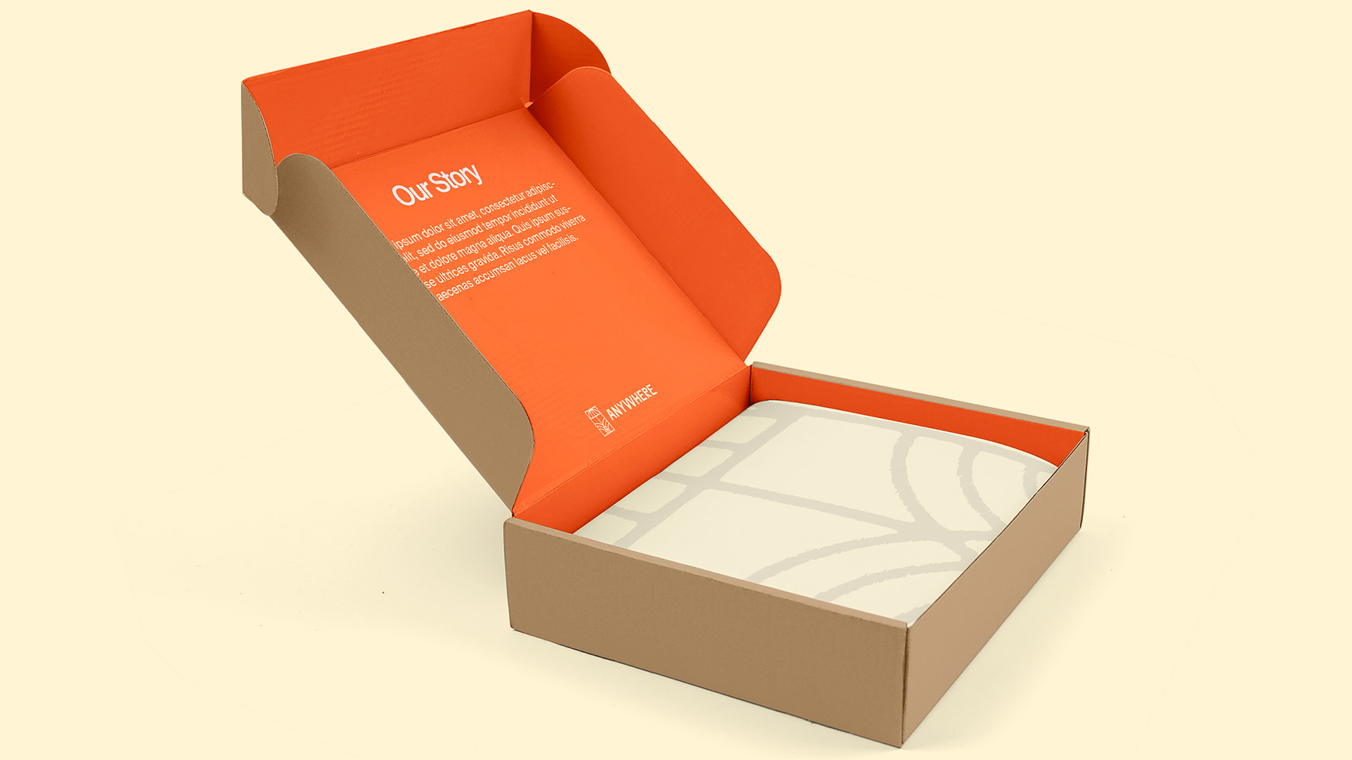
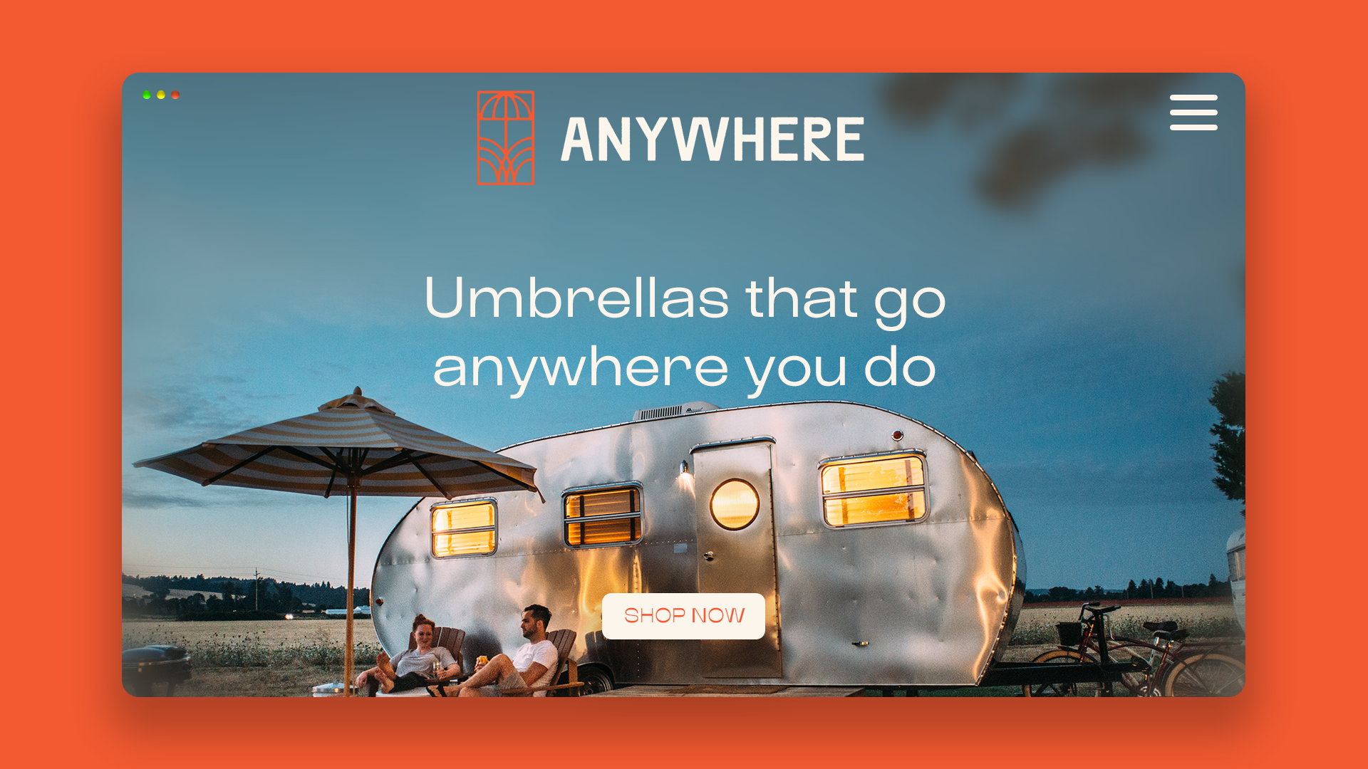


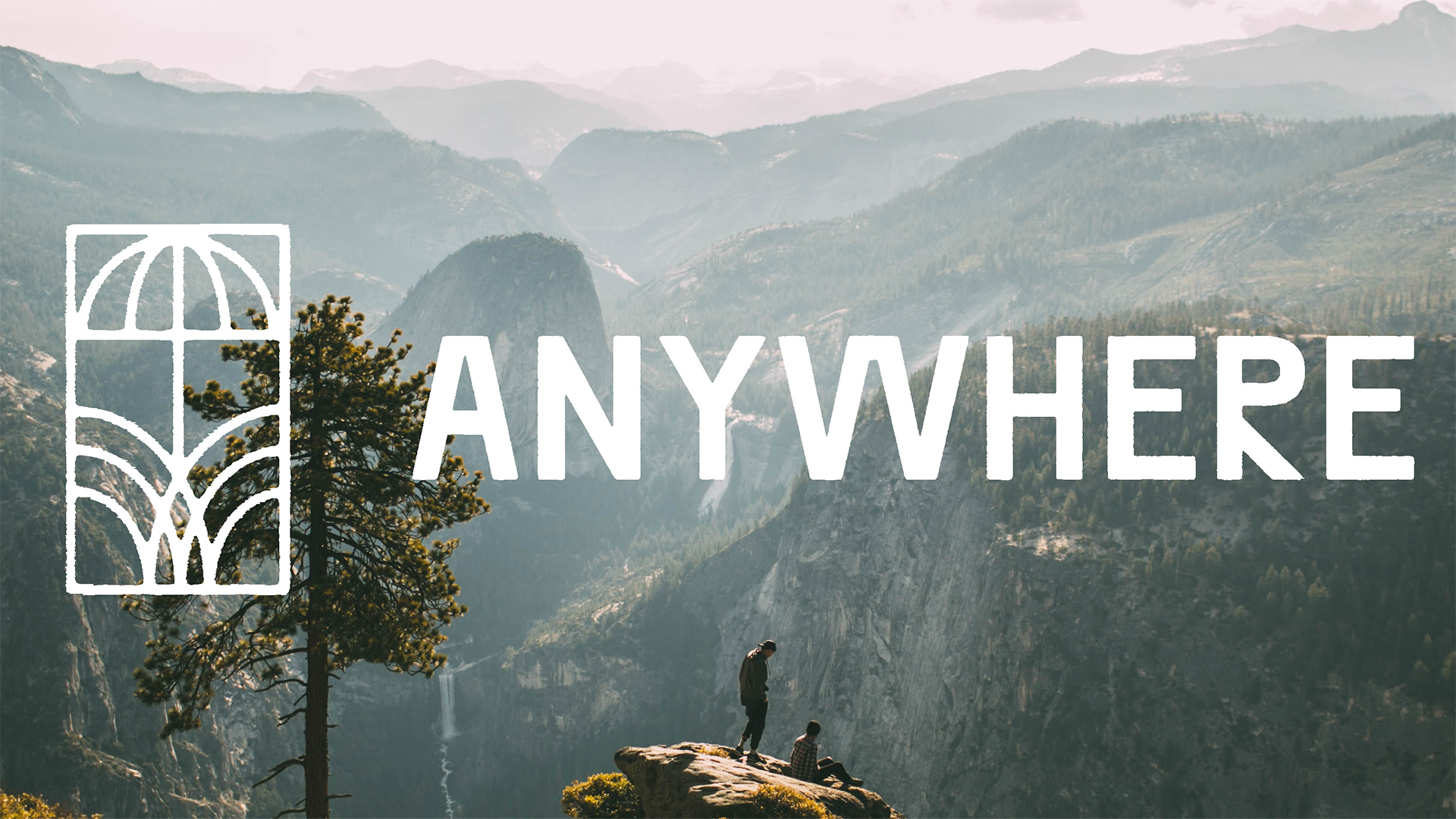
Anywhere Umbrellas
Logo design Anywhere, a patented umbrella stand design. The inspiration for this identity was from the natural world, while still elevating it from other cleaner, tech-centered brands. Drawing language from the craft movement.
Full Project Page
Logo design Anywhere, a patented umbrella stand design. The inspiration for this identity was from the natural world, while still elevating it from other cleaner, tech-centered brands. Drawing language from the craft movement.
Full Project Page
Branding
2021
Freelance Design
2021
Freelance Design
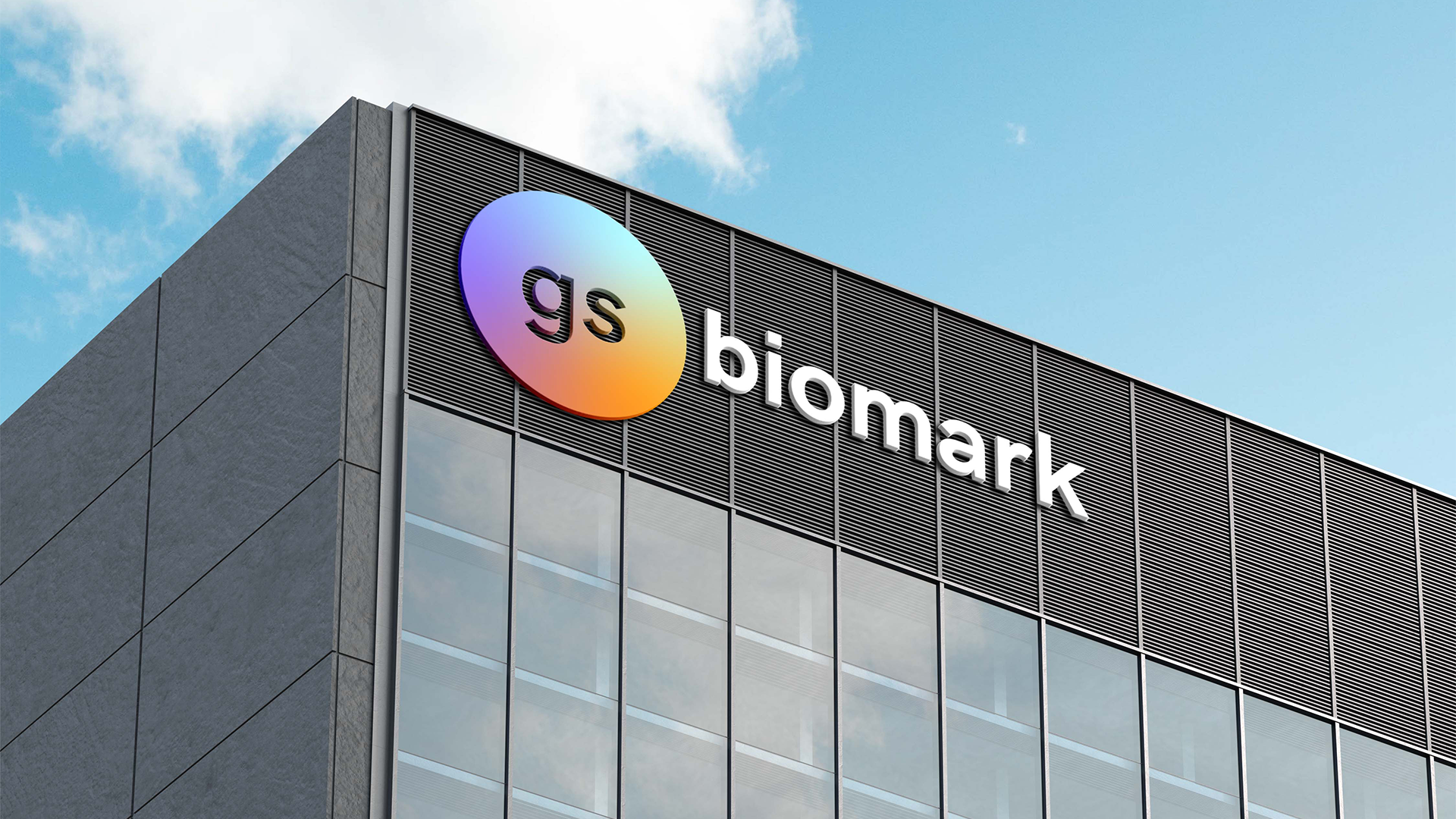
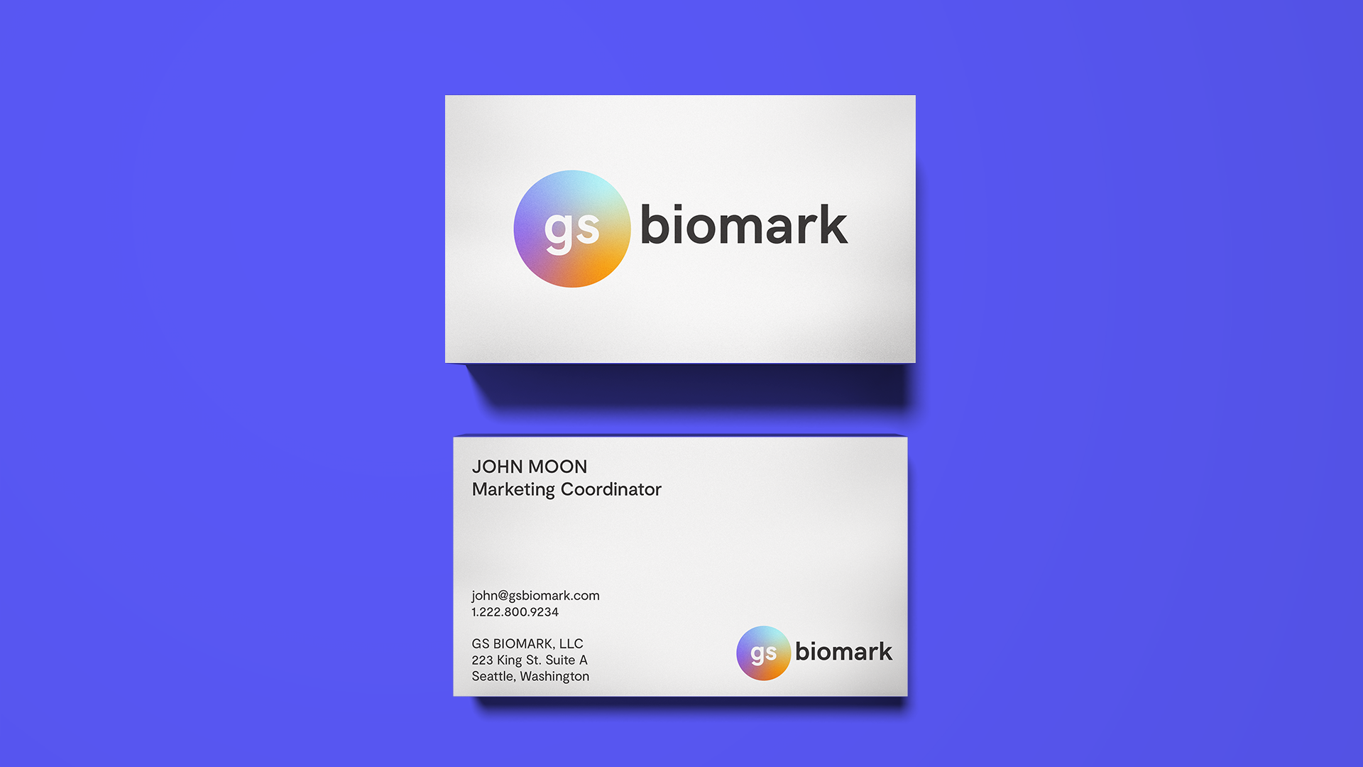

GS Biomark
GS Biomark, LLC is a licensed distributor for Resolution Biomedical, Inc. (“RBI”). RBI is a medical products manufacturer based in Orange County, California. Their COVID-19 testing products are supplied to laboratories globally and across the United States.
GS Biomark required a logo, and initial color palette as part of it’s launch in order to help distinguish it from it’s competitors during the influx of testing manufacturers and distributors during the COVID-19 pandemic.
Branding
2021
2021
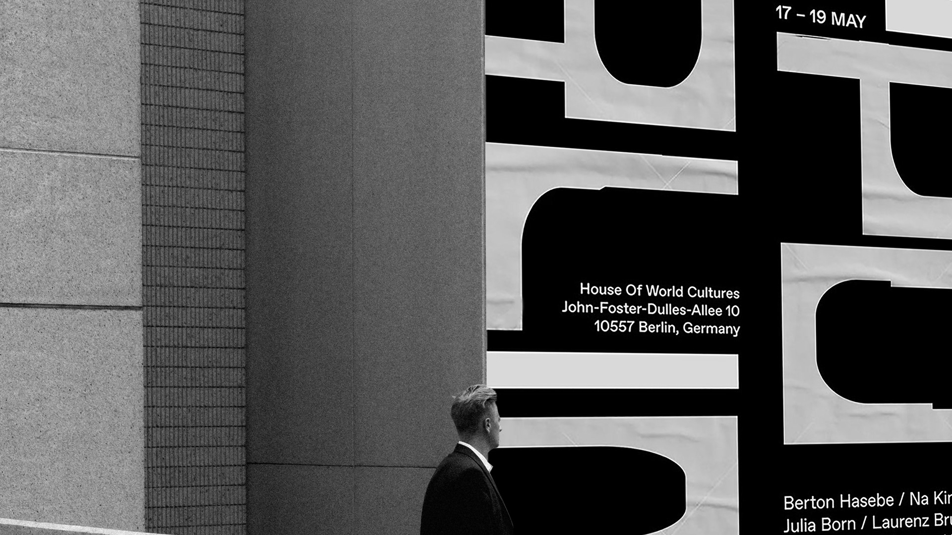
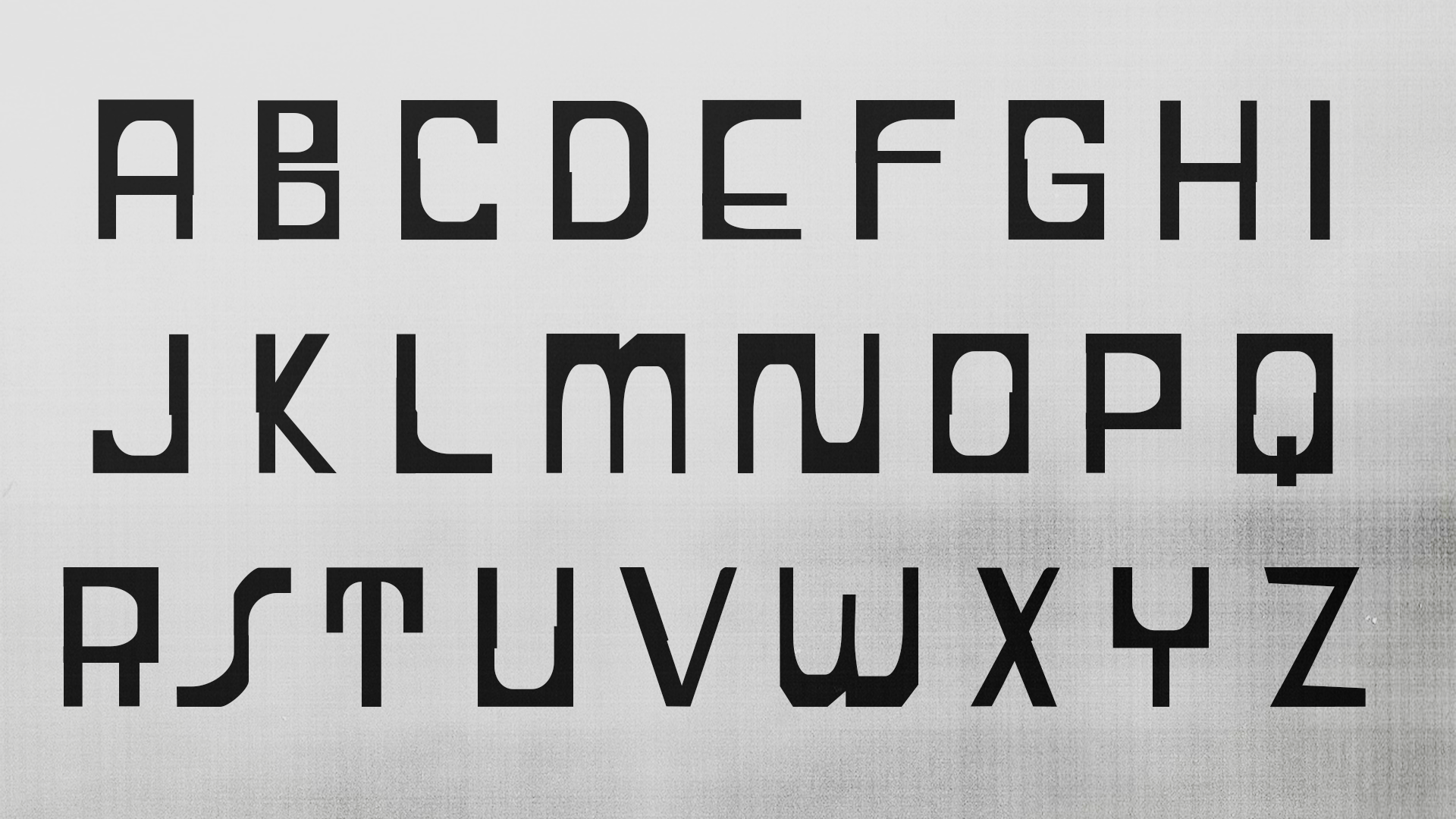


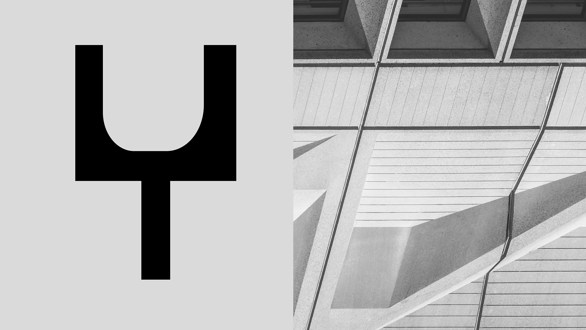
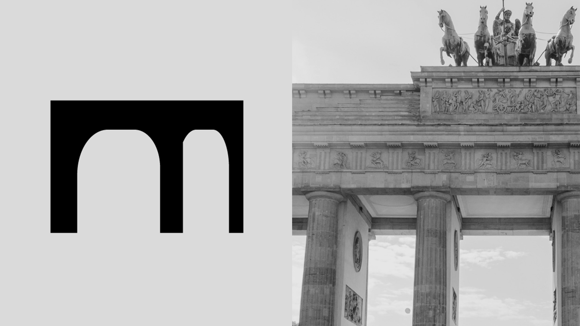
Berlin
This rationalist font was inspired by the Brutalist and Bauhaus architecture of Berlin. Utilizing a shared number of ragged shapes, the quirk of this font is the letterforms’ messiness and incongruity from one another. Created for a hypothetical typography conference inspired by the typography of Berlin.
This rationalist font was inspired by the Brutalist and Bauhaus architecture of Berlin. Utilizing a shared number of ragged shapes, the quirk of this font is the letterforms’ messiness and incongruity from one another. Created for a hypothetical typography conference inspired by the typography of Berlin.
Experimental Type Design
2019
Instructor: River Jukes Hudson
2019
Instructor: River Jukes Hudson
Live Oak Offerings
Live Oak Offerings is a small consultancy that helps other nonprofits get off the ground and established with some fundraising strategies. I was charged with creating a logo and color palette for this up-and-coming consultancy that could be scaled across their web presence.
Live Oak Offerings is a small consultancy that helps other nonprofits get off the ground and established with some fundraising strategies. I was charged with creating a logo and color palette for this up-and-coming consultancy that could be scaled across their web presence.
Branding
2022
2022
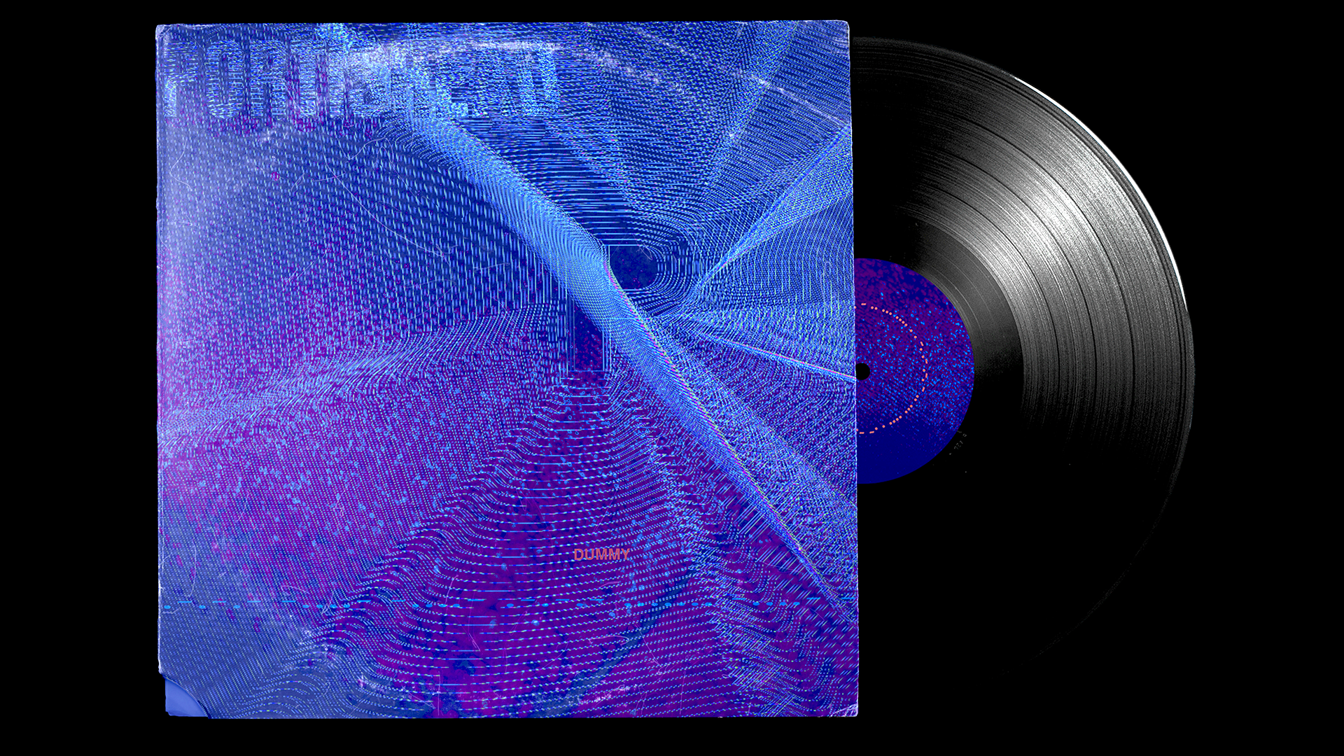
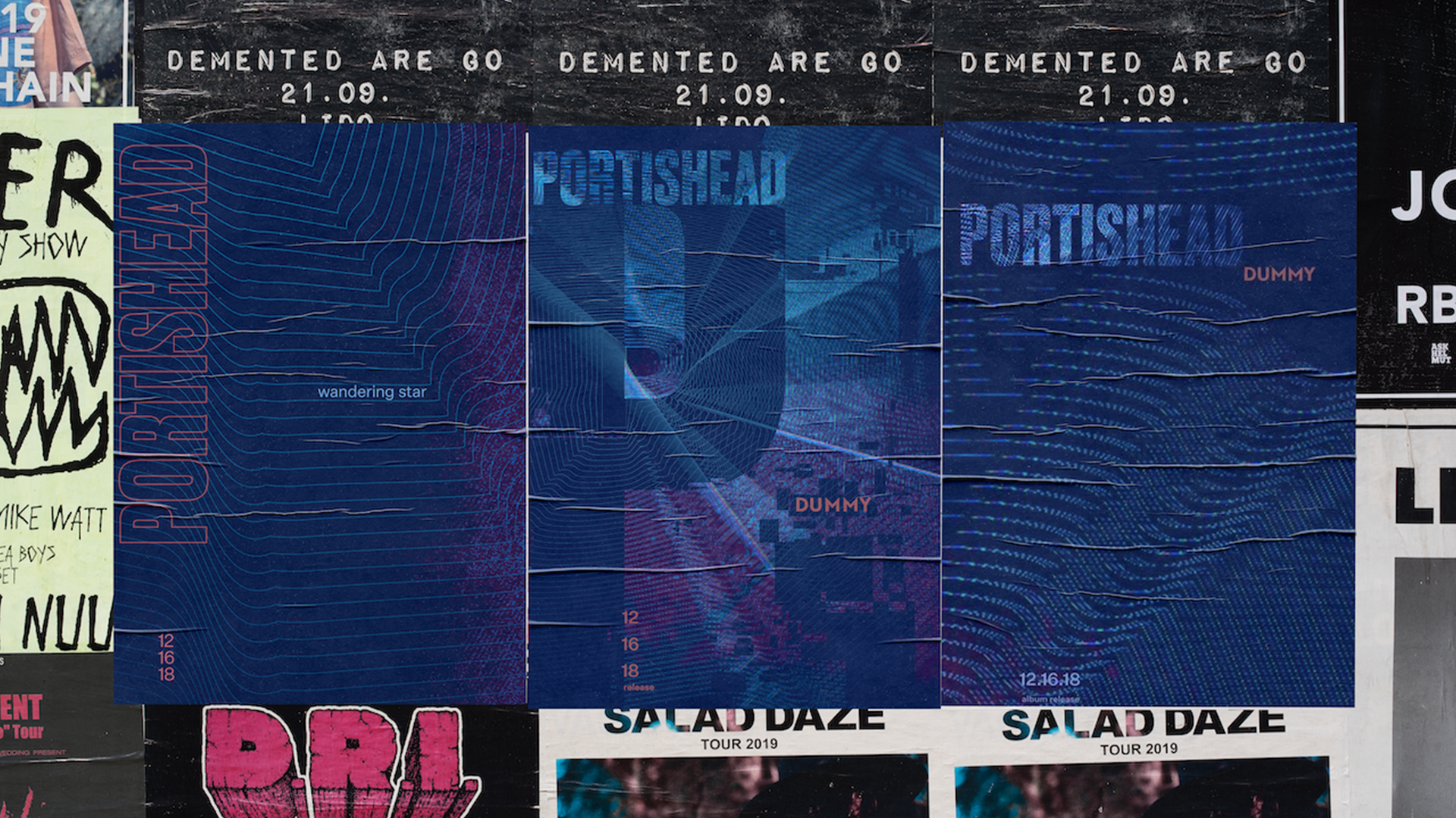
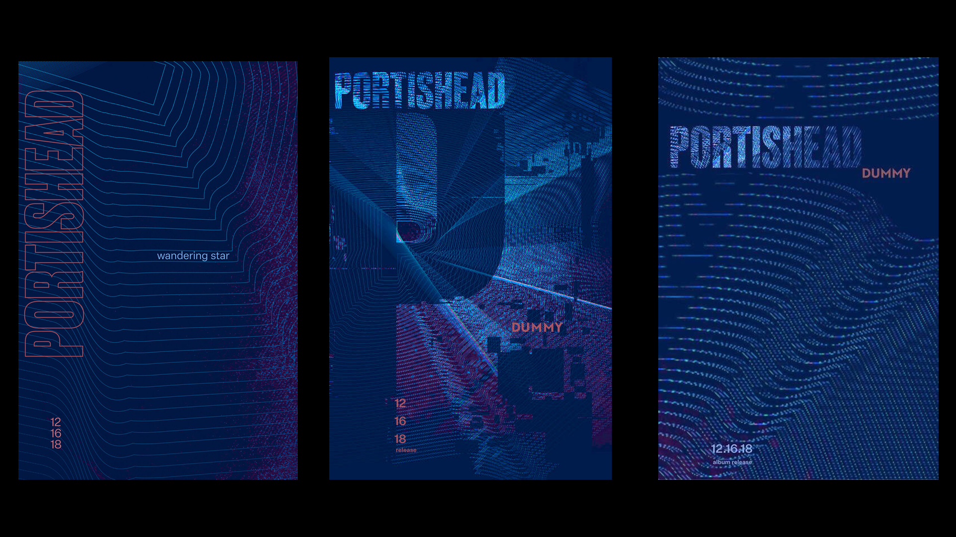
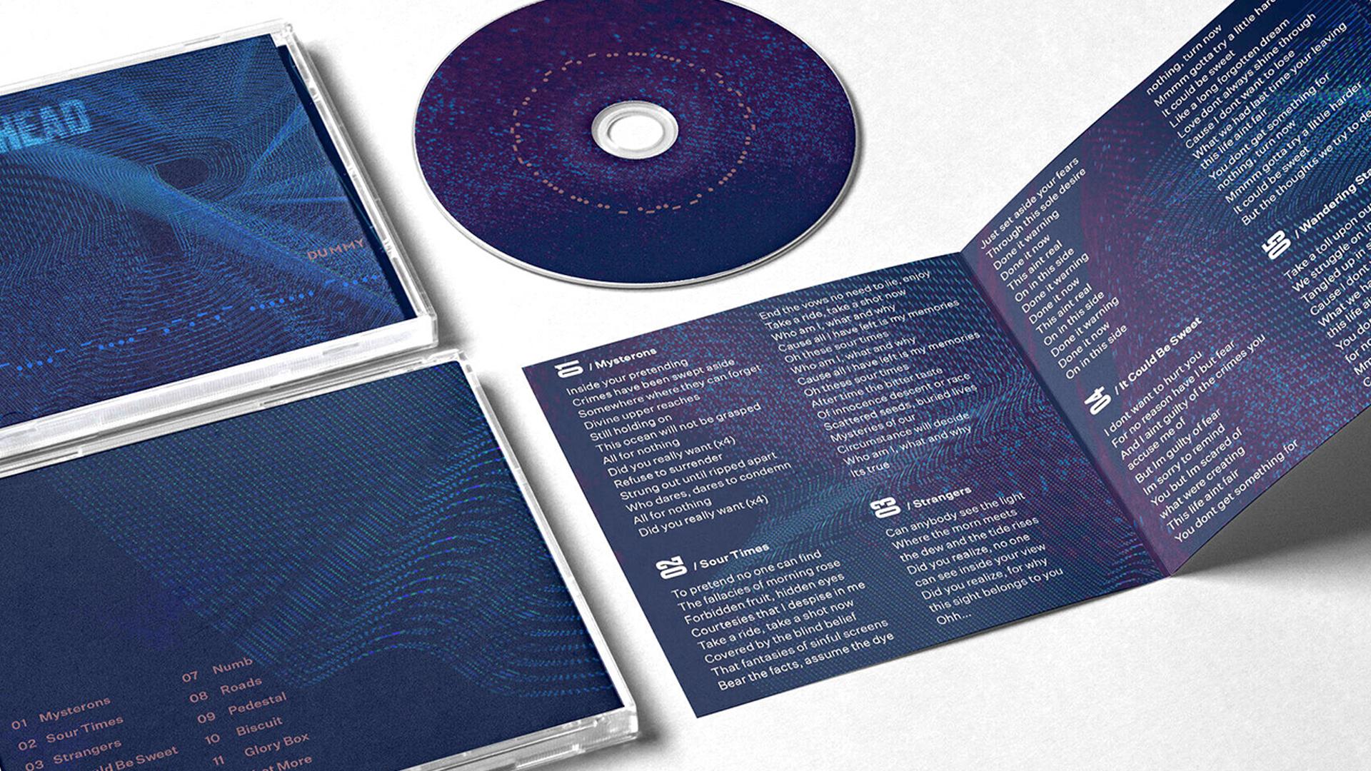

Dummy - Portishead
For my Grad Typography 2 class we were tasked with a rebranding of an assigned band’s album. For Portishead’s Dummy I focused on the underground, mythos they cultivated around themselves. Drawing inspiration from their inspiration, which included everything from East London hip hop, Sade, and the music of James Bond. Additionally I took considerable inspiration from their namesake, the seaside town of Portishead, which was home to Portishead Radio the largest radio station in the world during the second World War. I used glitches, morse code, and sound waves to elicit the feeling of a this radio expanding from such a small, anonymous town to reach all corners of the globe, much like the band themselves.
For my Grad Typography 2 class we were tasked with a rebranding of an assigned band’s album. For Portishead’s Dummy I focused on the underground, mythos they cultivated around themselves. Drawing inspiration from their inspiration, which included everything from East London hip hop, Sade, and the music of James Bond. Additionally I took considerable inspiration from their namesake, the seaside town of Portishead, which was home to Portishead Radio the largest radio station in the world during the second World War. I used glitches, morse code, and sound waves to elicit the feeling of a this radio expanding from such a small, anonymous town to reach all corners of the globe, much like the band themselves.
Typography
Packaging
2019
Instructor: Cheri Gray
Packaging
2019
Instructor: Cheri Gray
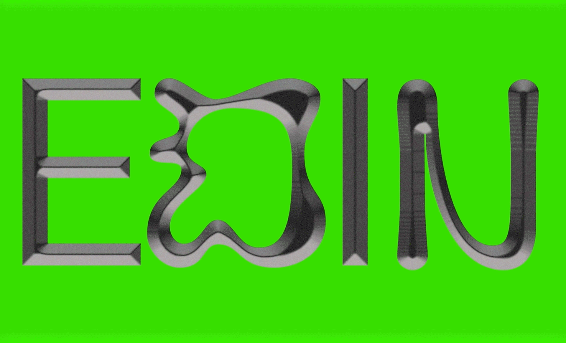
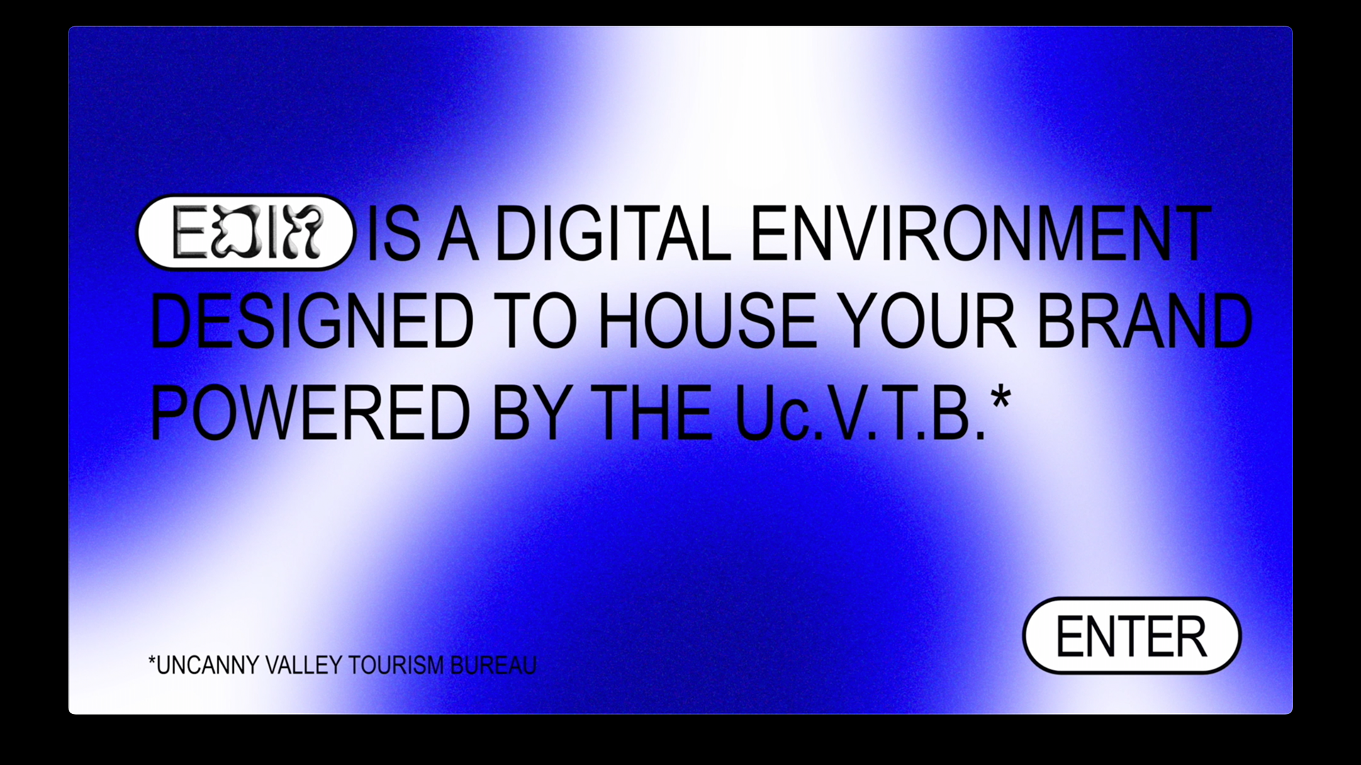


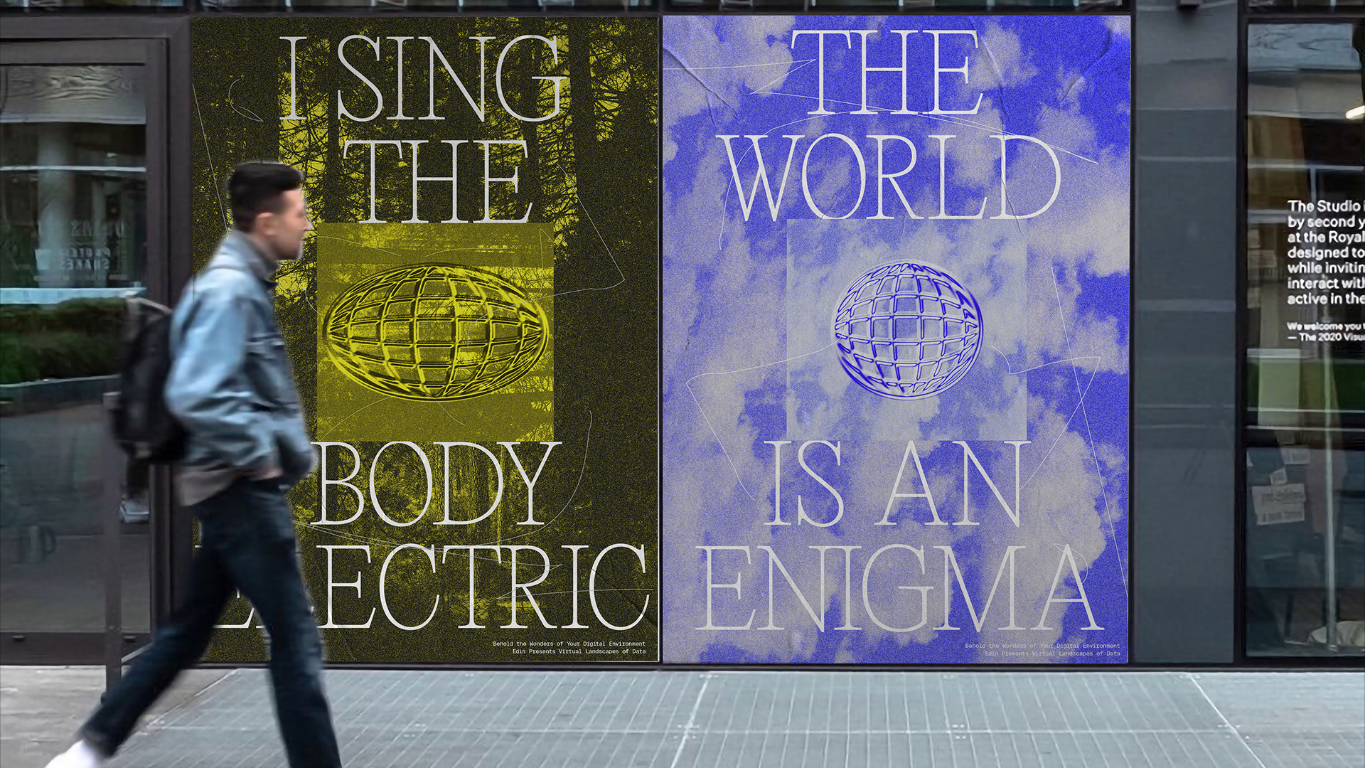
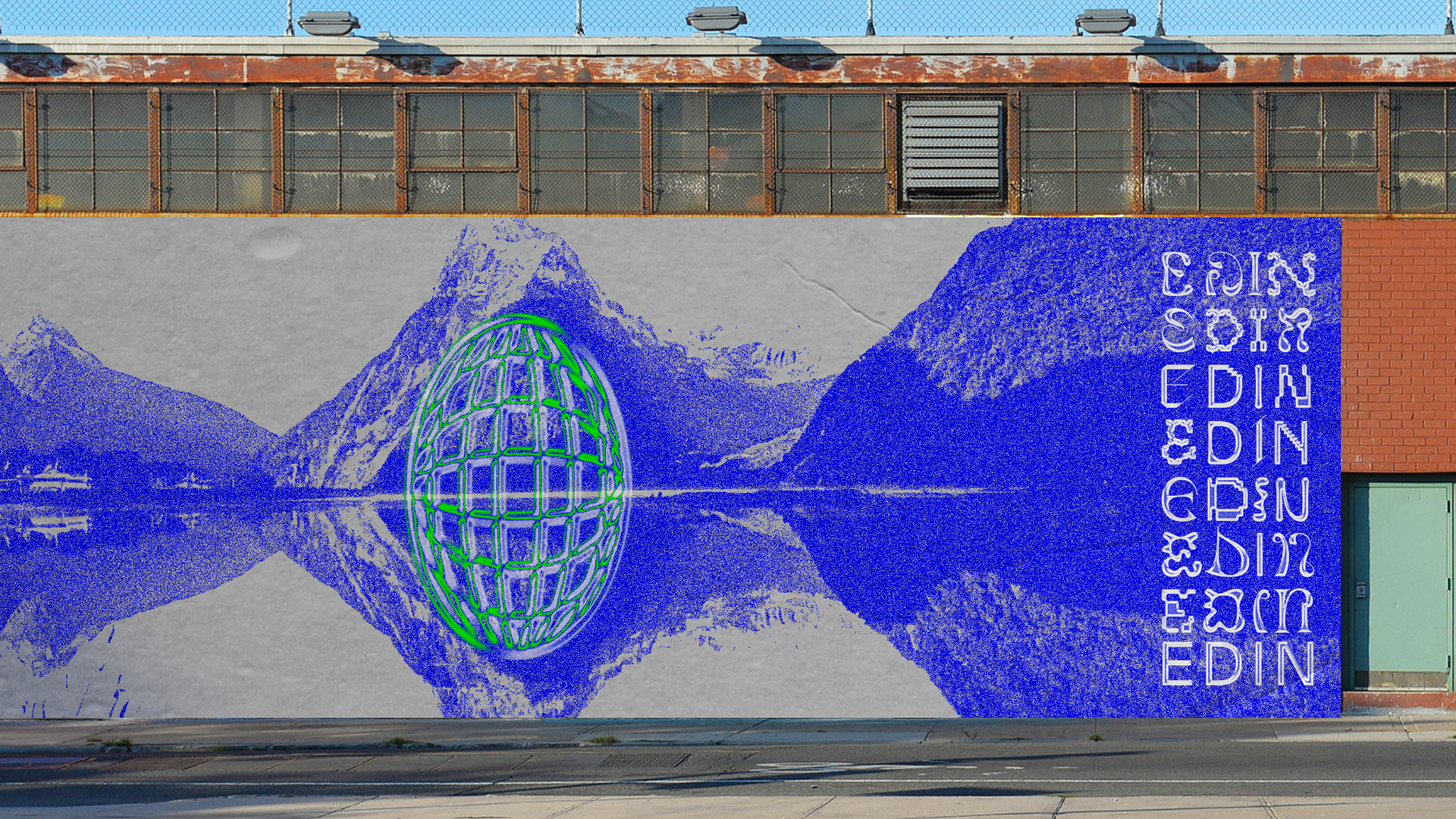
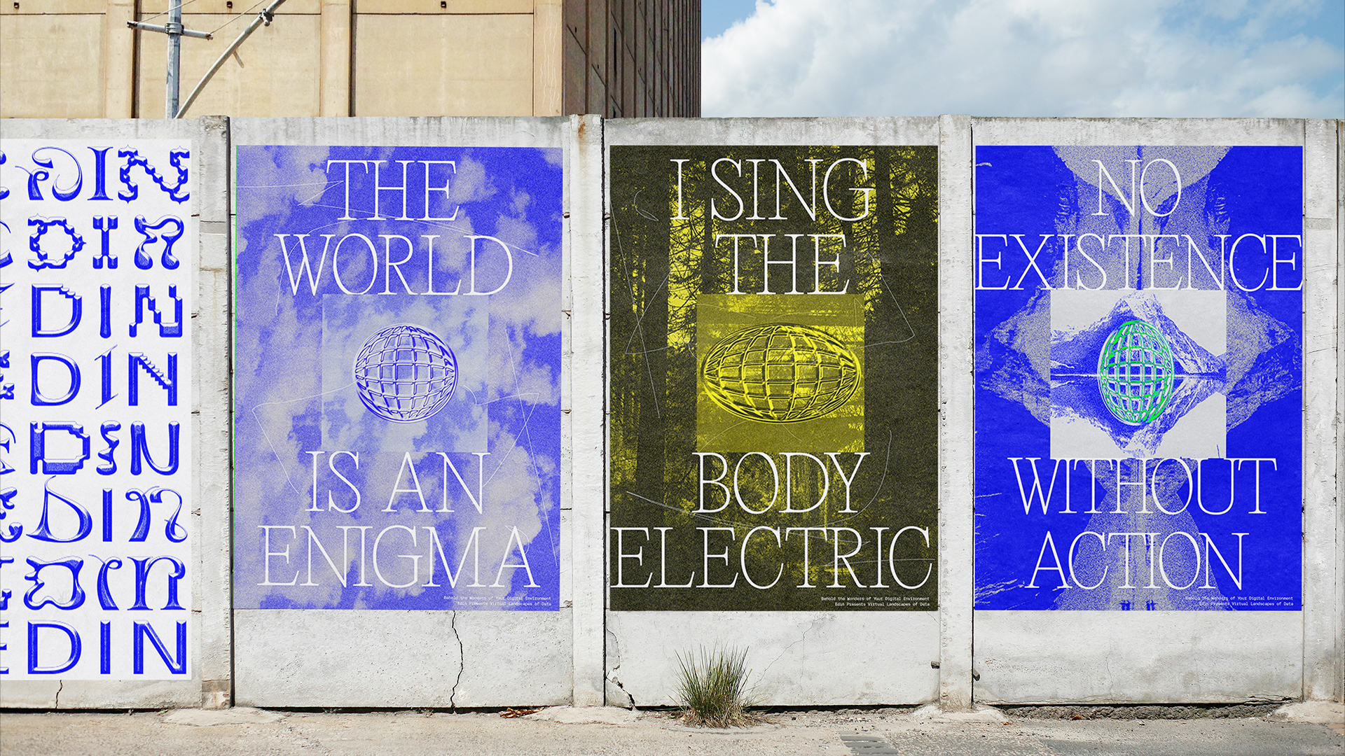

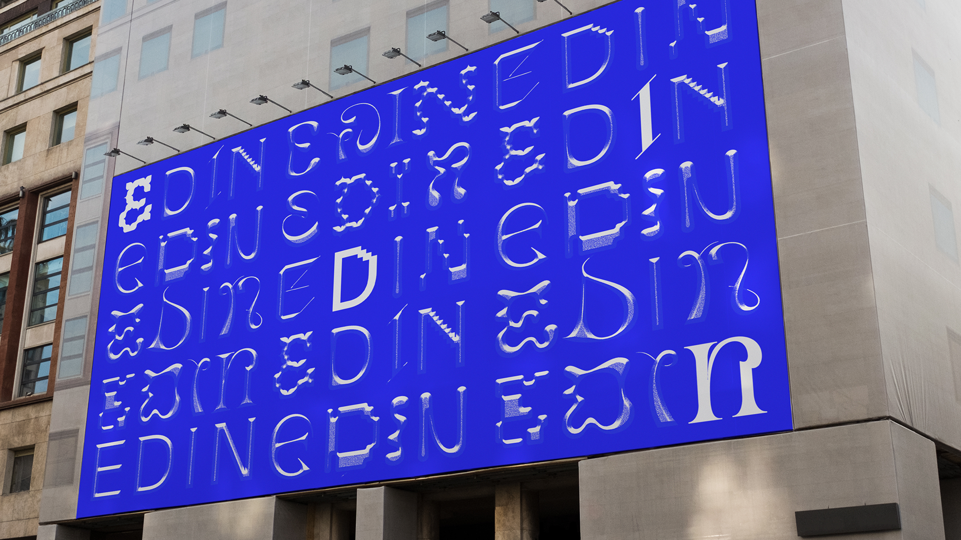

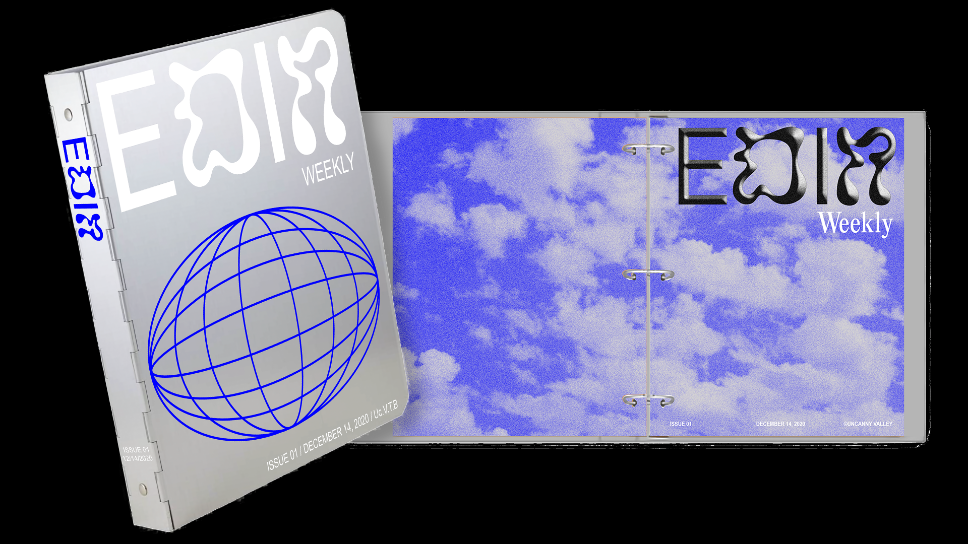
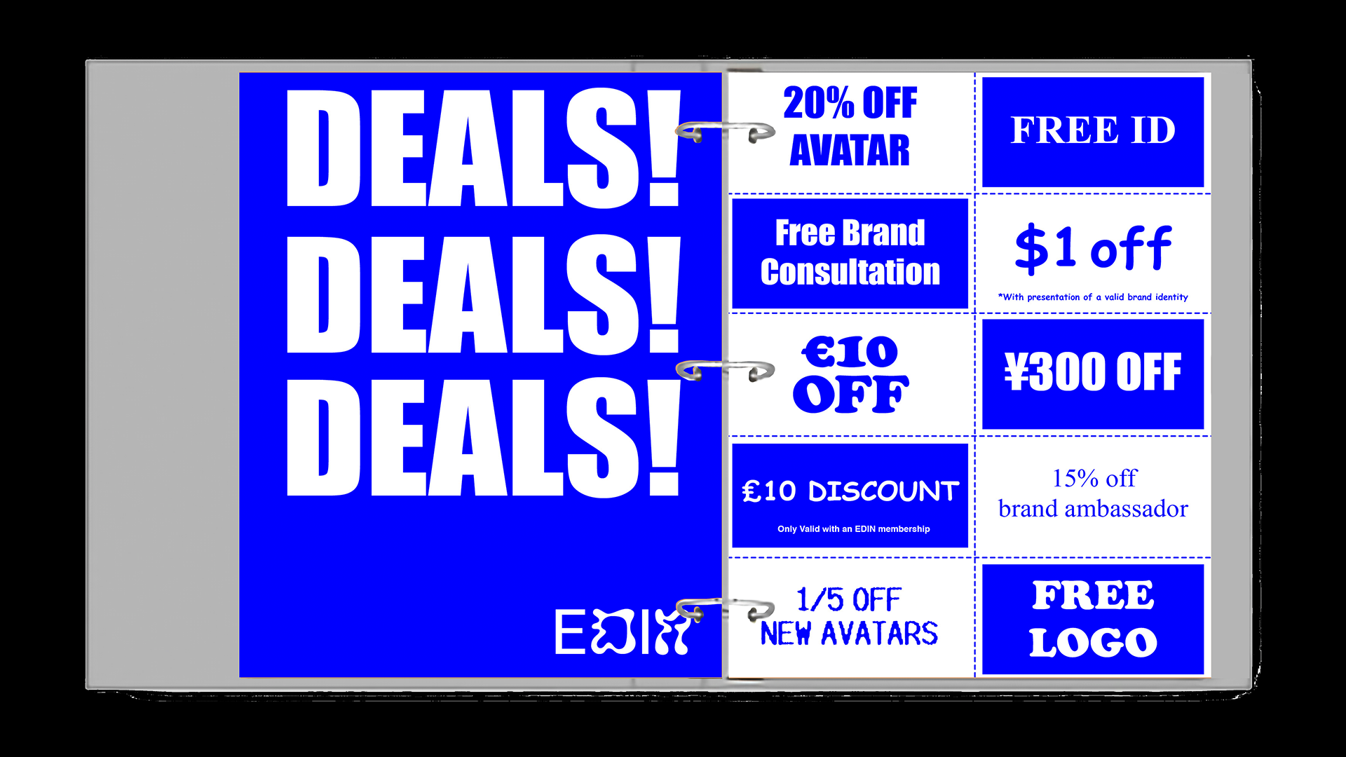

Edin - Uncanny Valley Tourism Bureau
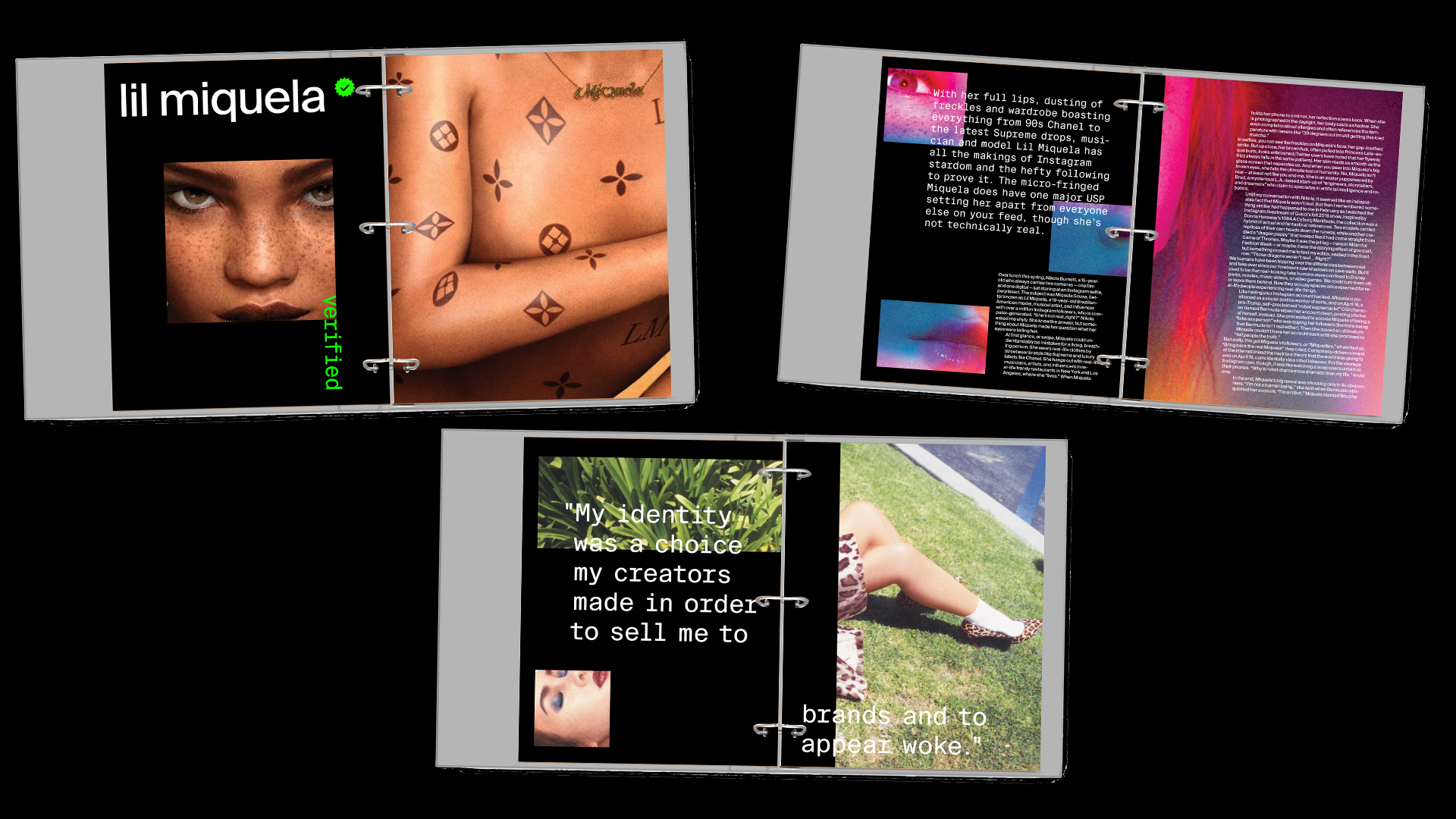
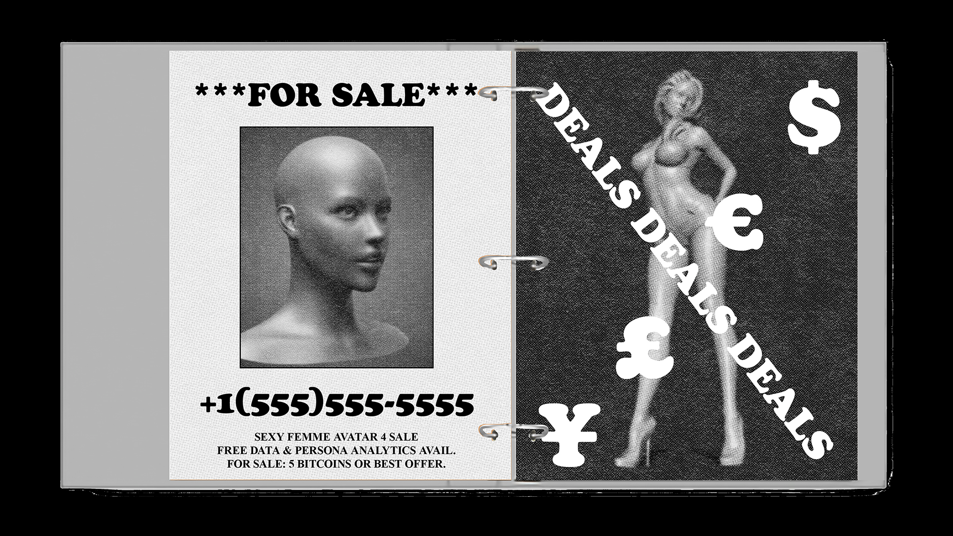
Edin is a satirical project that investigates the coalesced digitization and commodication of bodies and space online. Edin social media that hosts virtual environment/digital landscape and architecture generated from one’s data portrait. It can be generated from a person’s brand or from that of a company, the world of the project there is no distinction between personhood and brand.
One’s digitial terrain can function as a museum, store front, gallery, or landscape. Can also serve to maintain someone’s brand after they die. The project is satirical, it is trying to heighten the difference between reality and virtuality.
Transmedia
2020 Instructor: Carolina Trigo
2020 Instructor: Carolina Trigo

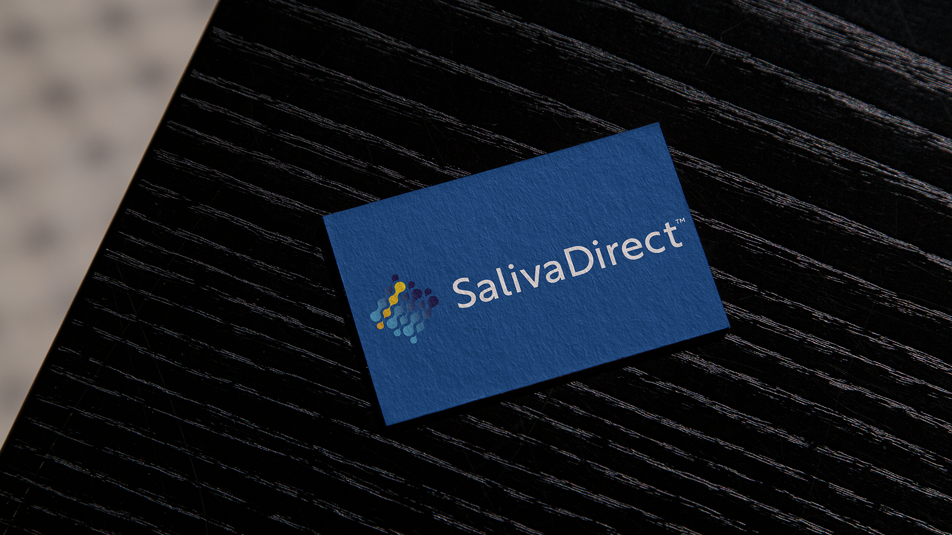
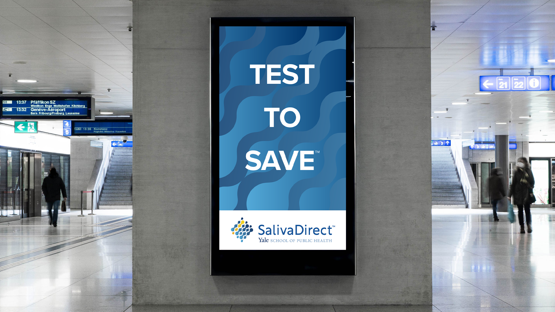
Saliva Direct - Yale School of Public Health
SalivaDirect is a new method developed at the Yale School of Public Health to test persons suspected of having COVID-19 for the virus, SARS-CoV-2.
I was tasked with standardizing the logo and visual language of the brand system and creating the print and digital collateral for Saliva Direct.
SalivaDirect is a new method developed at the Yale School of Public Health to test persons suspected of having COVID-19 for the virus, SARS-CoV-2.
I was tasked with standardizing the logo and visual language of the brand system and creating the print and digital collateral for Saliva Direct.
Branding
2022
2022

Gillian Robasciotti Hair
Logo and identity design for an independent hair and makeup artist based out of Chattanooga, Tennessee.
Logo and identity design for an independent hair and makeup artist based out of Chattanooga, Tennessee.
Logo Design
2020
2020

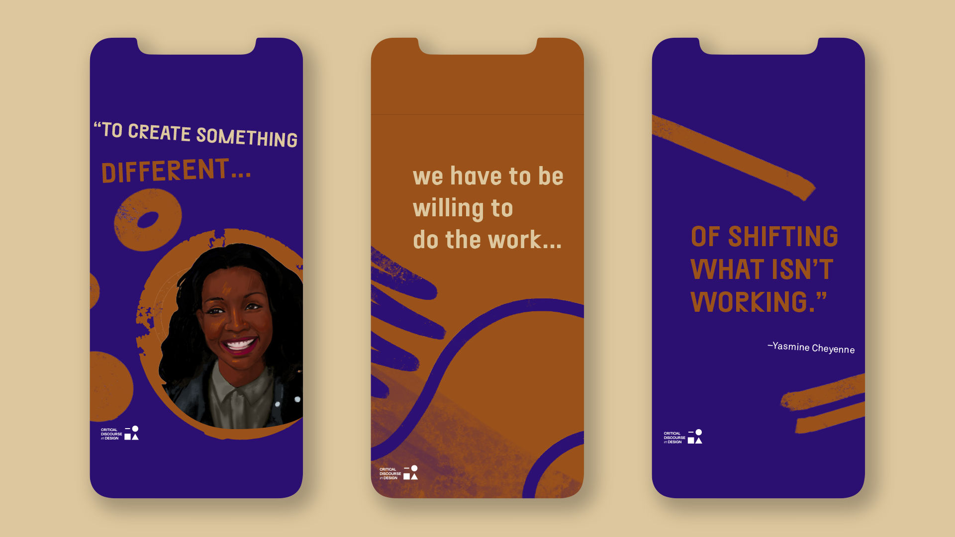
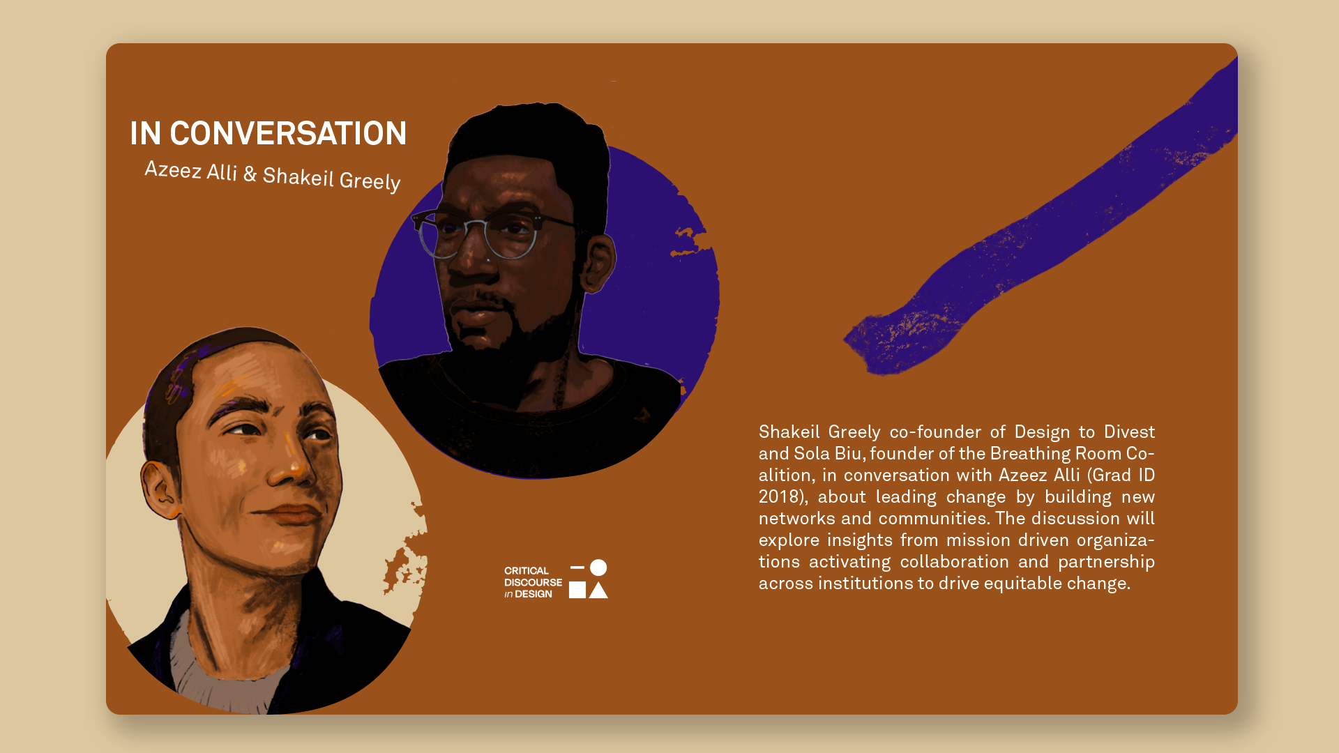
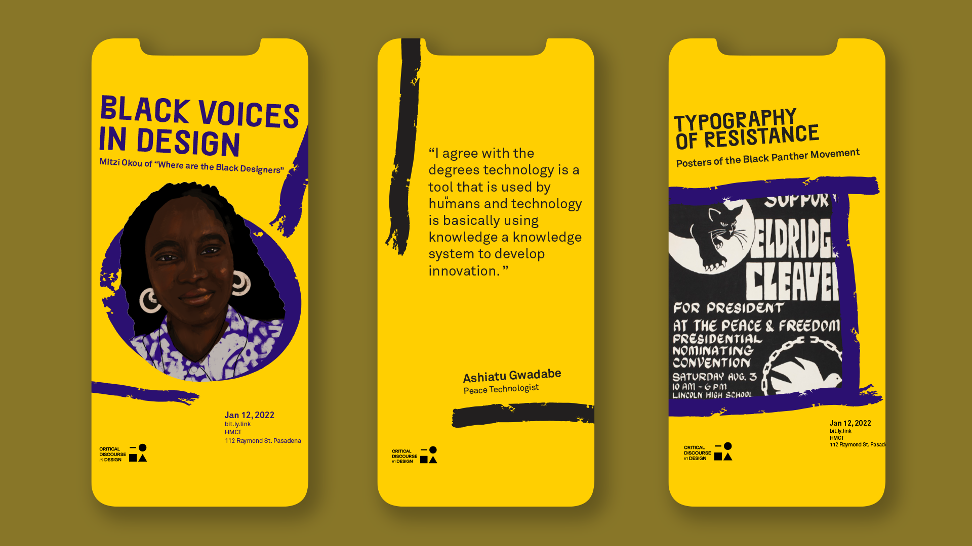
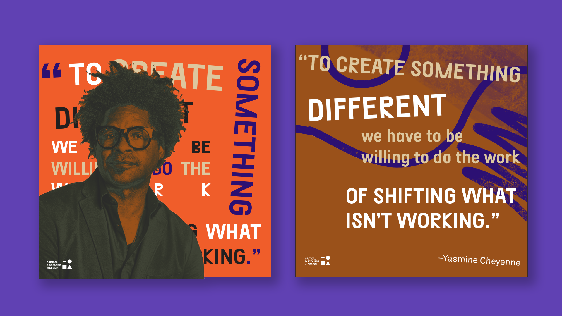
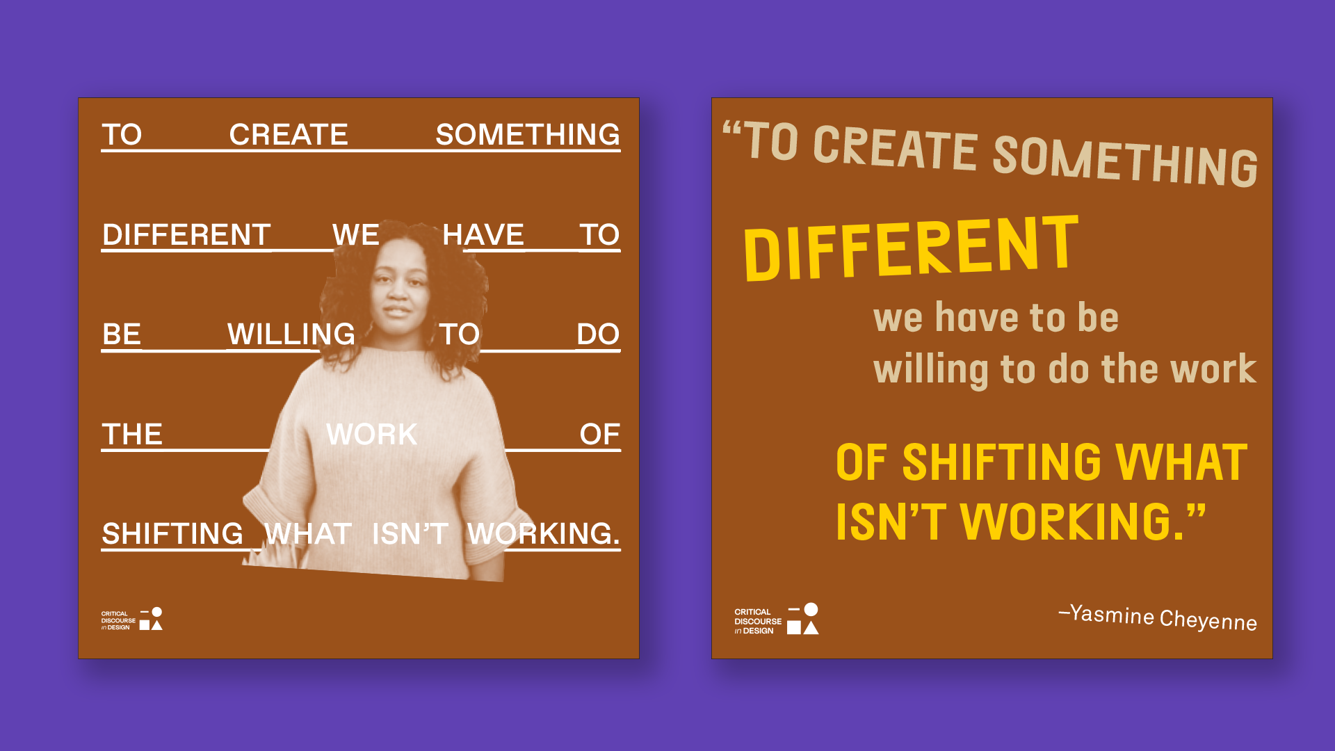
Critical Discourse in Design
Critical Discourse in Design is a digital forum to explore design and it’s implications through the lens of people, pedagogy, and practice. It was founded by Azeez Alli who brought me on to help flesh out the identity and create social media and marketing templates for events.
Illustration by Kristen Stain. Logo by Azeez Alli.
2021
Digital Design
Digital Design
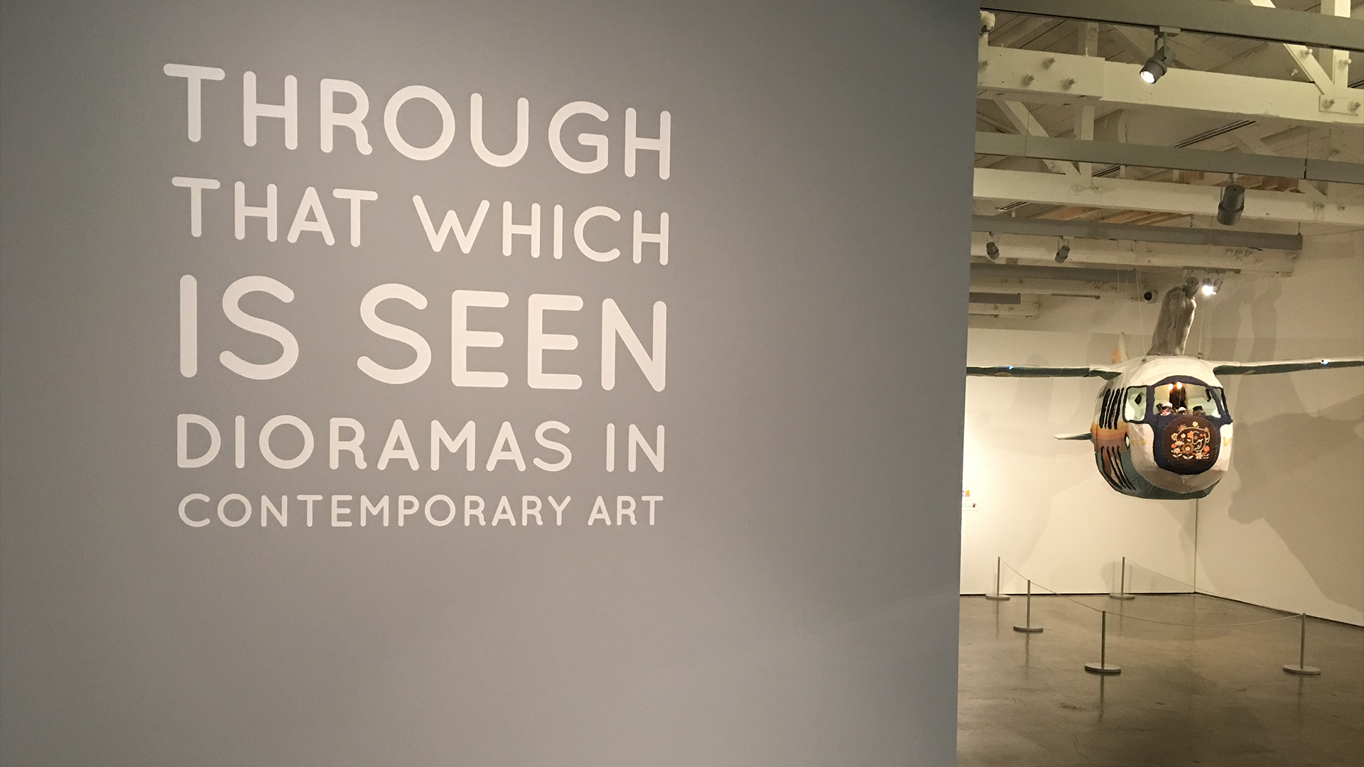
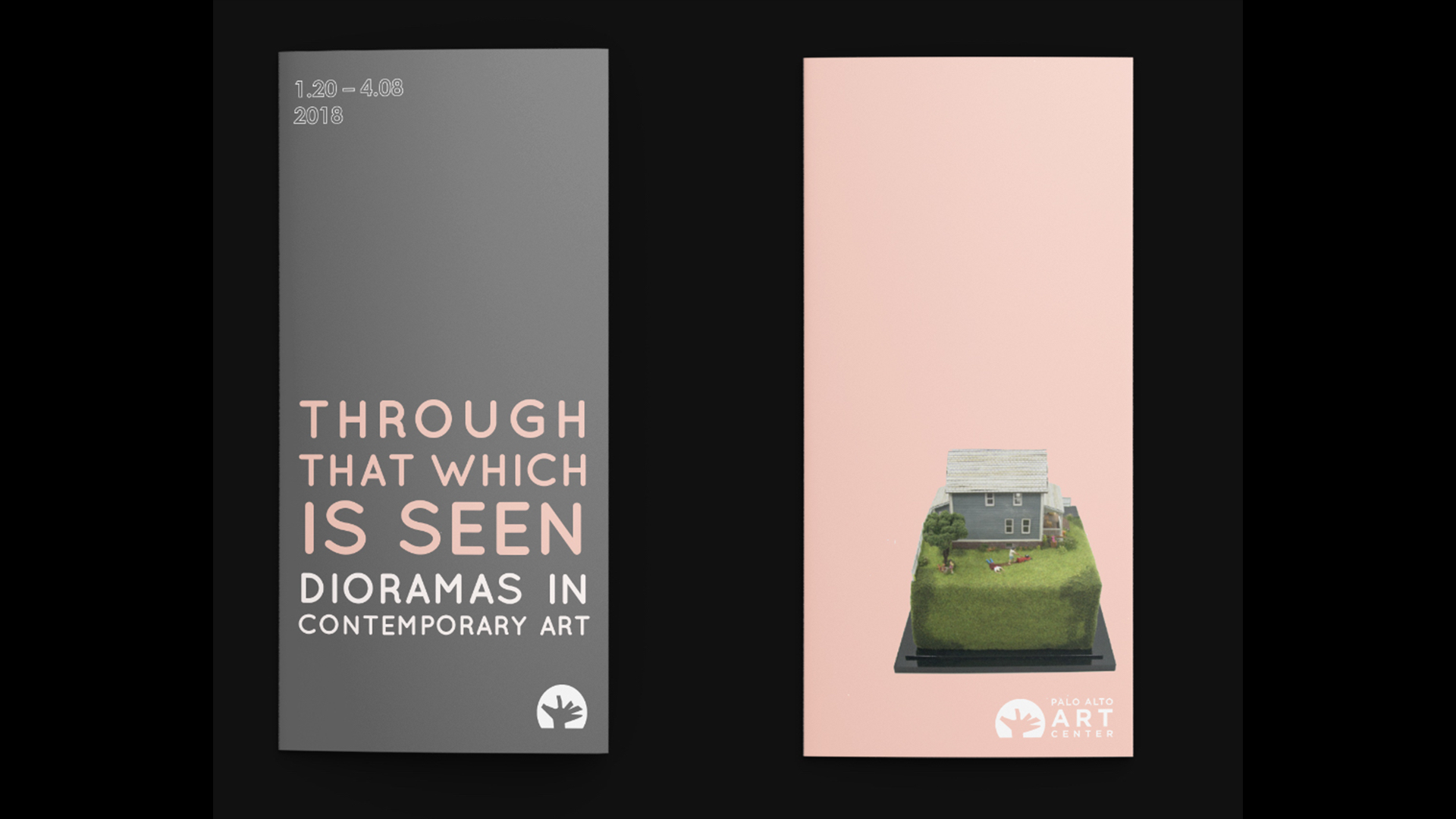
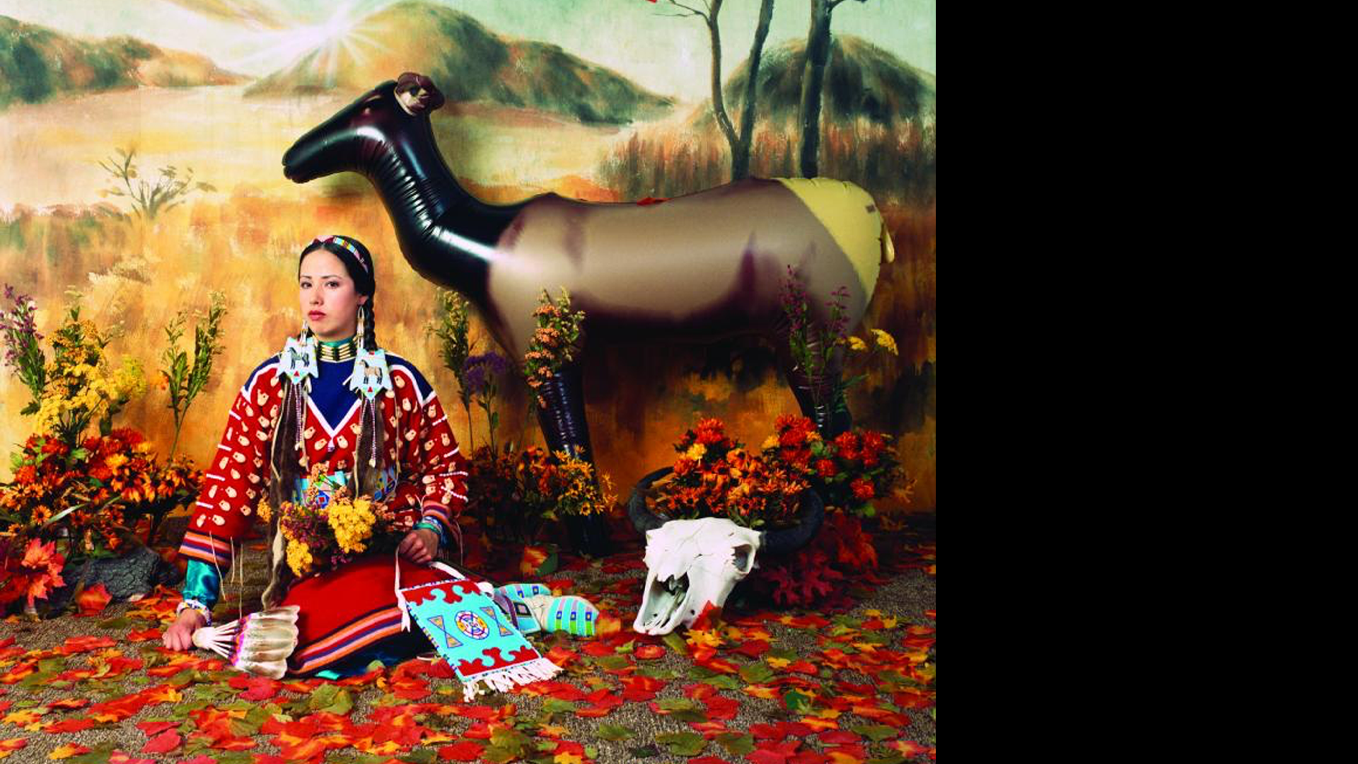
Through That Which Is Seen - Palo Alto Art Center
Exhibition identity design for the Palo Alto Art Center’s exhibition on dioramas in contemporary art. Done whilst I was an intern.
Exhibition identity design for the Palo Alto Art Center’s exhibition on dioramas in contemporary art. Done whilst I was an intern.
2017
Exhibition Design
Exhibition Design