
Rolling Stone
Editorial & Brand Design2020
Mentors: Annie Huang-Luck
Mentors: Annie Huang-Luck
Recognition:
Communication Arts Typography Award Finalist(2021)
Graphis New Talent Annual 2021 – Silver
Communication Arts Typography Award Finalist(2021)
Graphis New Talent Annual 2021 – Silver
Rolling Stone Magazine is an iconic part of America’s culture. Considered the touchstone of the Summer of Love and American counter-culture and liberal cultural commentary since, Rolling Stone’s presence in the collective conscious is mammoth.
Recently it has become mired in controversy, has struggled to appeal to new young readers, and been criticized for only courting celebrities for its cover. This rebrand looks to reframe the story of Rolling Stone, parring it back to origins as an editorial that uplifts grassroots and emerging voices.
The visual language of this rebrand takes inspiration from the Fluxus movement of the ‘60s and ‘70s. What this rebrand does is inject a humanistic touch to the sanitized, and corporate minimalism into the brand that was once the enfant terrible of journalism.
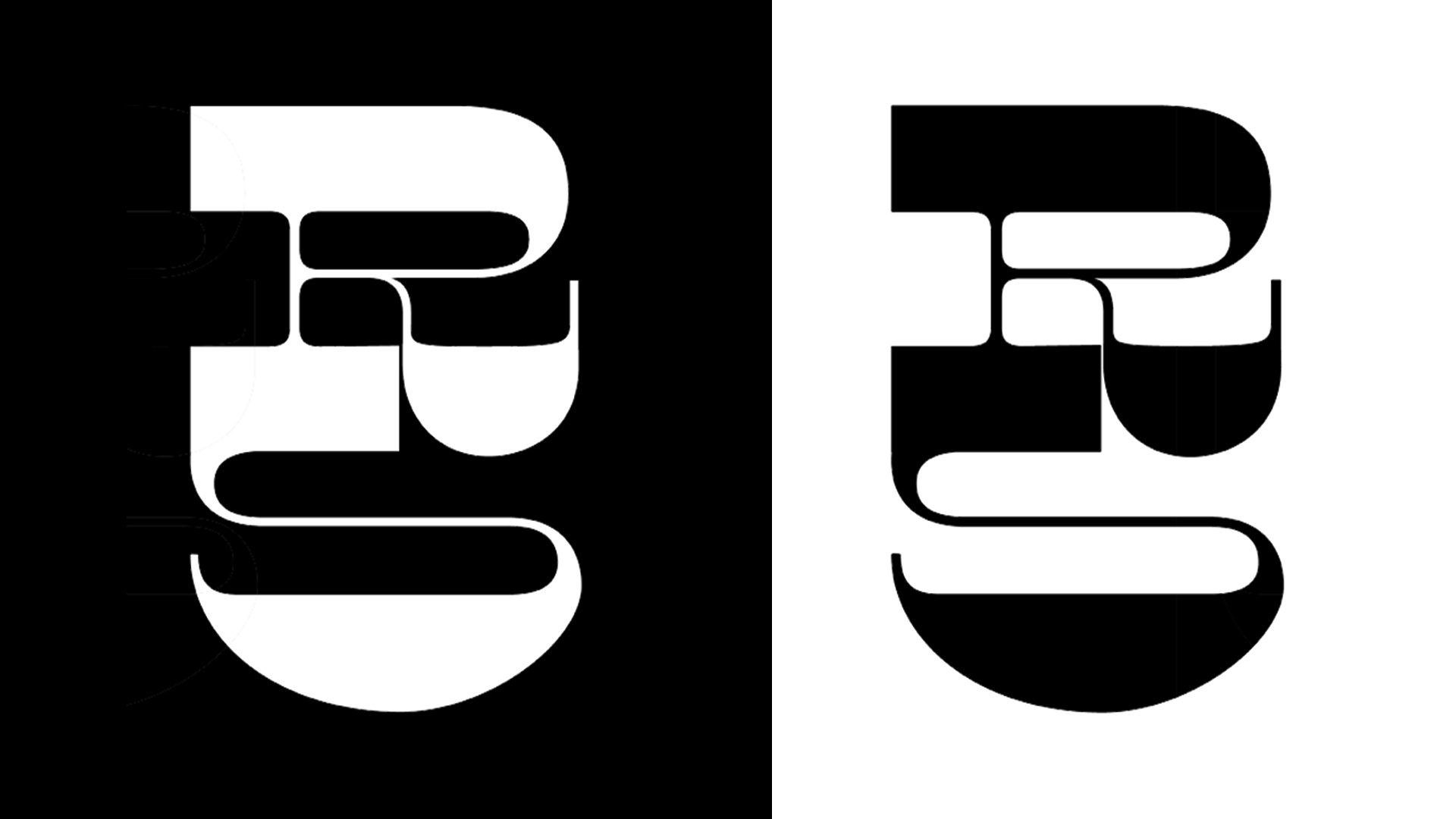
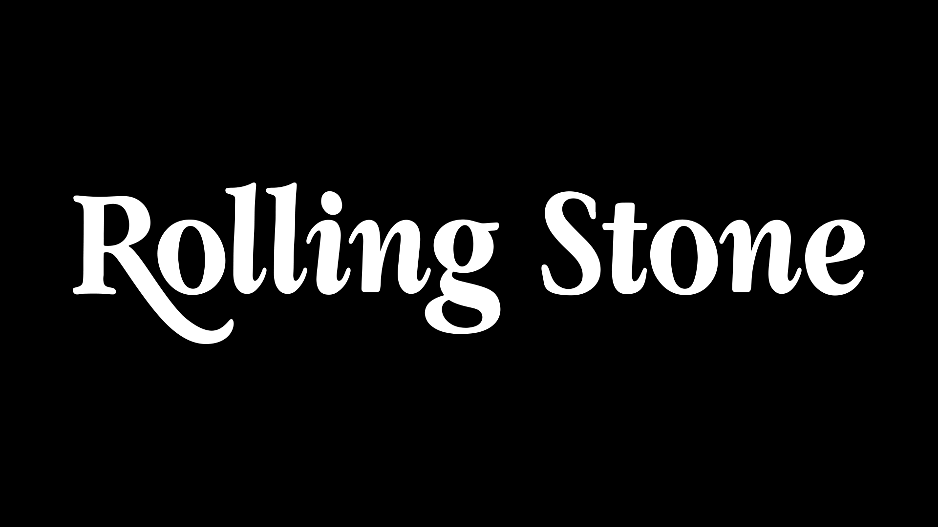
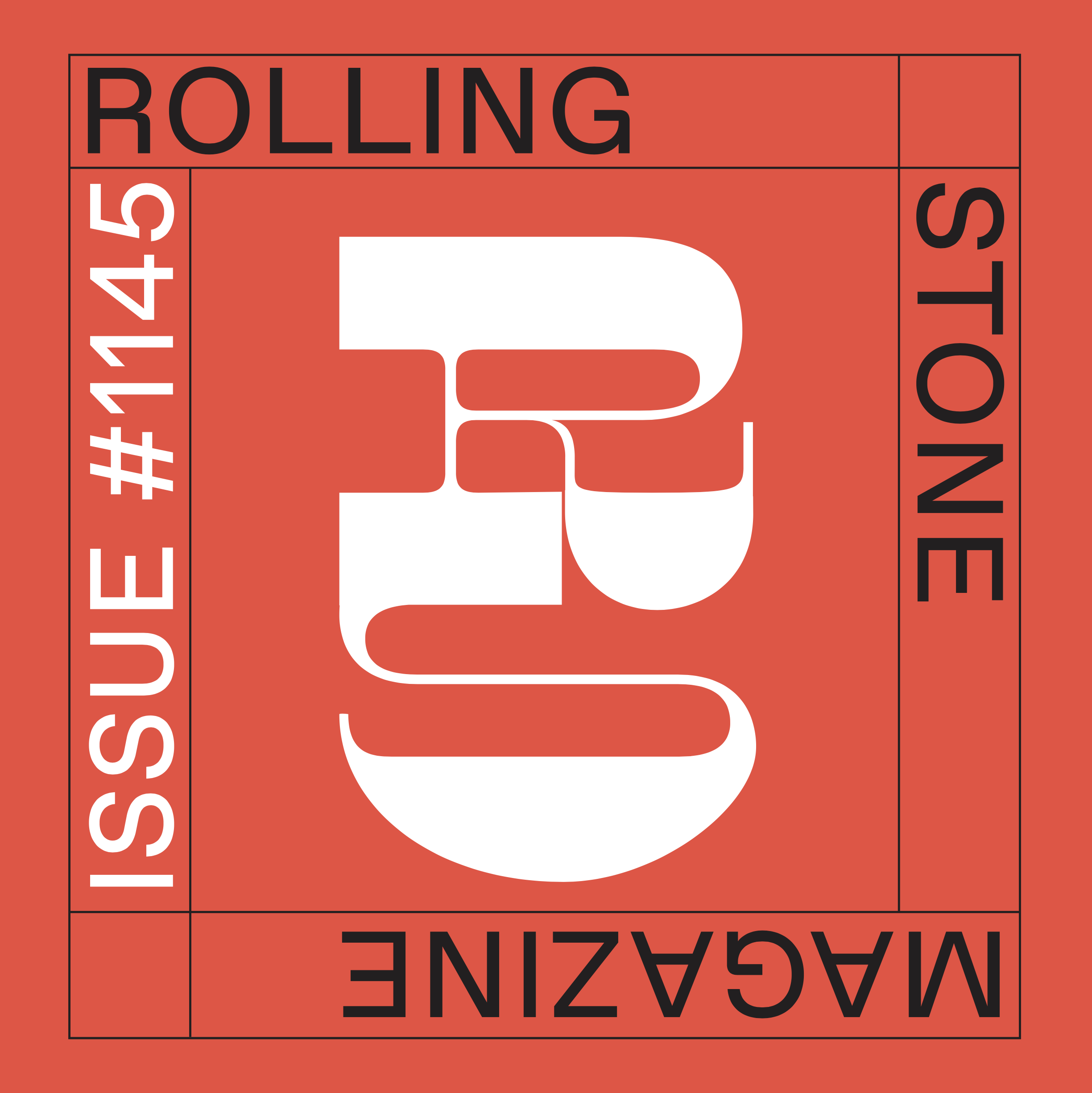
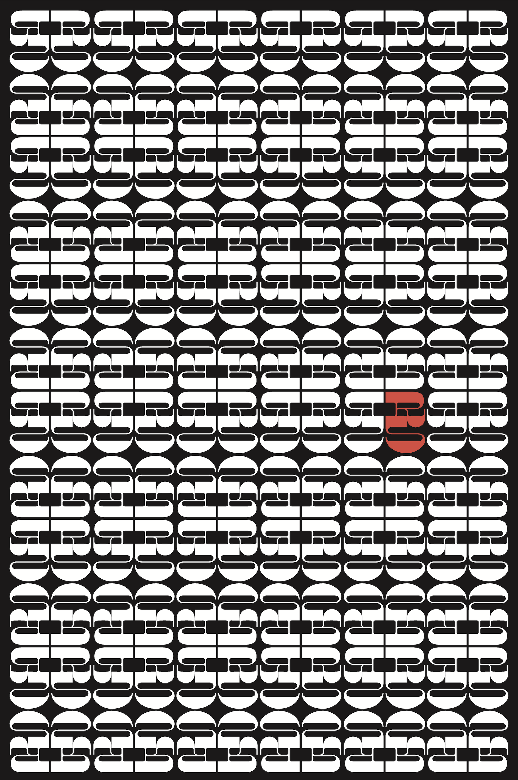
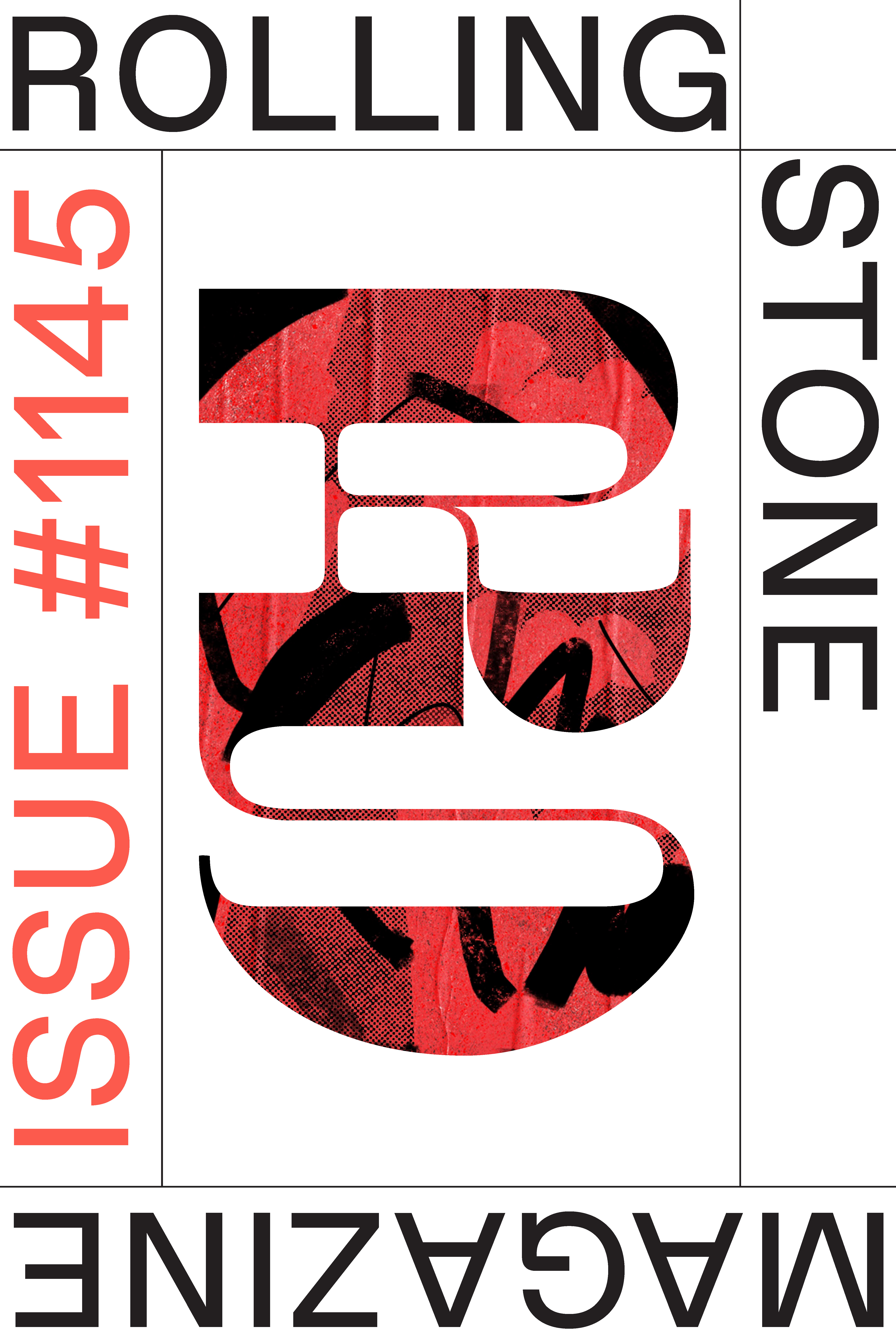
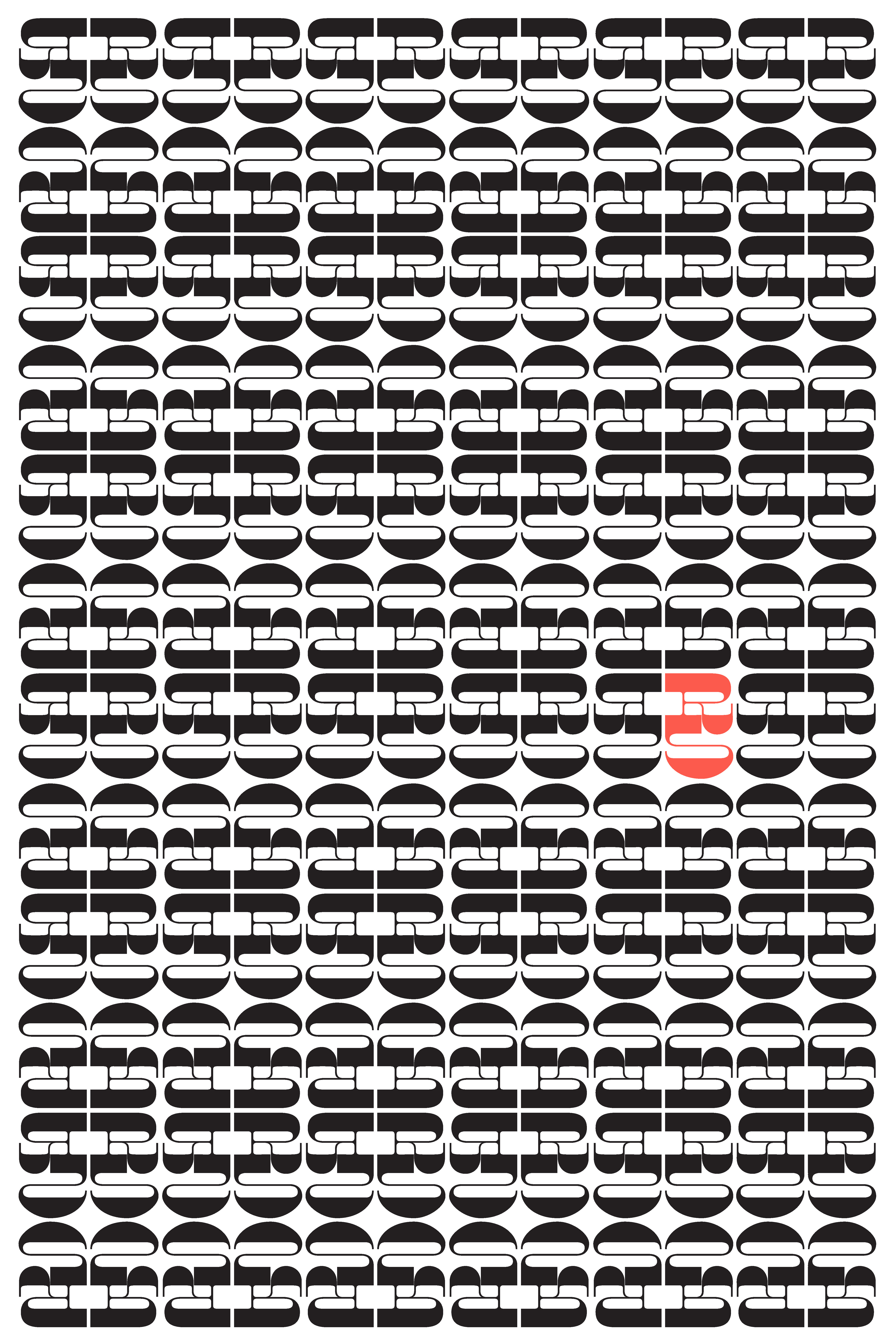
The logomark is an adaptation of Caslon Italian, an experimental typeface from the 19th Century that was considered a rebellious exploration of form at the time.
An additional reference is how the mark mimics a music note.
The logotype is an modification
of Garamond Bold, using the script serifs of the italic-face on Rolling Stone’s signature R.
Logo Development Process Here ︎︎︎
An additional reference is how the mark mimics a music note.
The logotype is an modification
of Garamond Bold, using the script serifs of the italic-face on Rolling Stone’s signature R.
Logo Development Process Here ︎︎︎

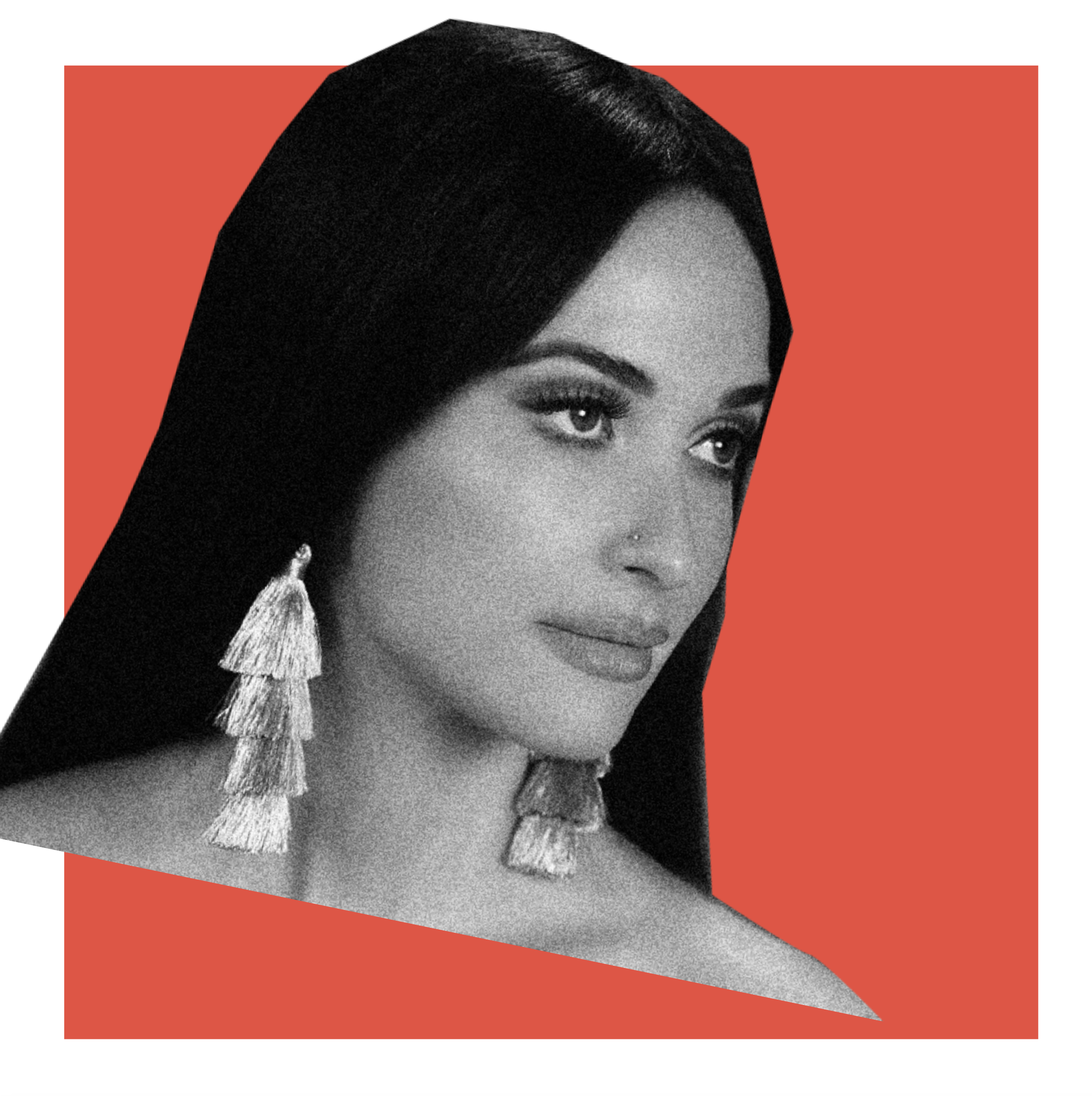
The color palette is an adaptation of the existing palette, but making the tones of the white, grey and, black slightly warmer, and utlizing a warmer-orange red rather than the colder red currently used.


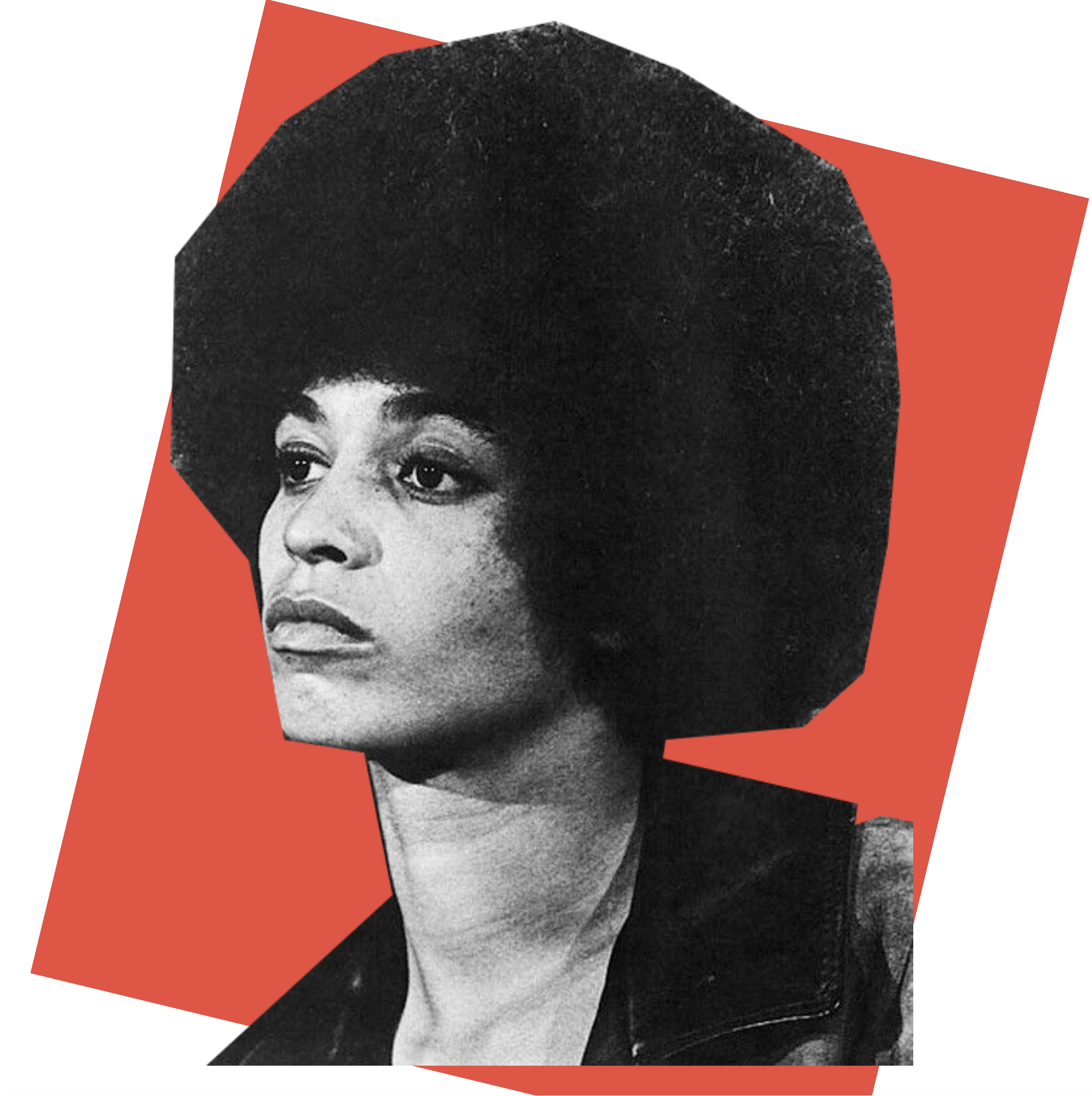
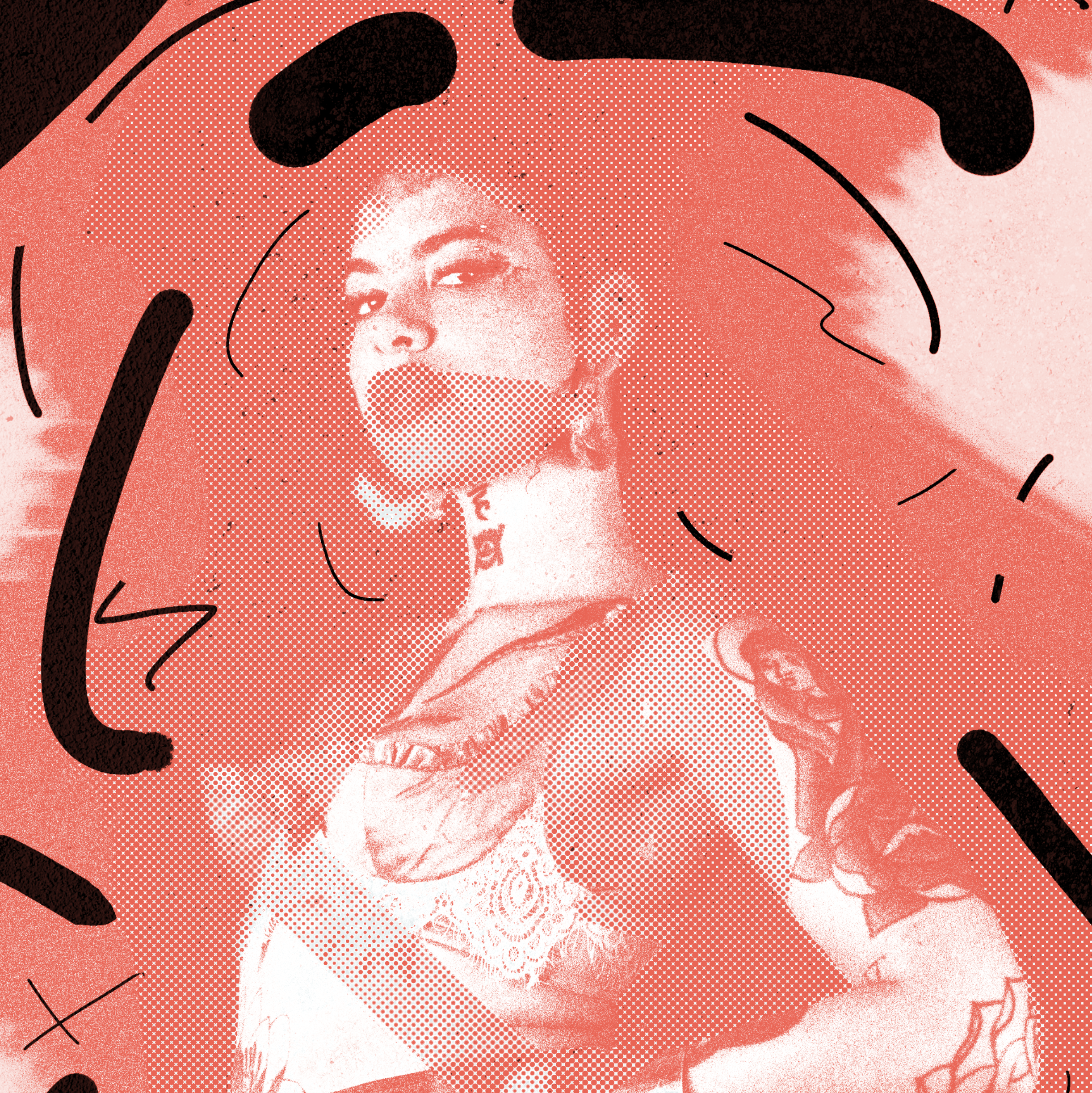
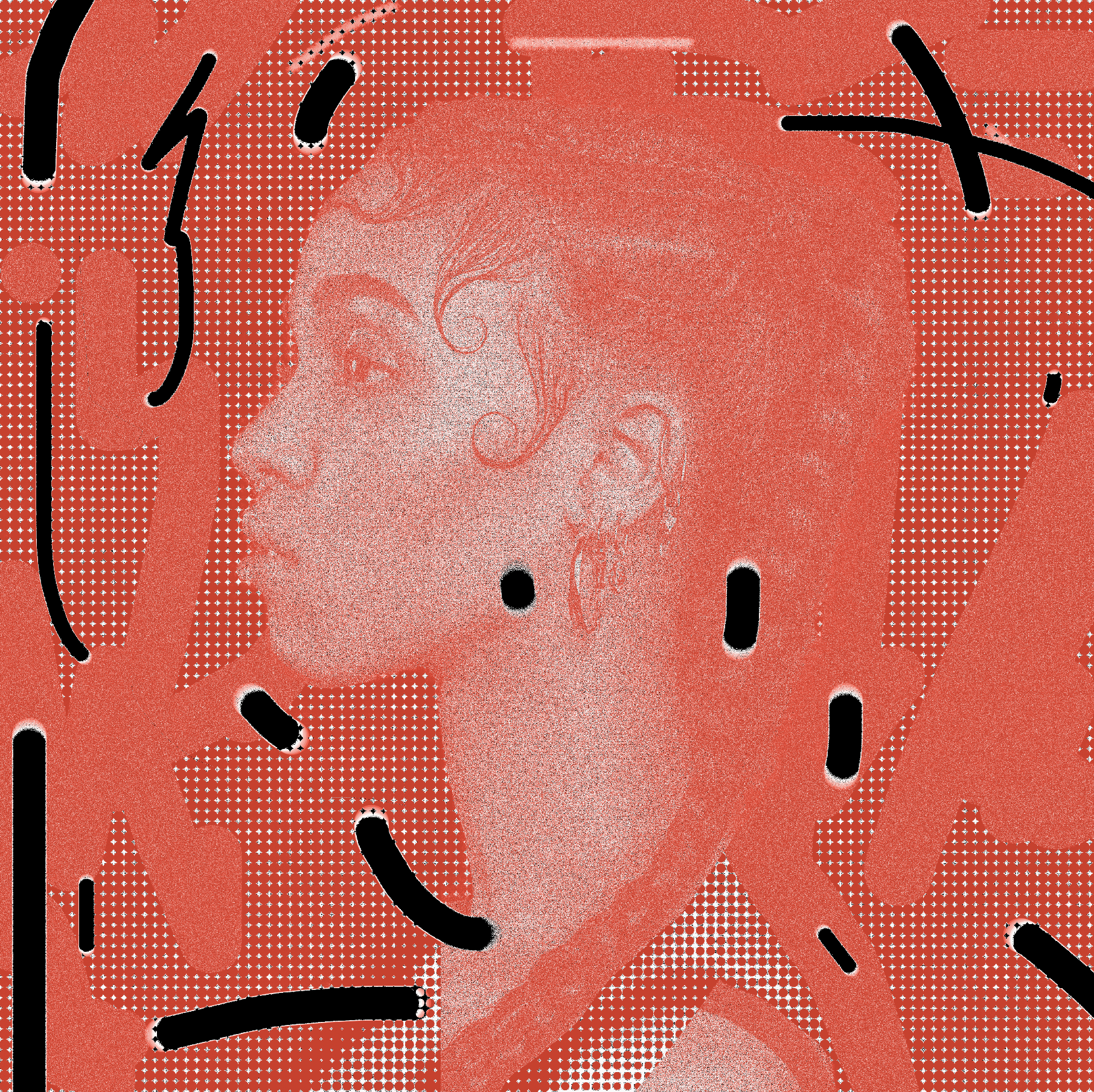
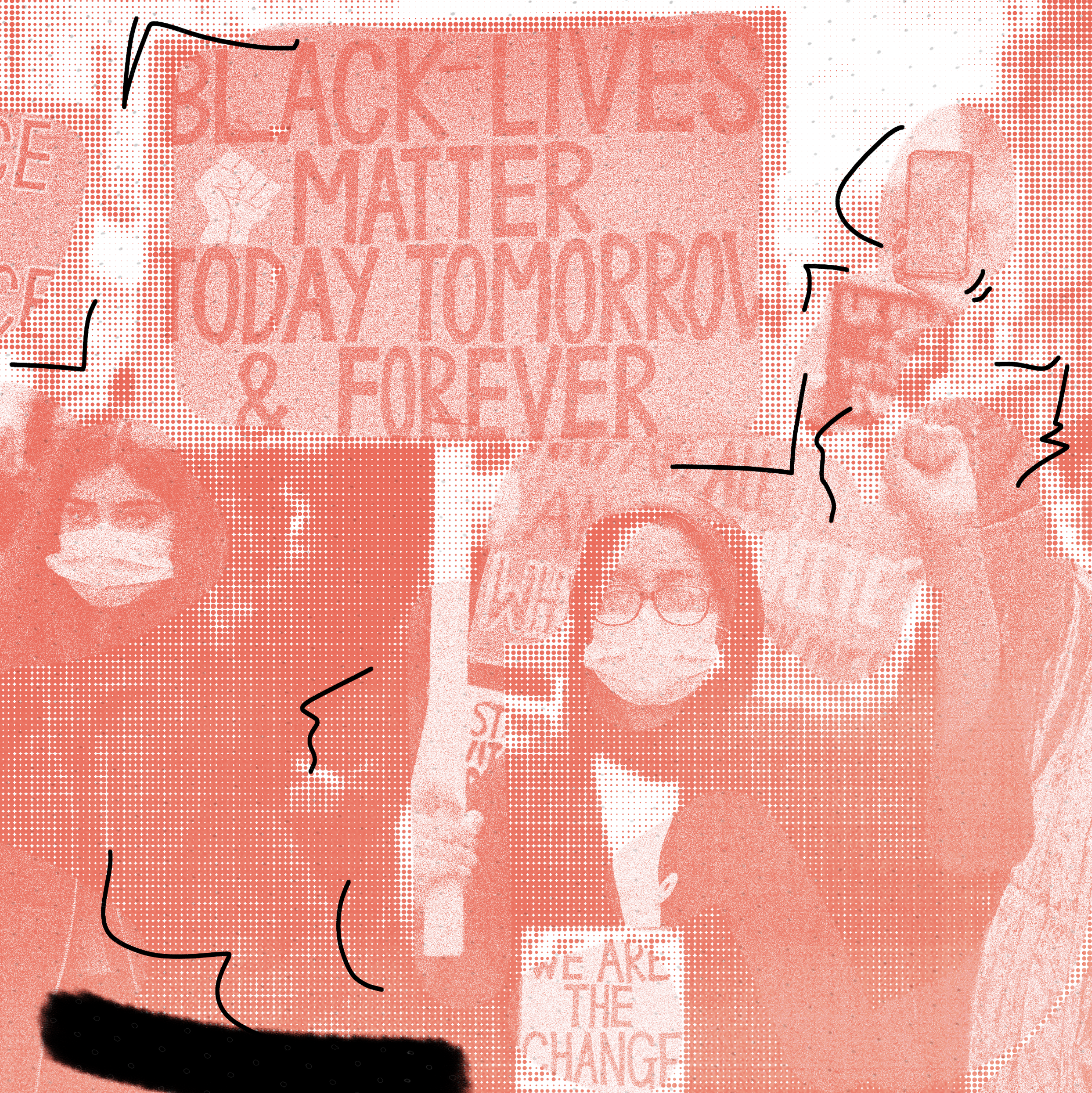
Image treatment is a reference to the Fluxus movement of the ‘60s employing collage and analog effects.
This is to position Rolling Stone back in it’s indie journalism roots, rather than relying on clean, “corporate” photography.
This is to position Rolling Stone back in it’s indie journalism roots, rather than relying on clean, “corporate” photography.
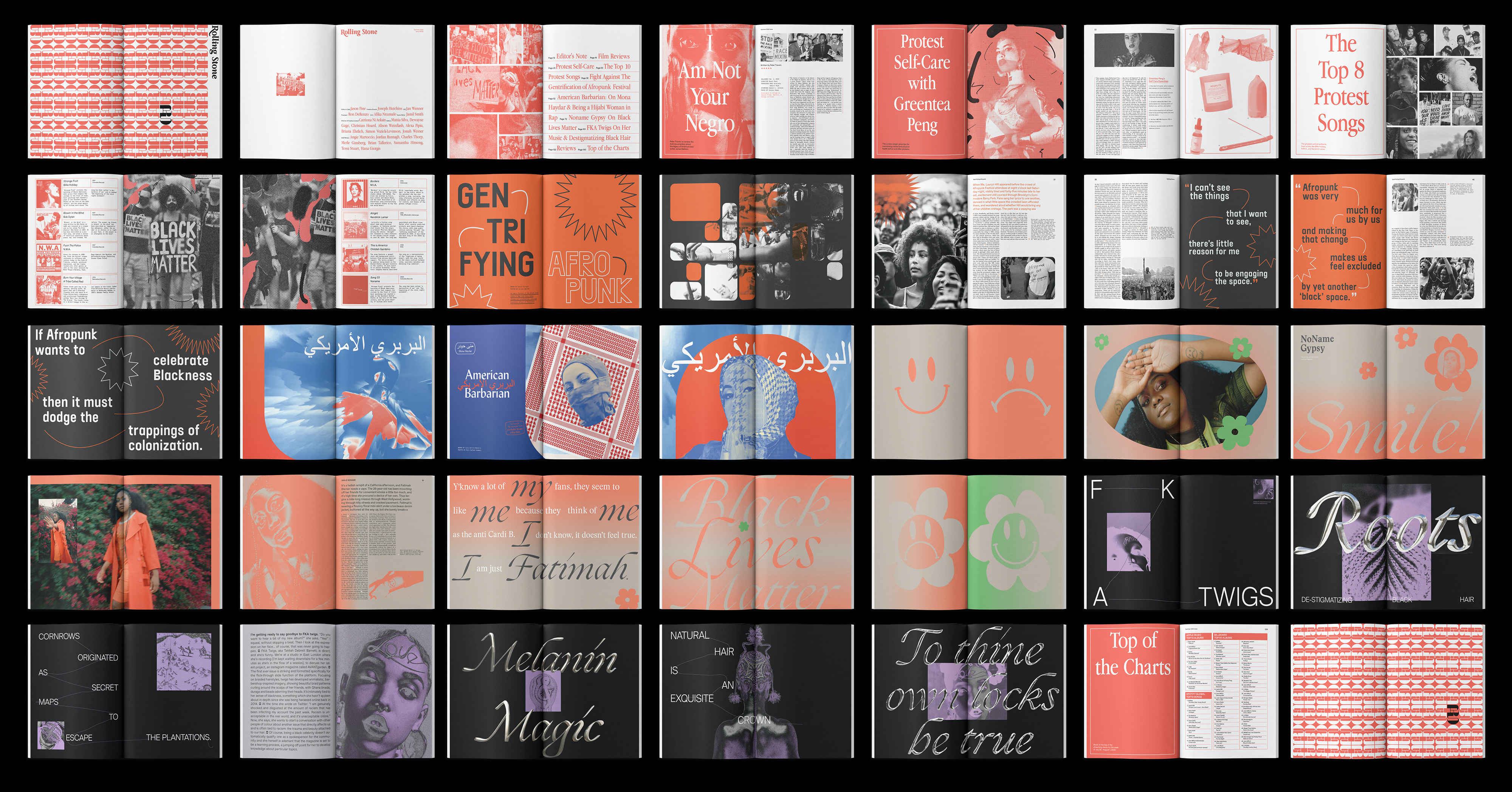
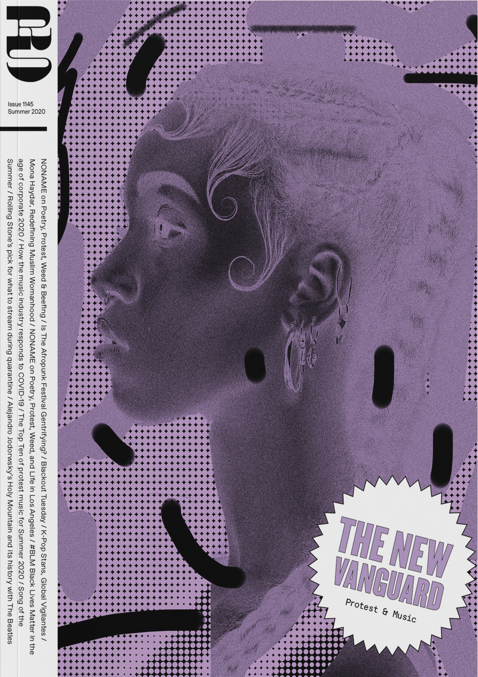
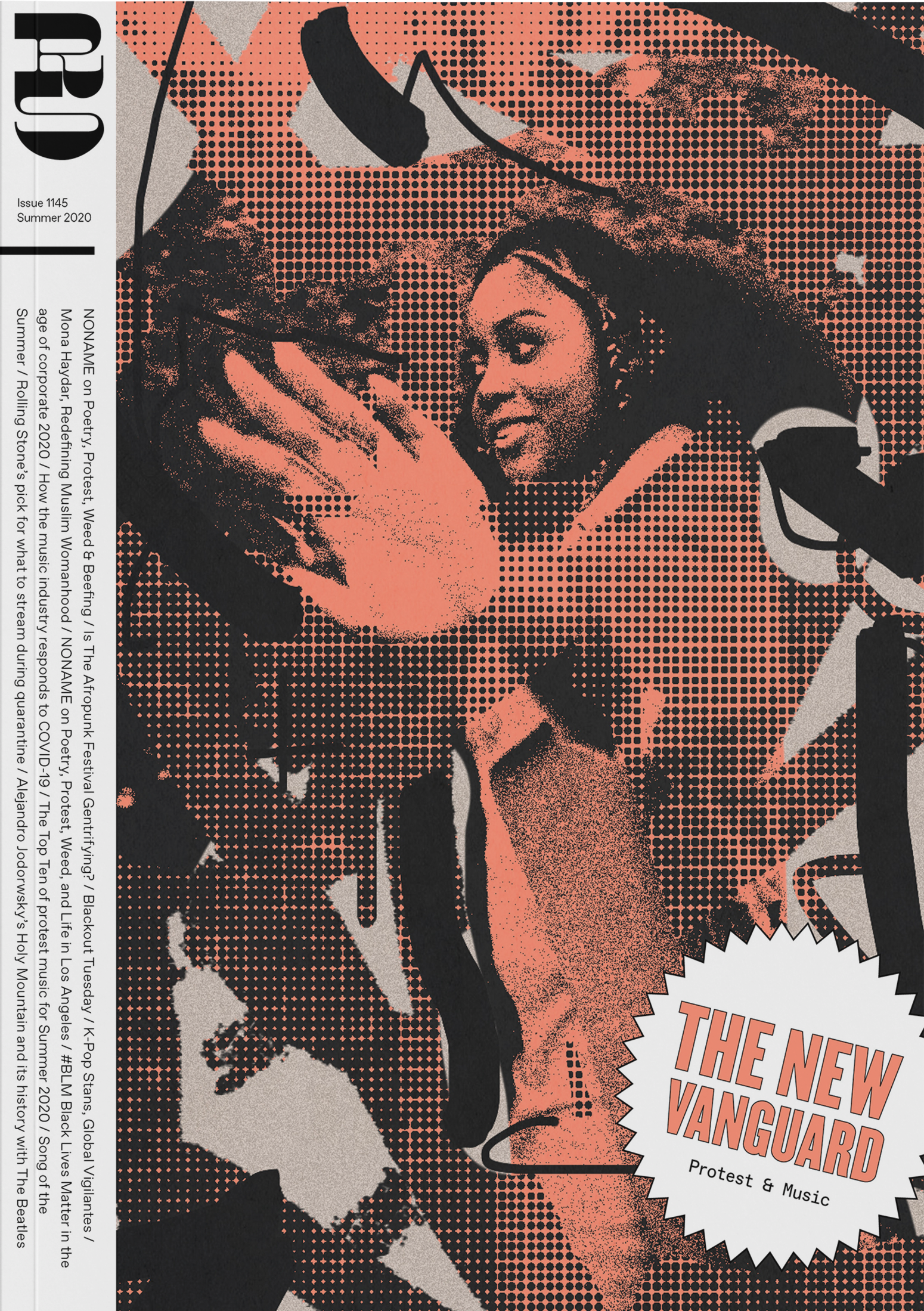

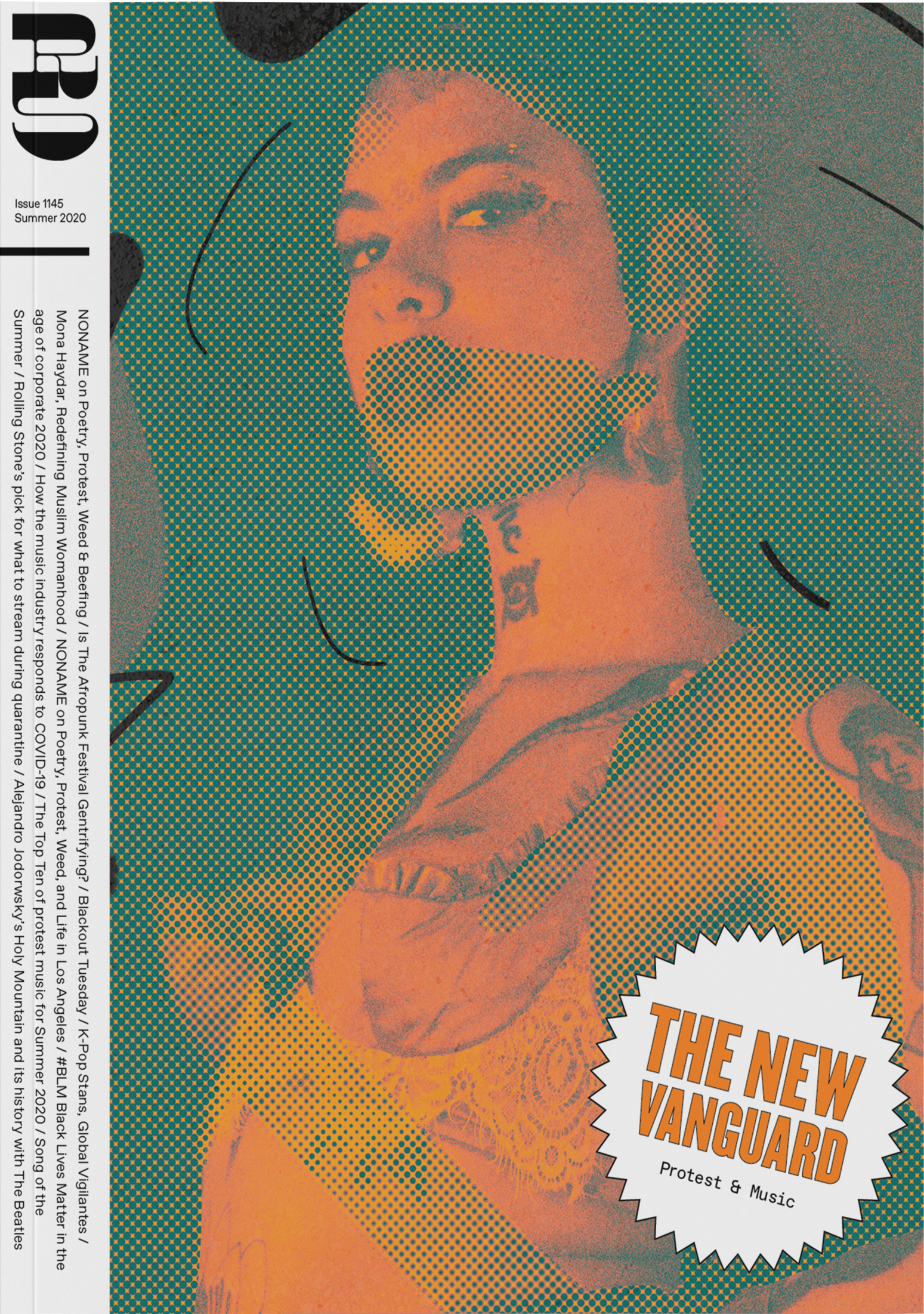
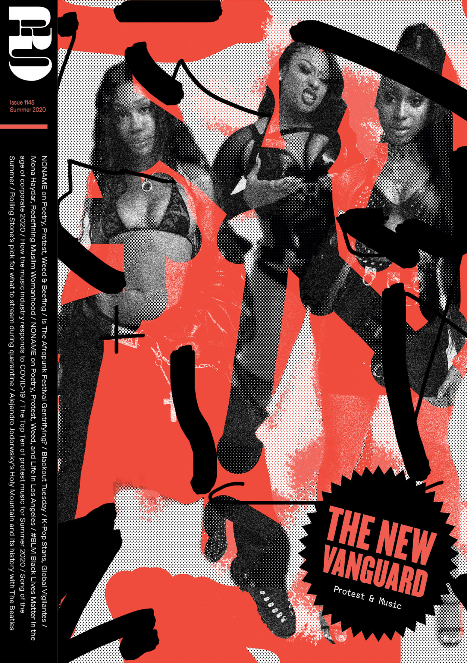
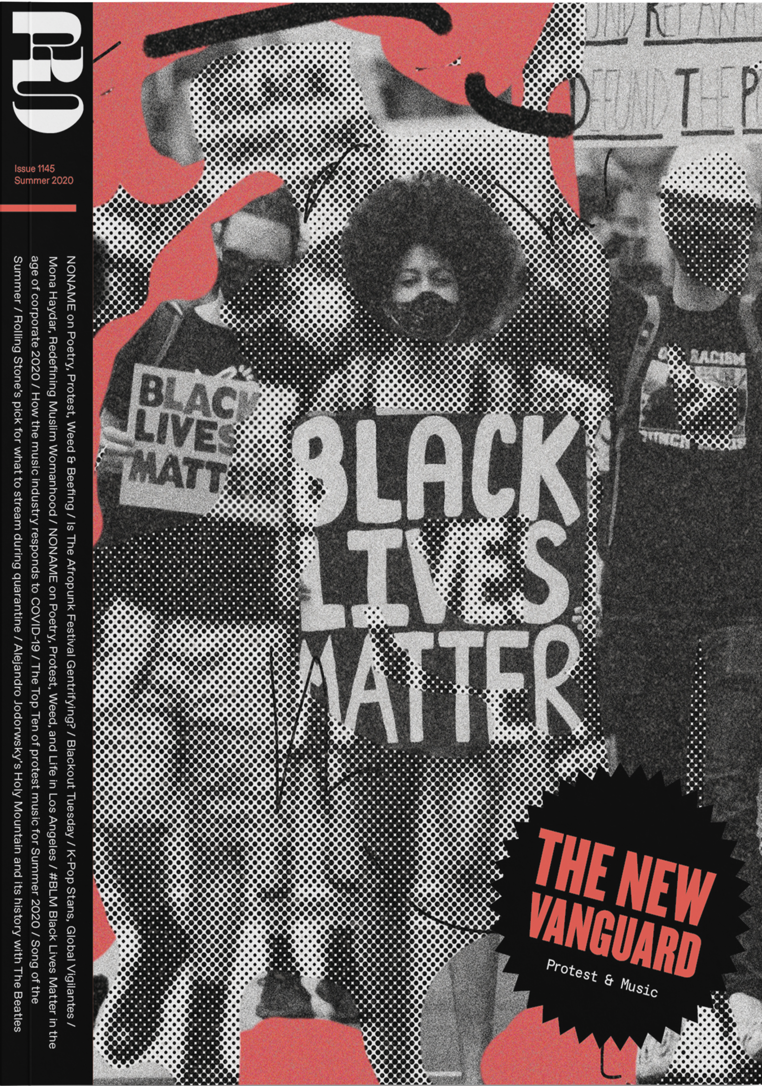
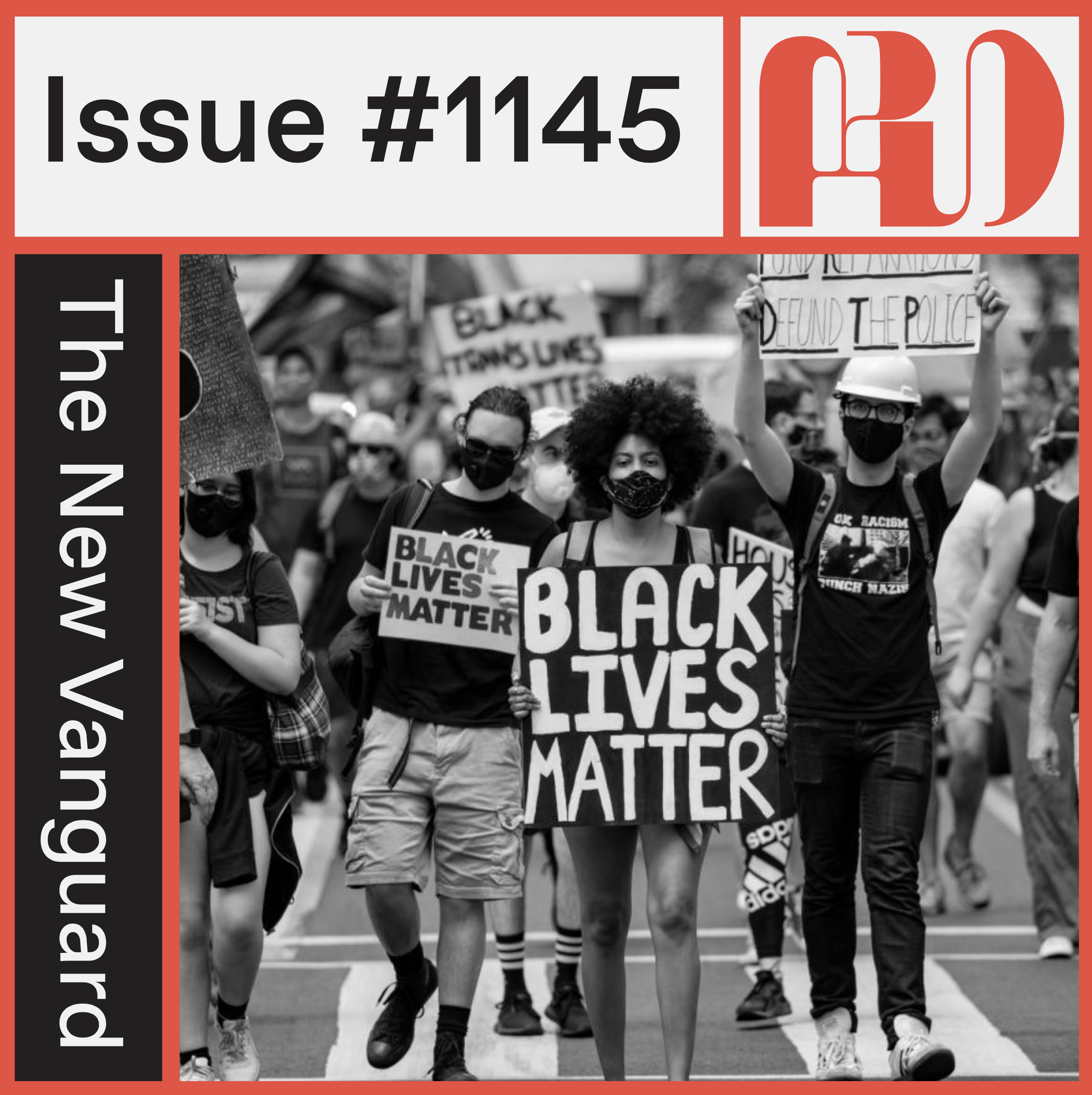
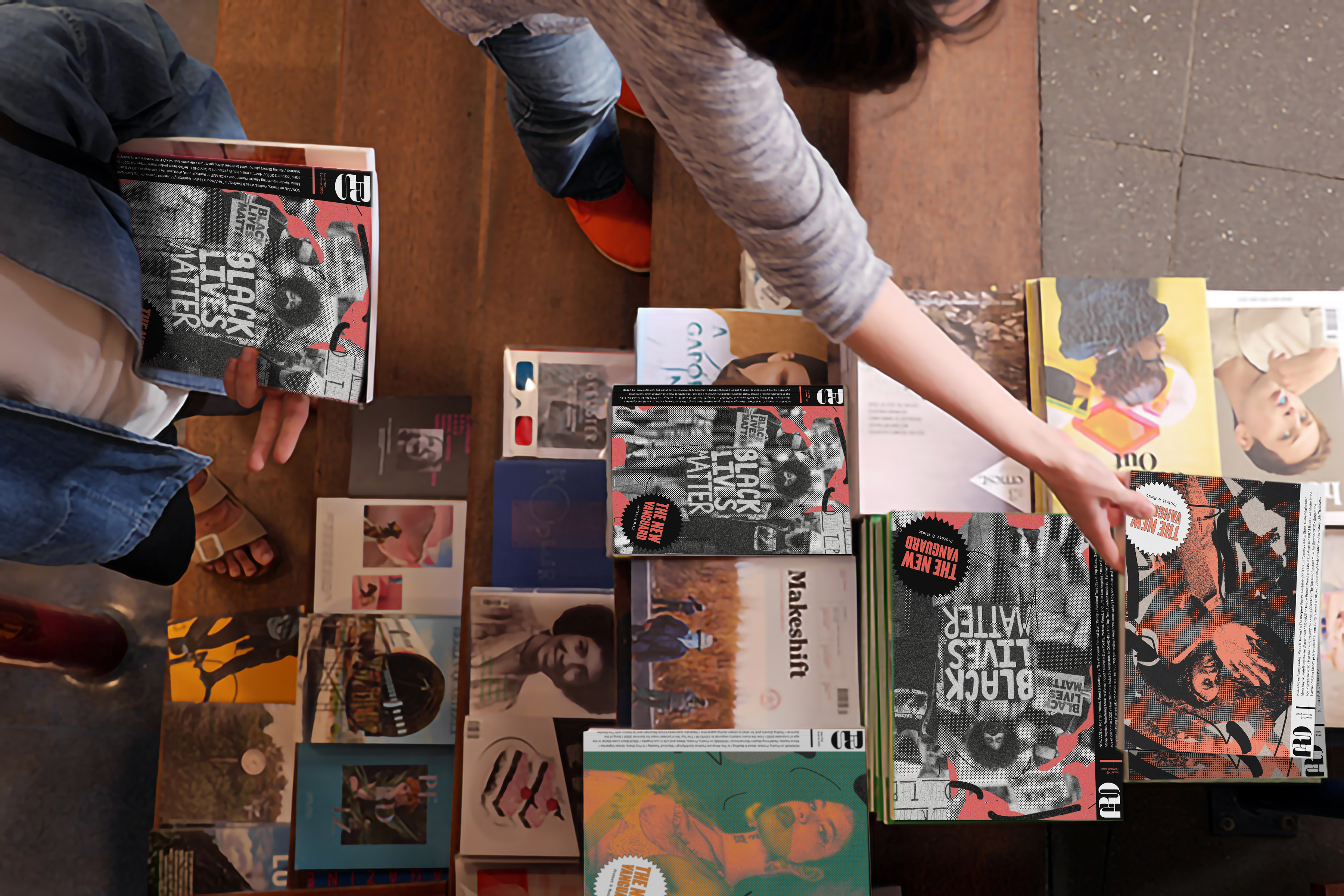
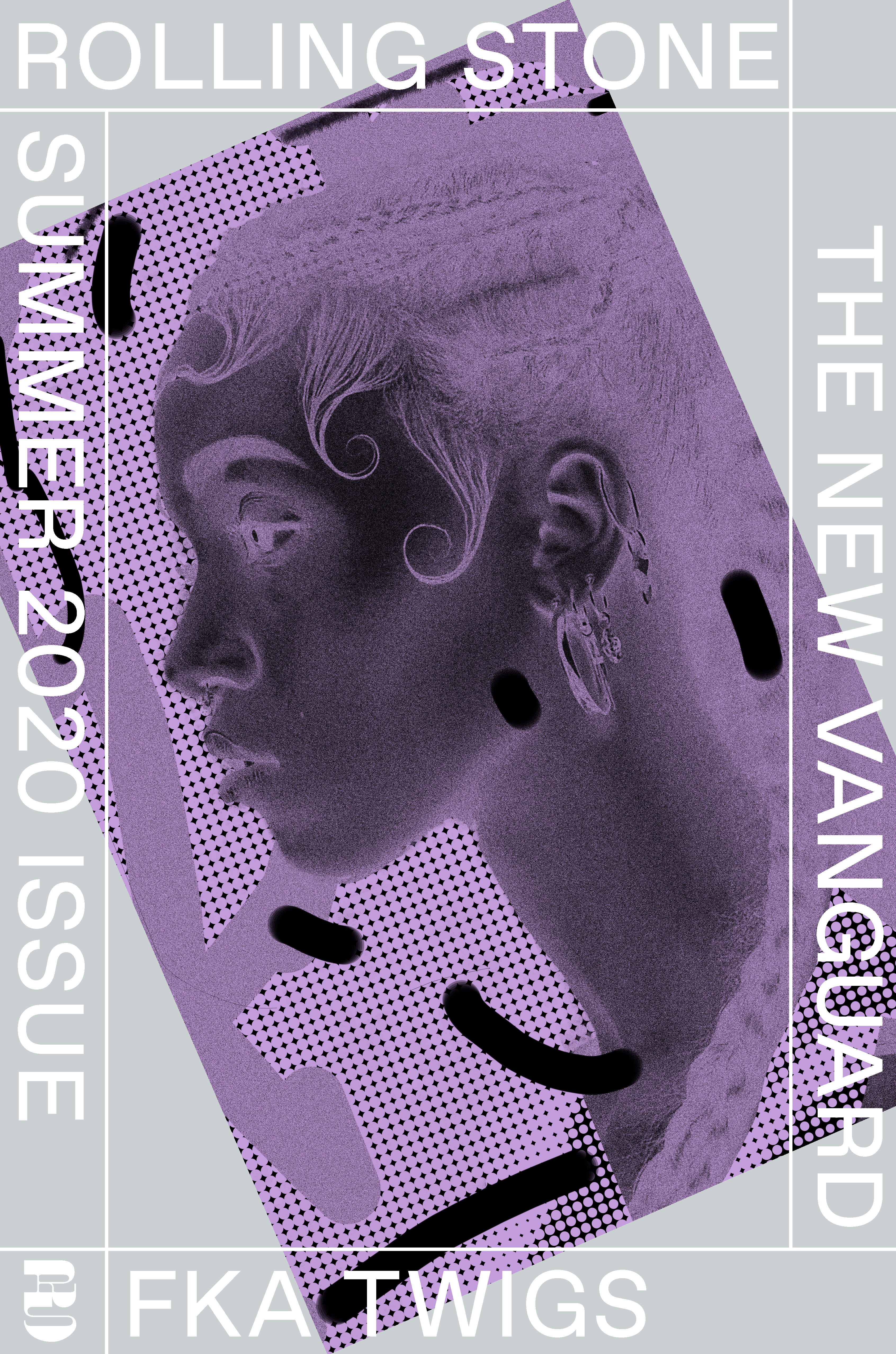
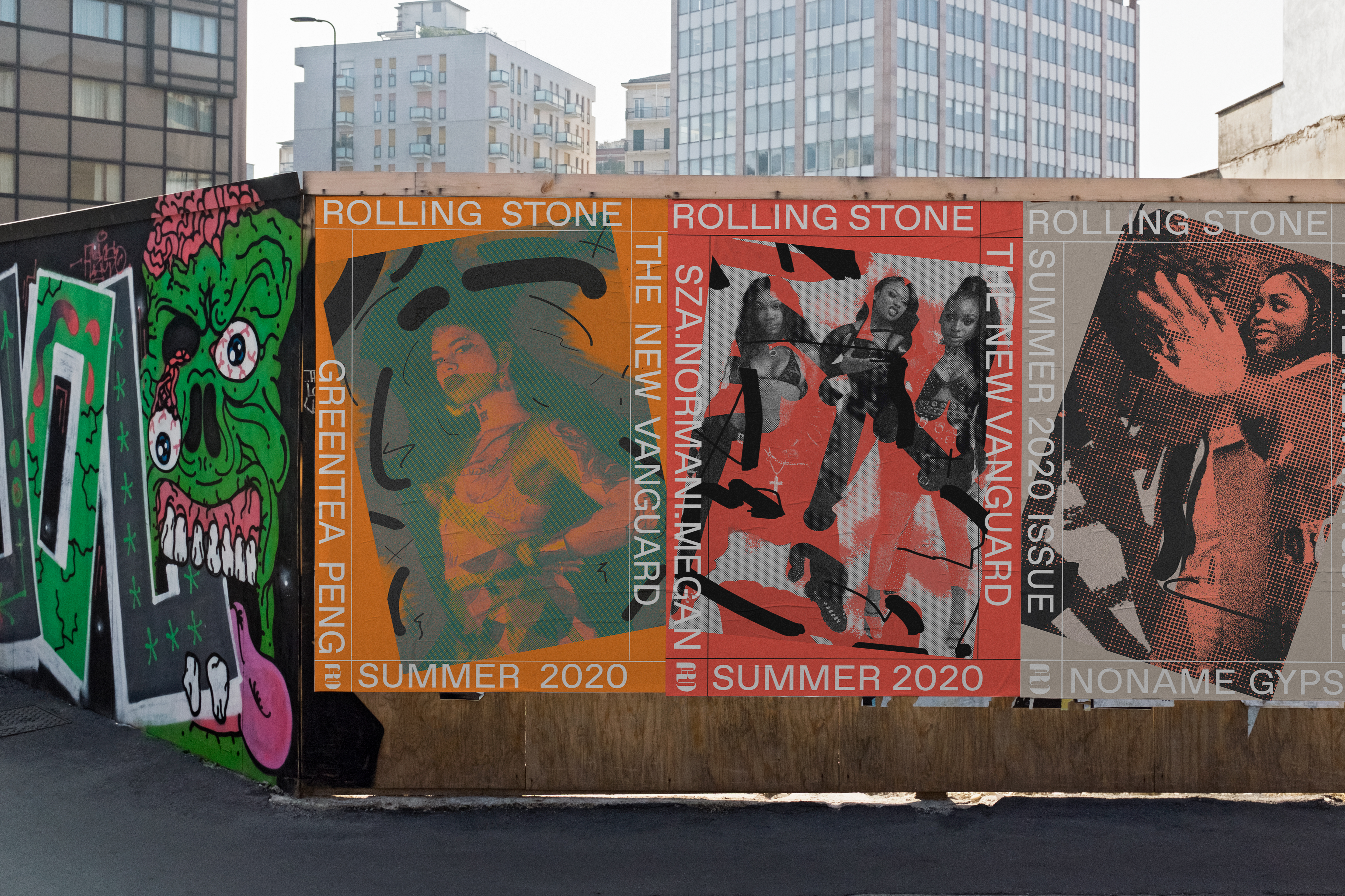
The first issue of the new Rolling Stone magazine is called “The New Vanguard” and focuses on the intersection of protest & music.
It features four covers for the issue, three content-specific ones, and a hero cover featuring an evocative collage of the themes of the issue.
Full magazine ︎︎︎
It features four covers for the issue, three content-specific ones, and a hero cover featuring an evocative collage of the themes of the issue.
Full magazine ︎︎︎

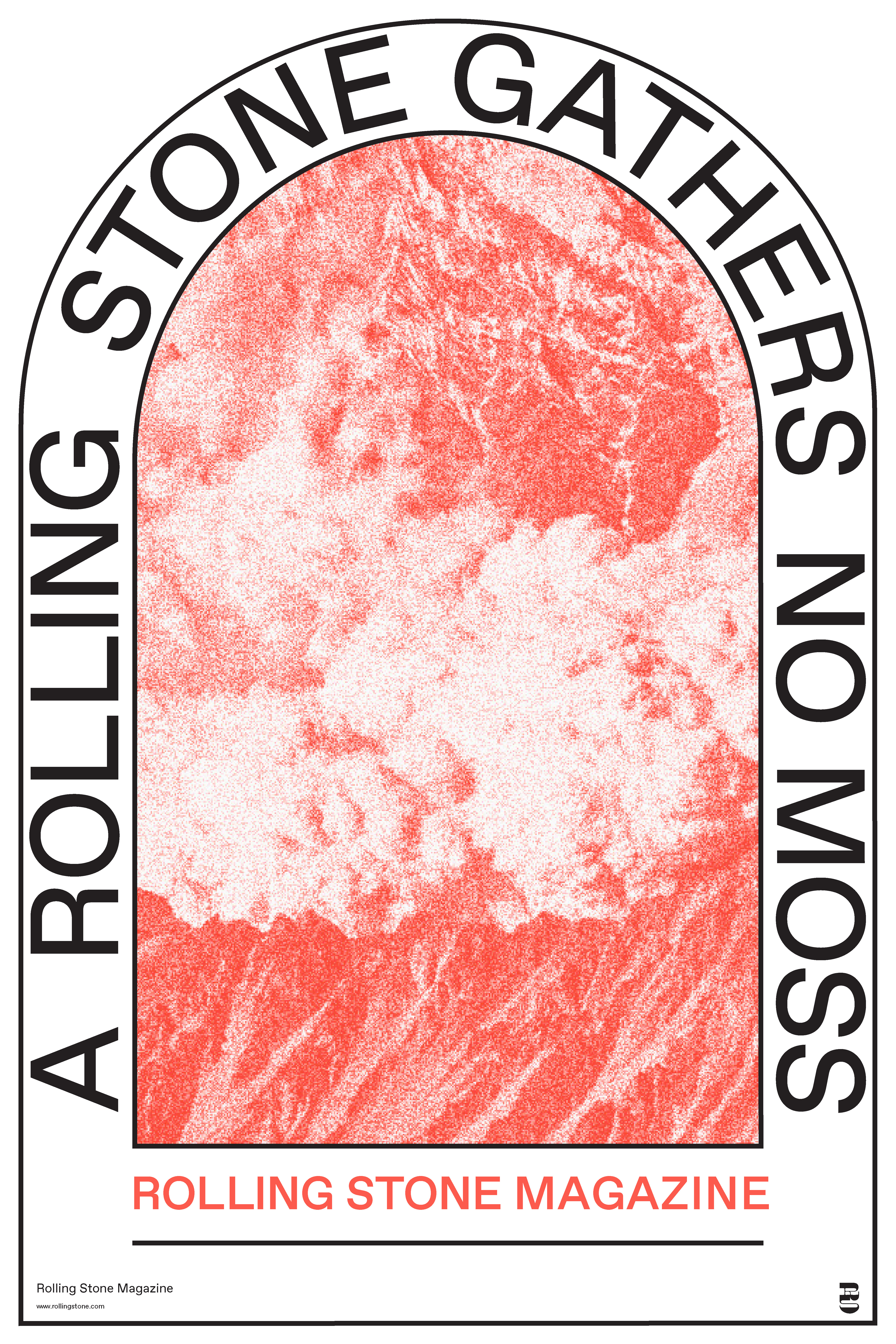
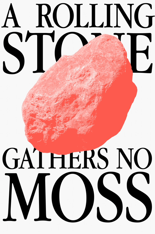
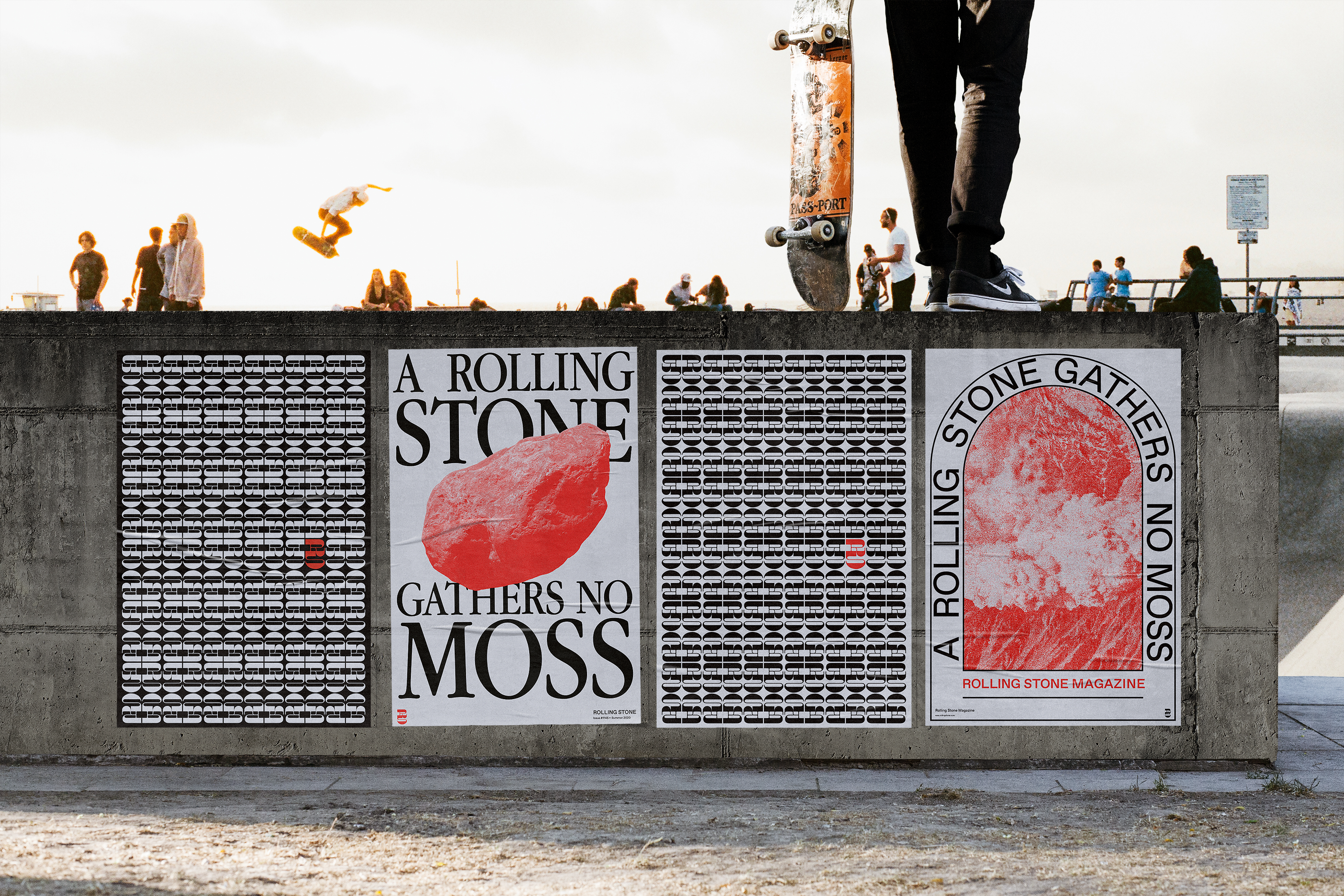
The posters advertise the new direction for Rolling Stone, using the idiom “a rolling stone gathers no moss.” Referencing how Rolling Stone’s progress will continue to push it forward and not be stuck in the past.


Rolling Stone can lend its name to a streaming service to offer highlight independent artists in small venues that people can stream at home.
The new Rolling Stone website includes how articles are translated onto a digital platform, news and music charts, and a platform to stream concerts.
Rolling Stone Social Media content. This translates the editorial voice and content into the form of Instagram.