Nike Brand Packaging
Packaging
2021-2023
Studio: Tolleson
Client: Nike
Creative Directors: Carlos Montalvan & Molly Skonieczny
Role: Junior Designer
Studio: Tolleson
Client: Nike
Creative Directors: Carlos Montalvan & Molly Skonieczny
Role: Junior Designer
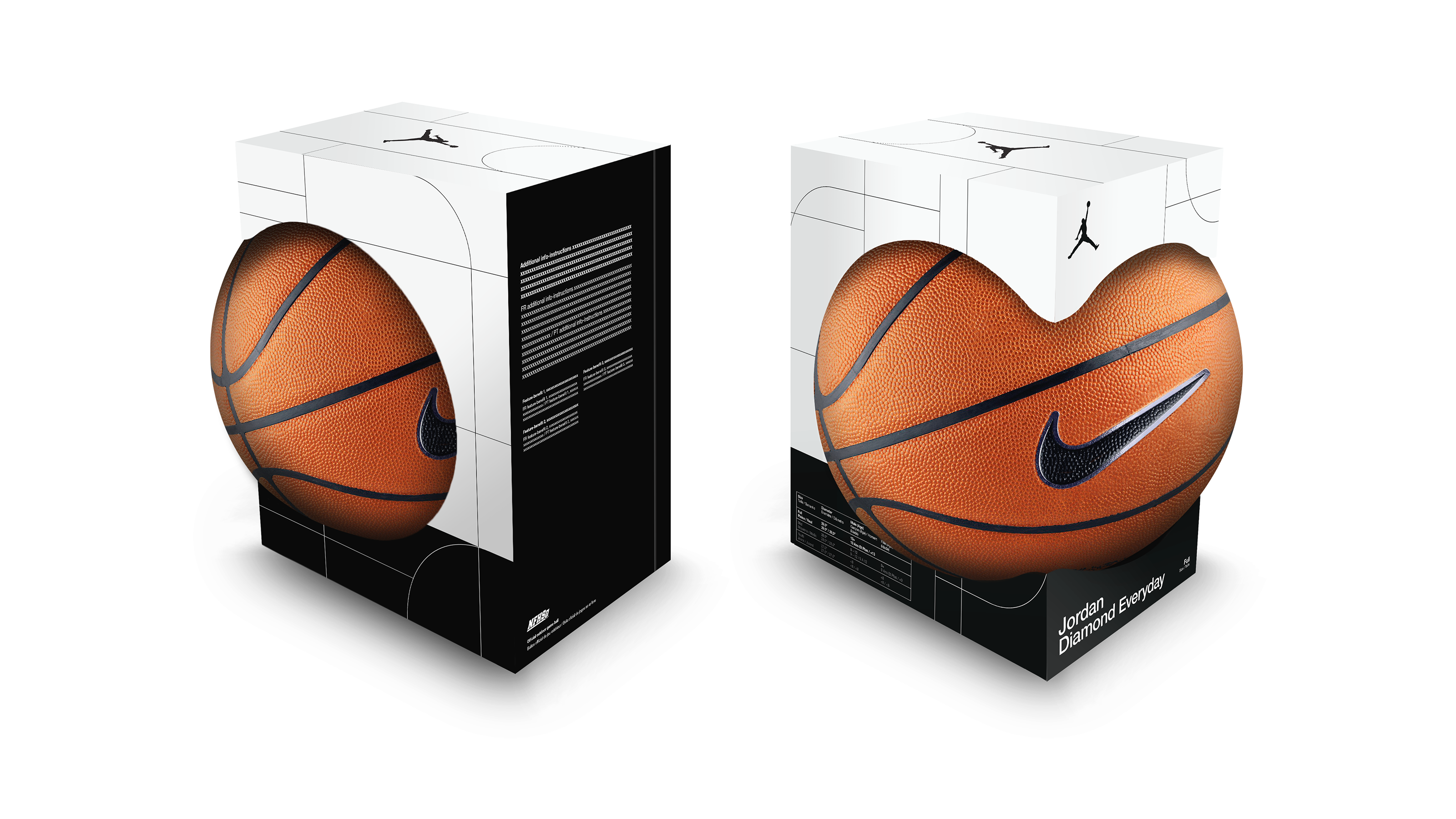
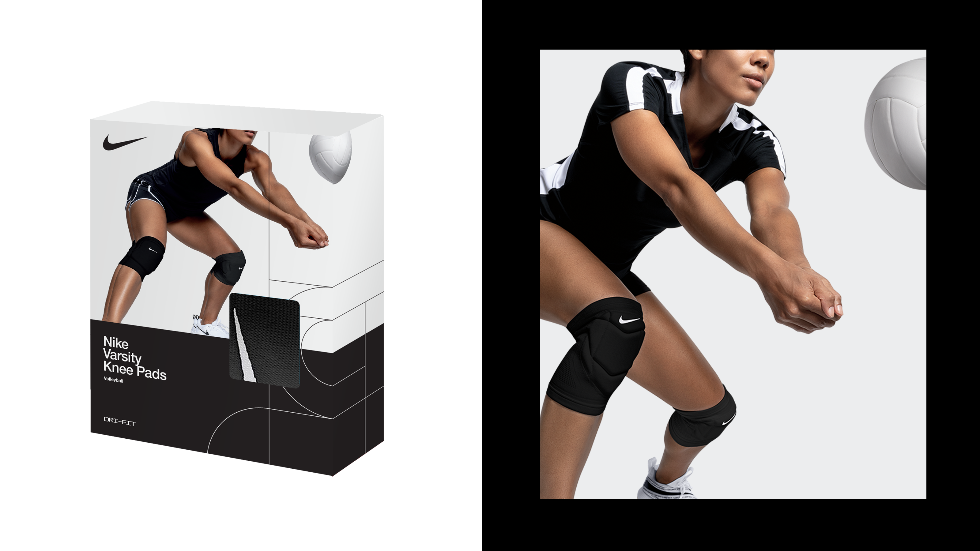
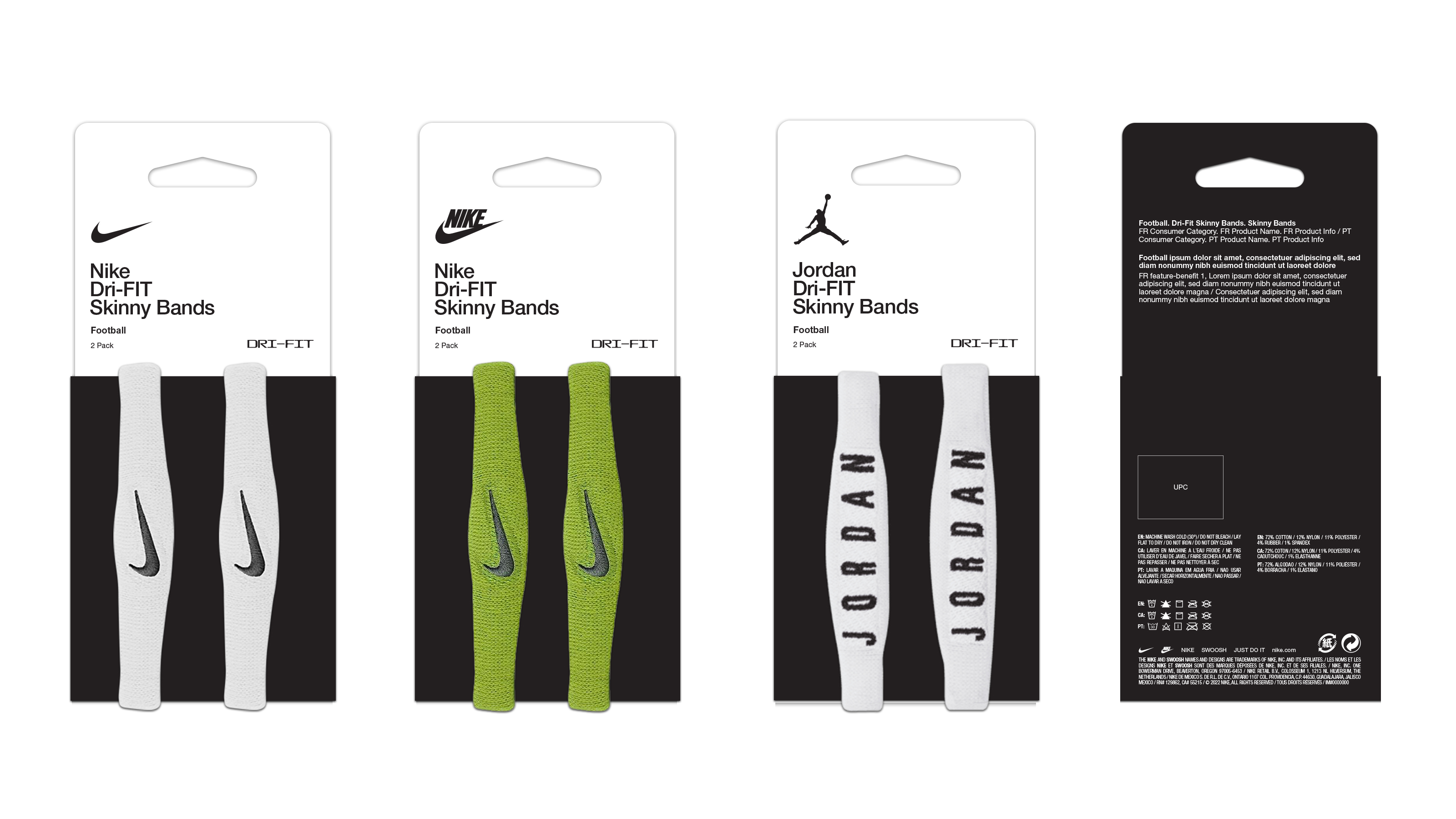
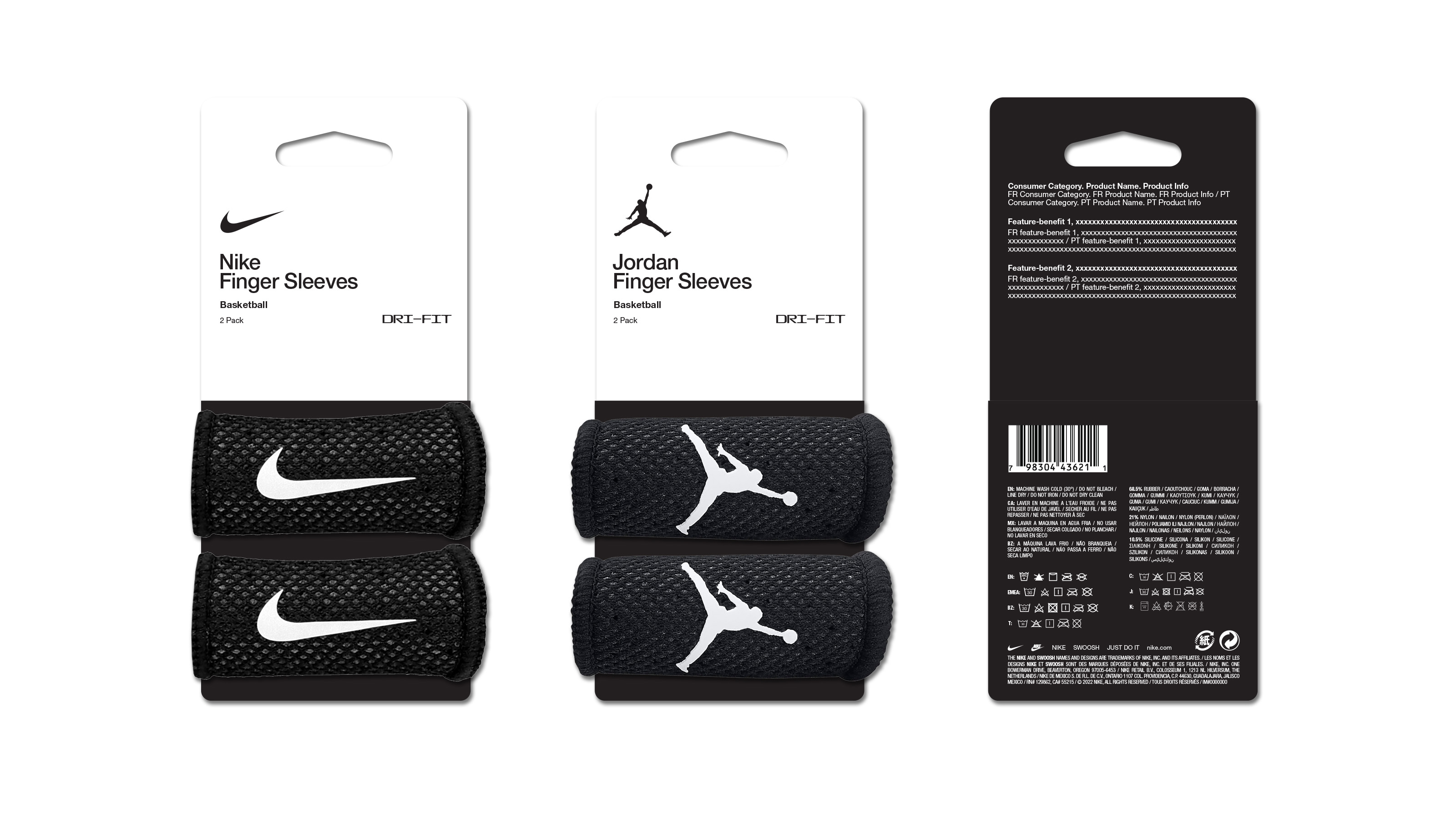
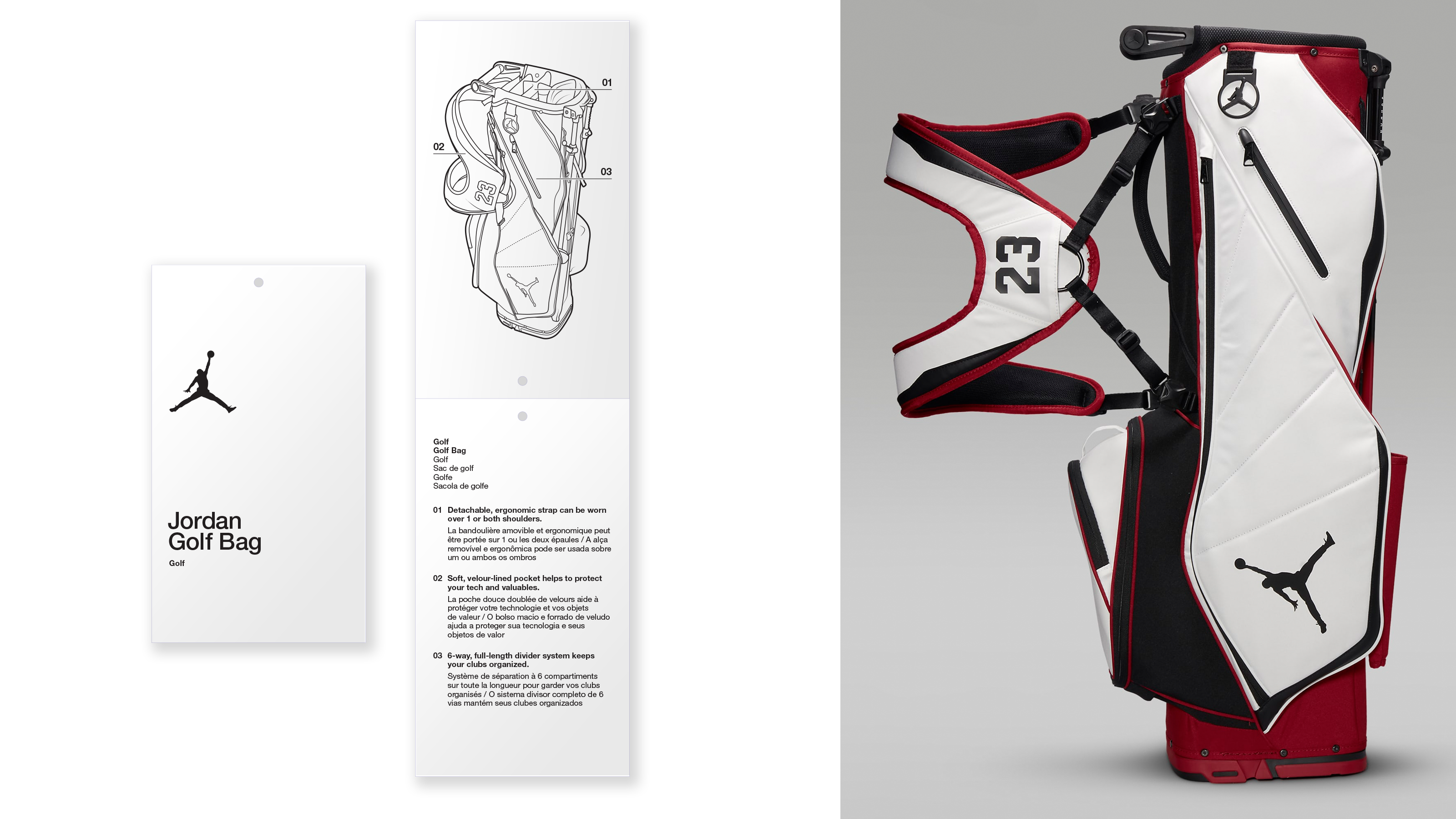
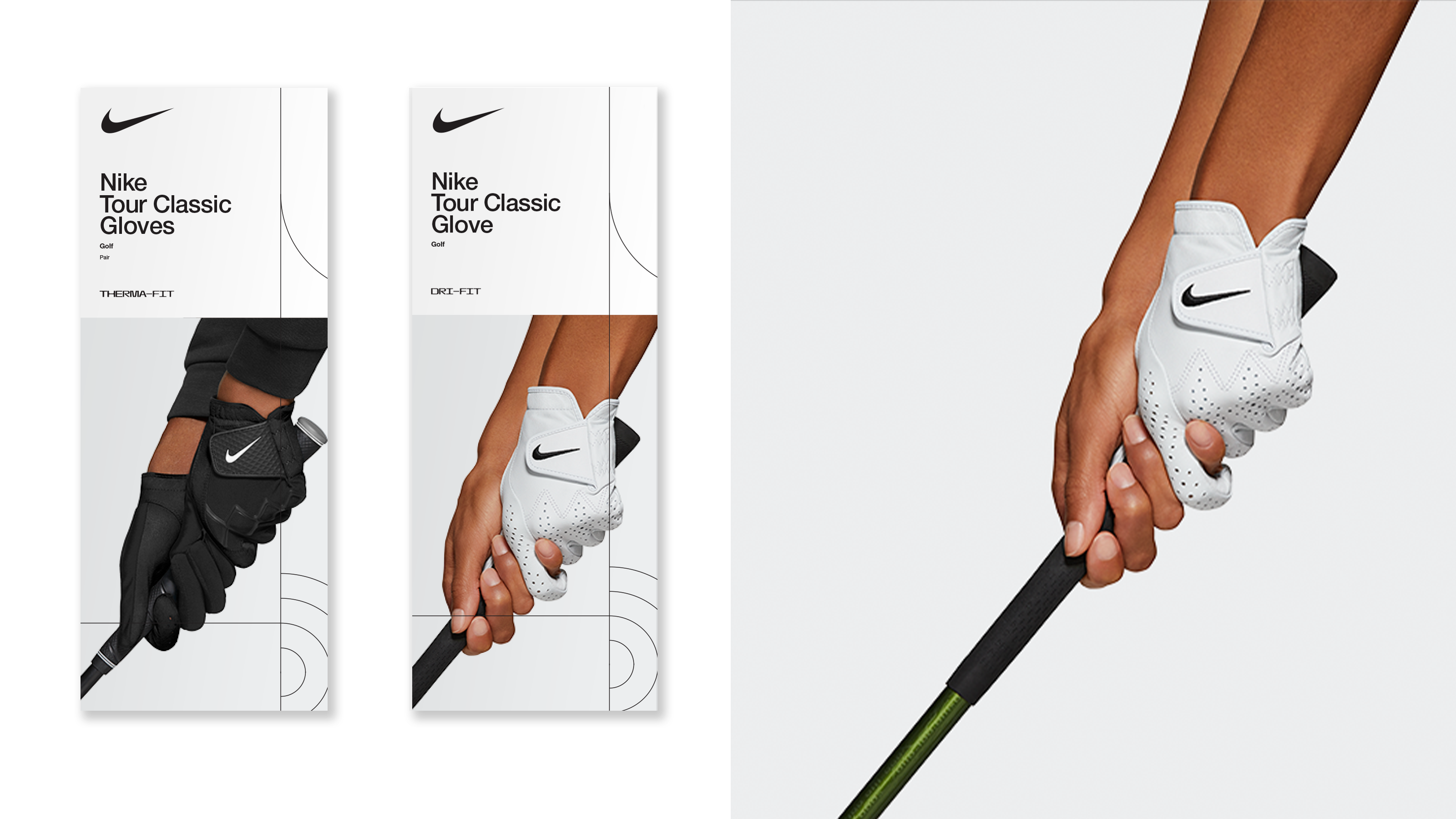
In 2019, Tolleson began a rebrand of Nike Apparel & Equipment packaging. This encompassed all Nike packaging that appeared on shelves of Nike flagship stores, outlets, and basically anywhere Nike products were sold.
My role, when I came to Tolleson in late Spring 2021, was to support the team creating the seasonal Nike apparel and equipment packaging within this new brand system, and one-off packaging needs. This ranged from designing on existing and new forms, assiting in mechanical reviews before sending to print, and learning the brand system which emcompassed the Nike brand, all of it’s sub-brands and global brand partnerships.
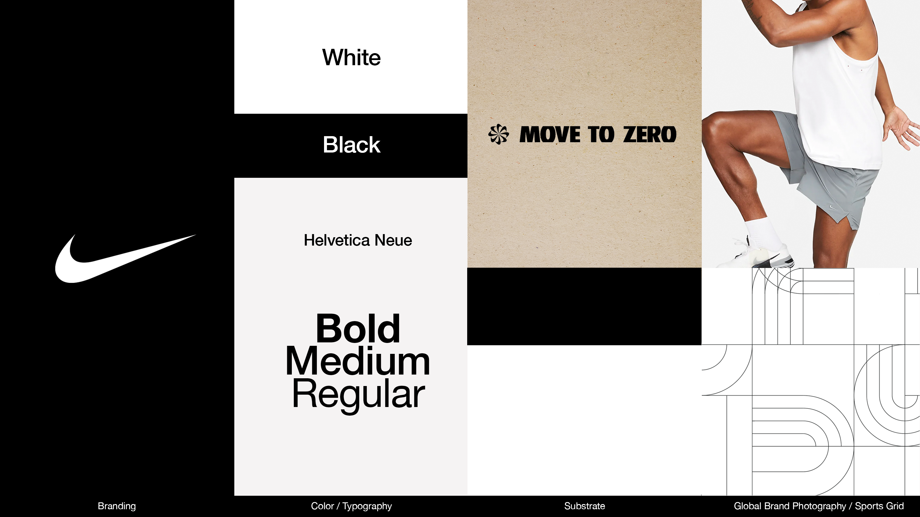
The system utilizes a simplified black and white color palette, with craft substrate on the Move to Zero sub-brand. The primary typeface is Helvetica Neue. Visual language includes a grid referencing sports which interacts with color fields and photography.

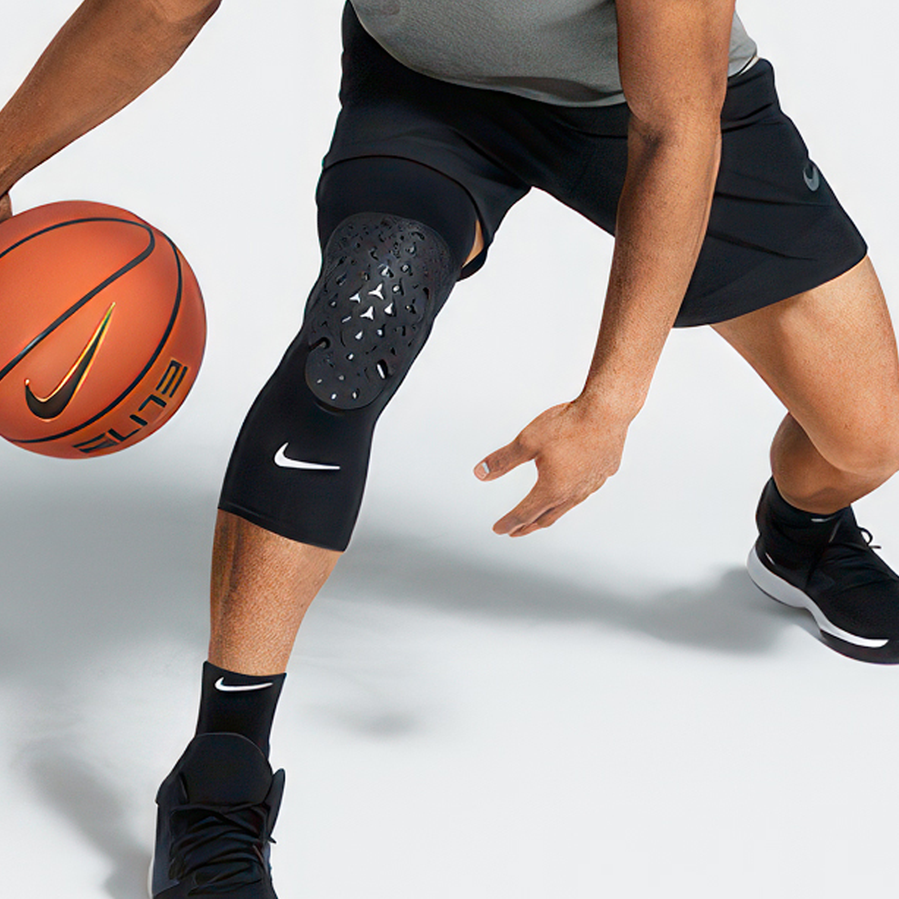






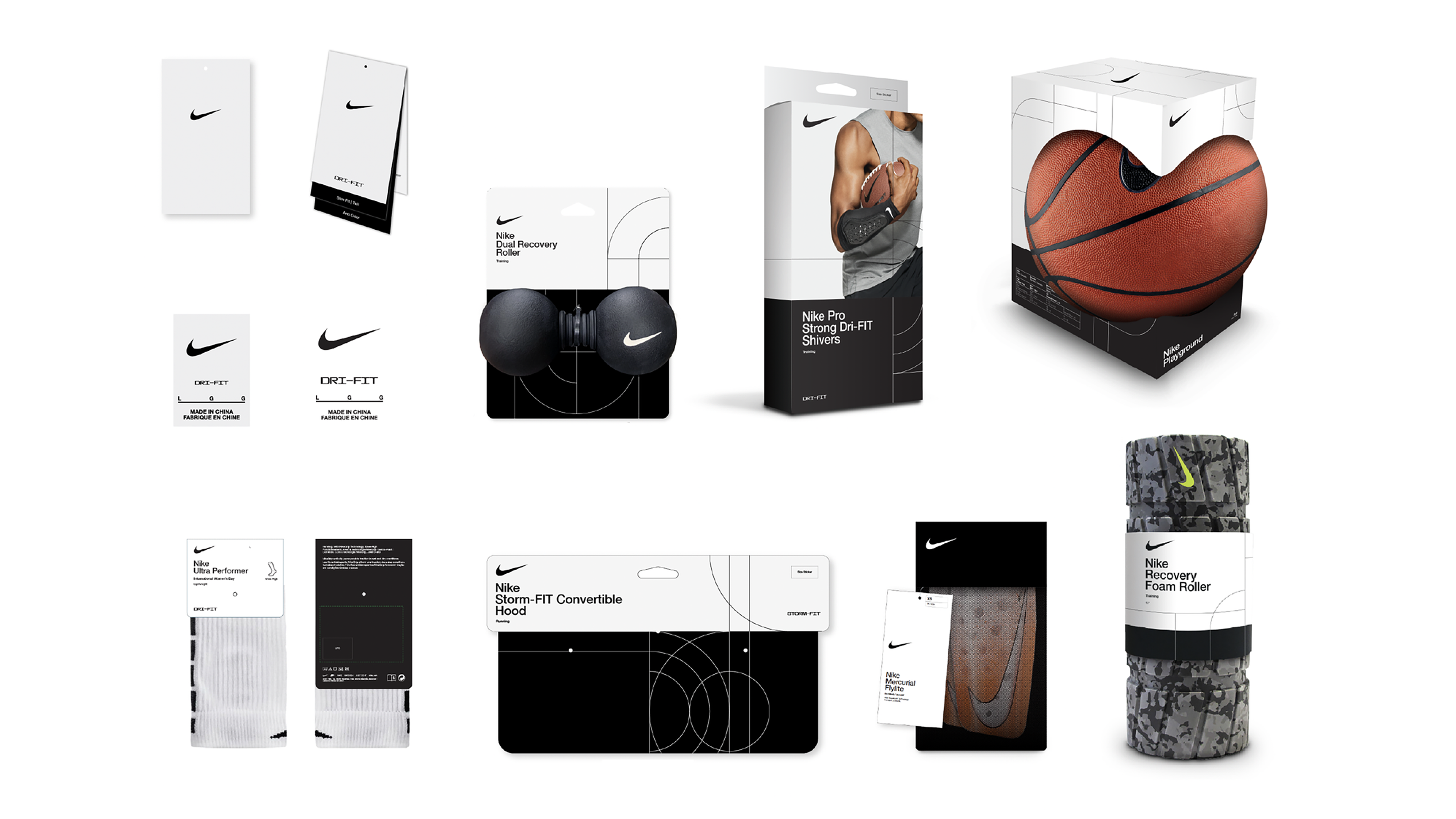
Foundational System
The hero system for Nike’s packaging, utilizing the black and white color blocking, the sports grid, and photography.
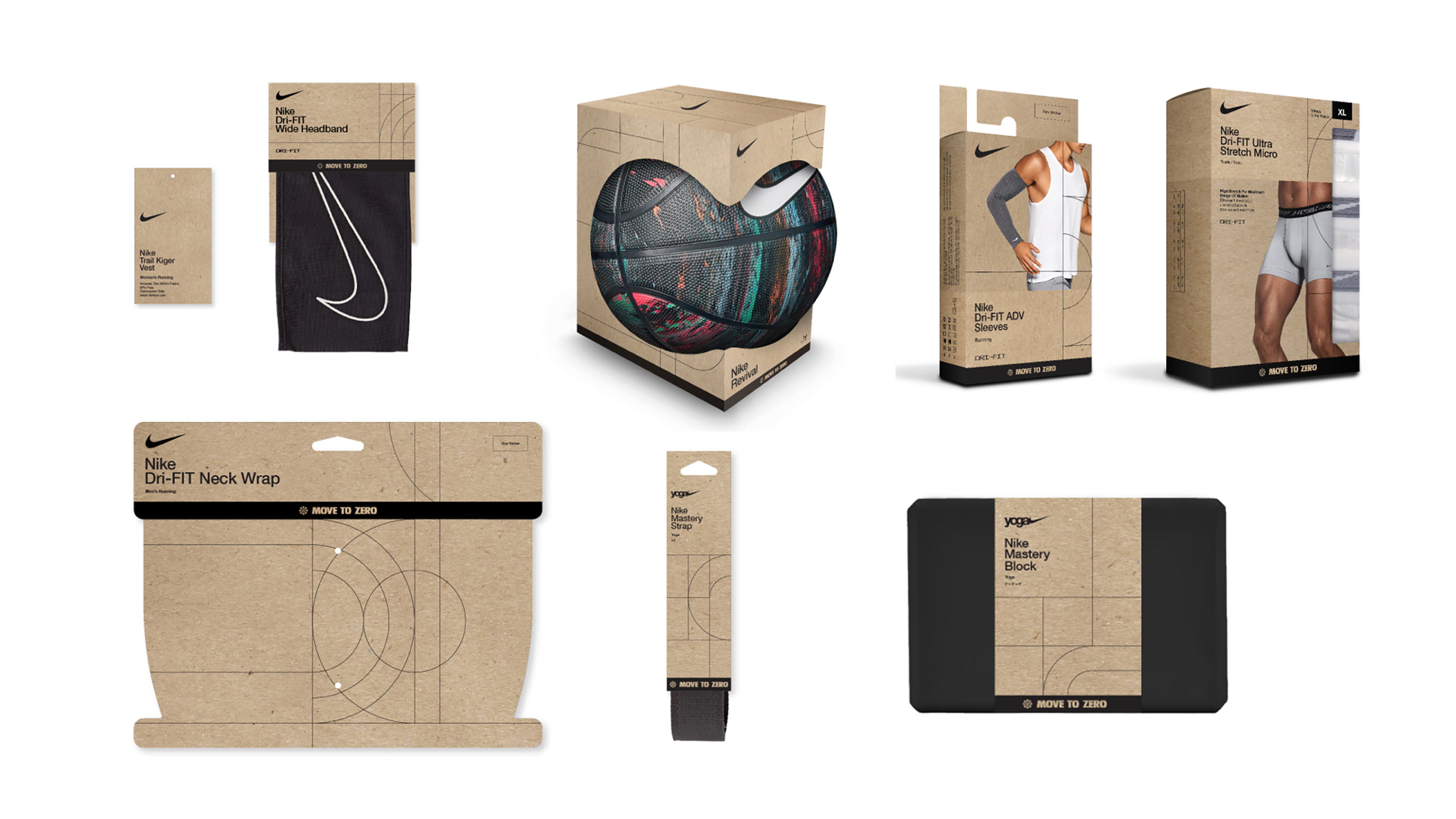
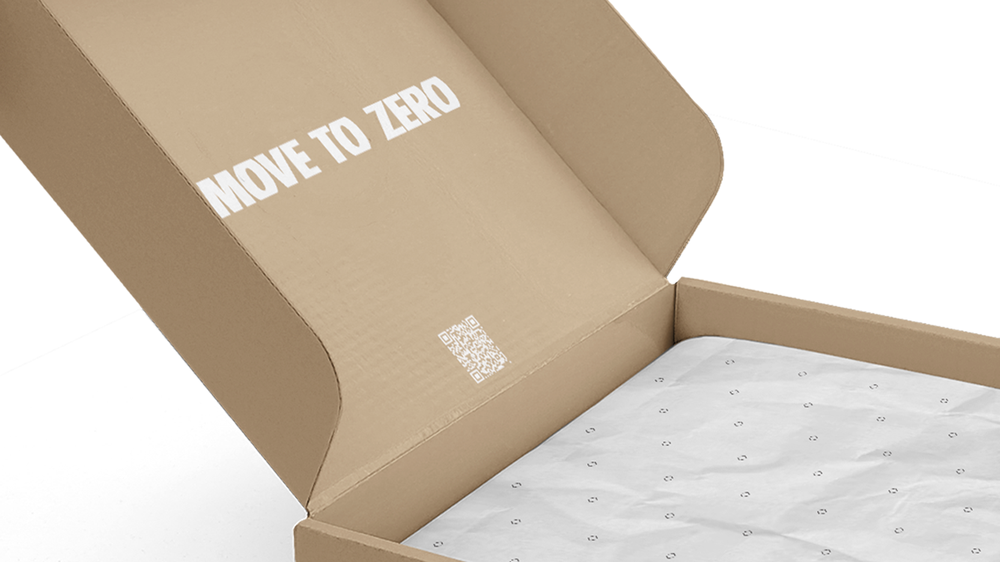
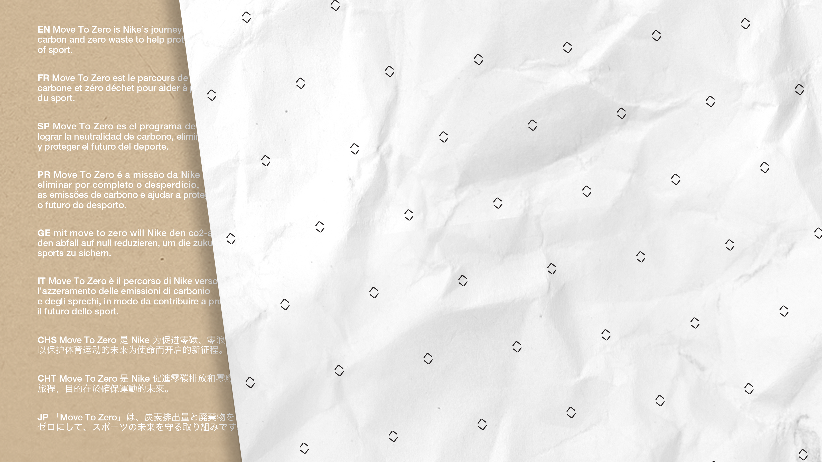
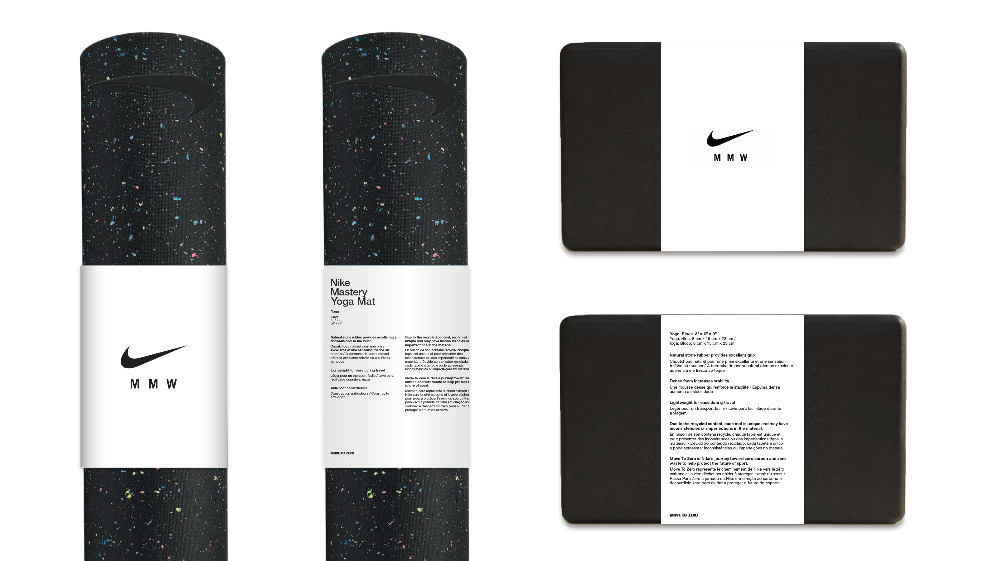
Move to Zero
Nike’s packaging system adapted off the Foundational System using sustainable methods of packaging, all printed on craft paper substrate.
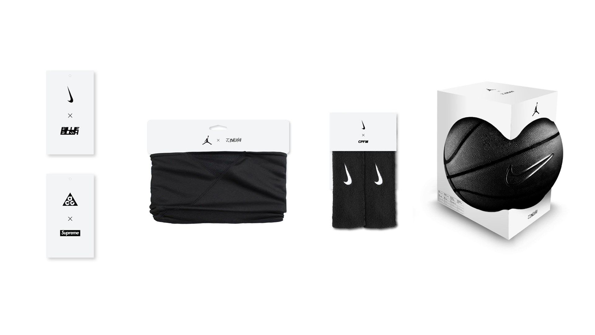
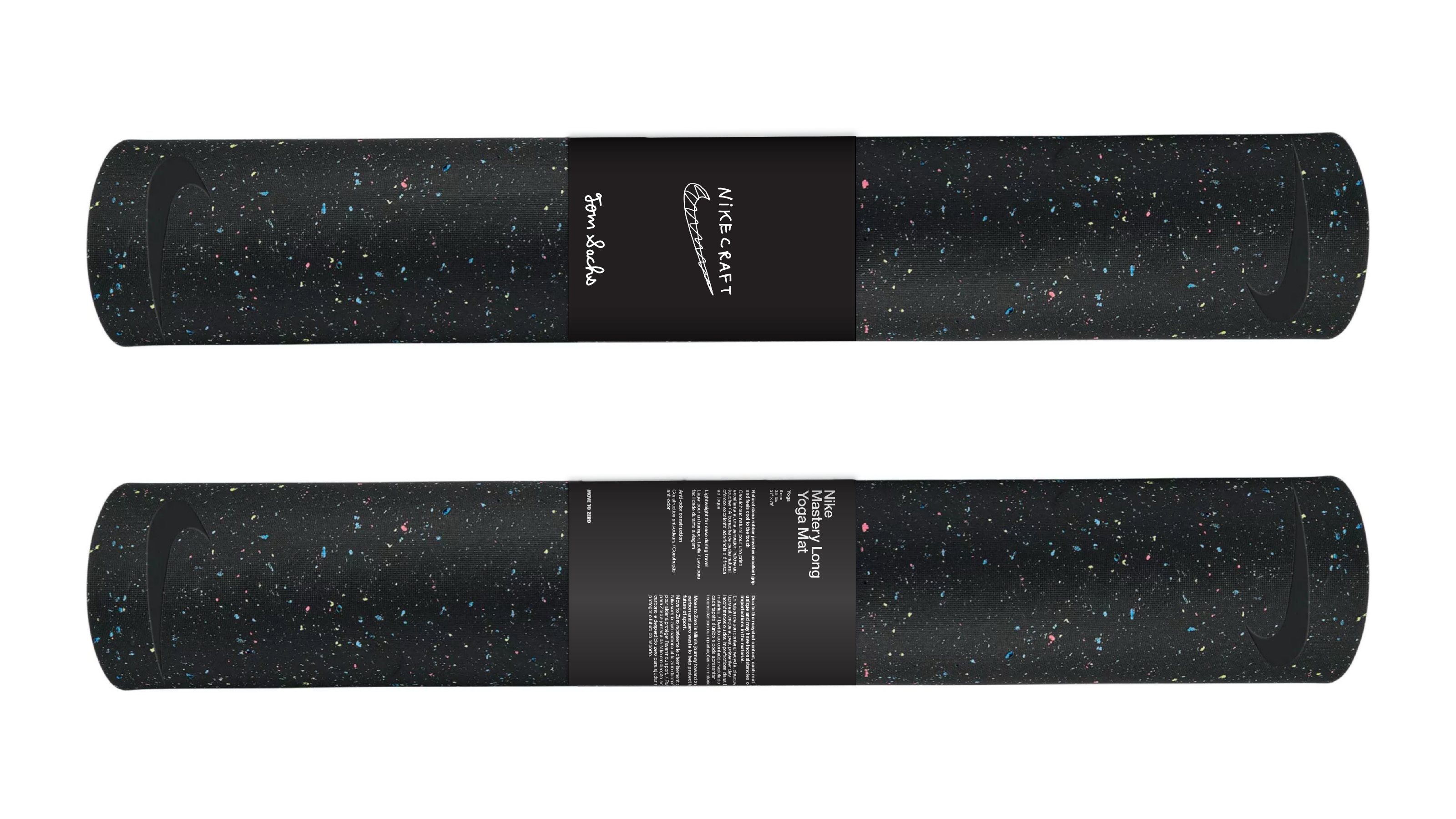
Catalyst System
Nike’s system for branded collaboration products.
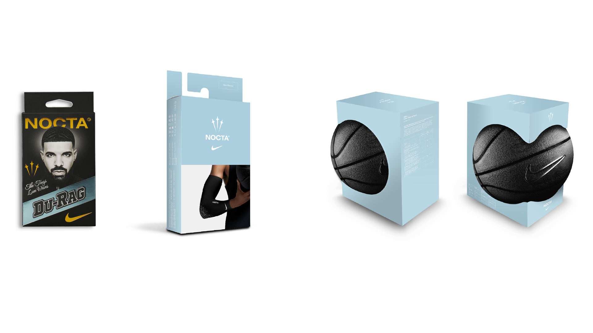
NOCTA
Nike and Drake’s sub-brand utilizing a unique mark and light blue color.

Catalyst Packaging
Catalyst represents the system for Nike’s many collaborations with other fashion brands, musicians, and athletes.
![]()
![]()
Catalyst represents the system for Nike’s many collaborations with other fashion brands, musicians, and athletes.
SIOC PackagingSIOC is part of Nike’s zero waste initiative. The packaging solutions that it encompasses included created singular shipping boxes that function across multiple brands, therefore reducing the amount of packaging needed to produce for shipping needs.
![]()
![]()
![]()

