
Death of Truth
Typography Research Project2020
Mentor: Tyrone Drake
Mentor: Tyrone Drake
This project explores the typographic implications of a world where language is made meaningless. It will look at how it is informed by relativity, the concept of space-time, the importance of humanity or lack thereof, and the ways in which digital language (verbal and visual) has bled into reality and thus made language meaningless.
Because of this project’s inspiration by The Death of Truth: Falsehood in the Age of Trump (2019) by Michiko Kakutani, the cultural focus of this project will be around its presence in the United States, specifically how U.S. President Donald Trump has degraded the humanistic aspects of language to his socio-political advantage.
Ultimately the central question that this project seeks to answer is “what is typography when language is rendered meaningless?”
This project comprised a 10 poster series, two motion pieces, as well as a spatial and environmental piece.

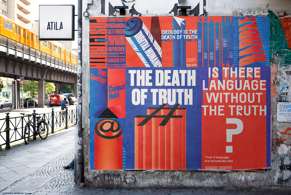
The poster series establishes the visual language of this project. The visual language references both digital rhetoric and the visual cues of WWII propaganda.
“Human agreement decides what is true and what’s false? – It is what human beings say that is true and false; and they agree in the language they use. That is not agreement in opinions, but in forms of life.”
- Ludwig Wittgenstein

The copy on this motion poster “The Truth of Falsehood, The Falsehood of Truth” is a reference to The Blinding of Truth by Falsehood, an Ancient Egyptian story. It narrates the dispute that occurs between Ma'at (Truth), his unnamed son, and Gereg (Falsehood).
The central motion piece for this project is a reference to surveillance, and how presentation of ordinary and sometimes mundane objects can be manipulated to appear sinister, and vice-versa.
The video uses the CCTV format as well as kinetic type-messaging to convey the project message.
The video uses the CCTV format as well as kinetic type-messaging to convey the project message.

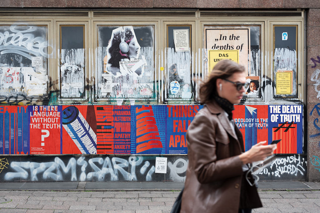
The central question of this project is “What is Typography without Truth.” This billboard displays the question to passersby in a very blunt and bold manner.
The only obvious treatment to the type being the lo-fi glitch effect, also used in the motion piece.
The only obvious treatment to the type being the lo-fi glitch effect, also used in the motion piece.