
Typo Berlin
Typography & Identity Design2019
Mentor: River Jukes-Hudson
Mentor: River Jukes-Hudson
This project created an identity for the Typo Berlin Typography Conference. The constraint was to work in black and white, creating positive and negative versions of everything. The process was centered around the design of a logo that spoke to the conference’s identity, as well as the identity of Berlin.
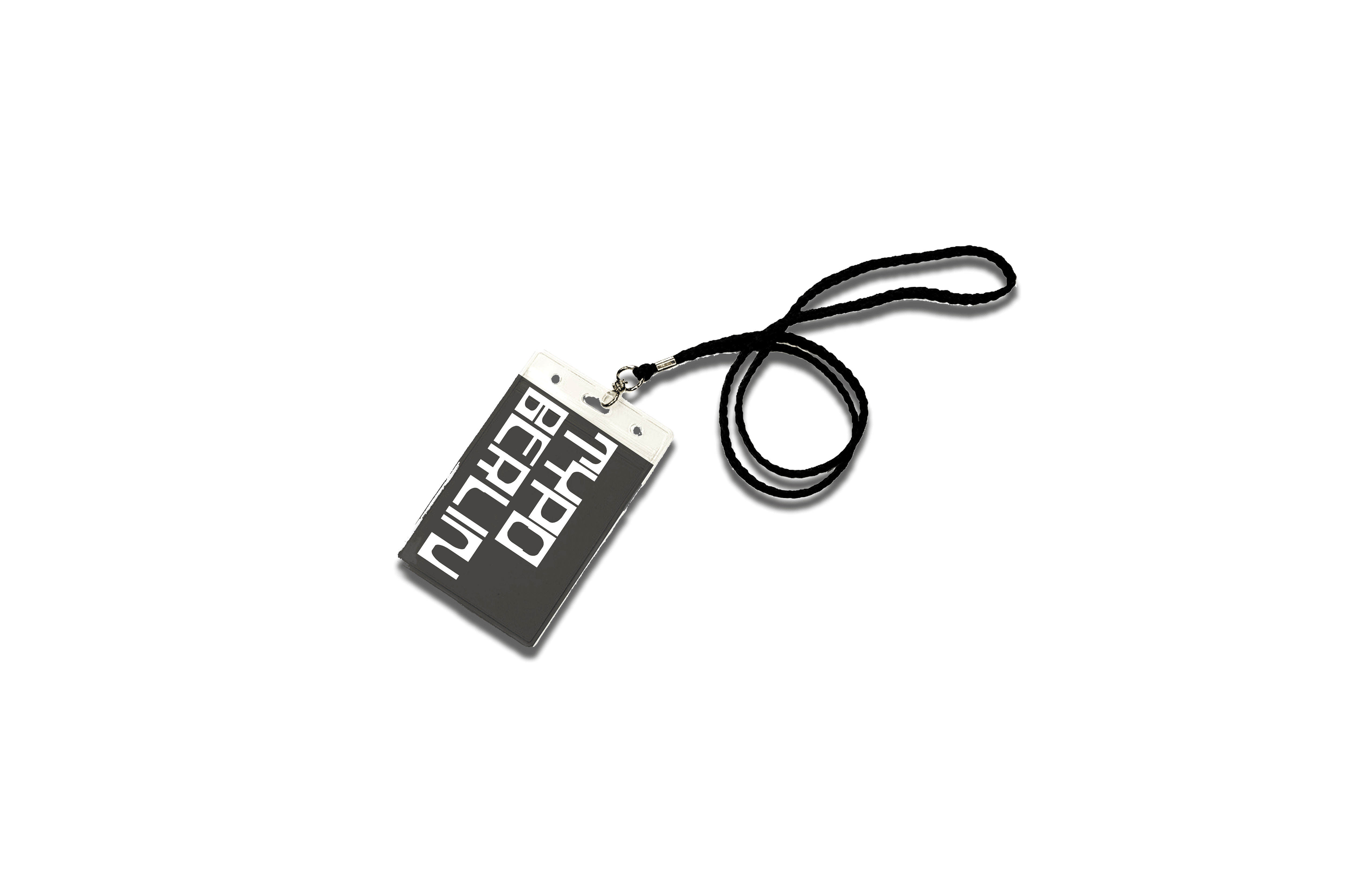
Collateral for the project included two posters printed on cheap 3” x 6” black and white, laser paper, name tags for the conference, and a piece of wearable merchandise.
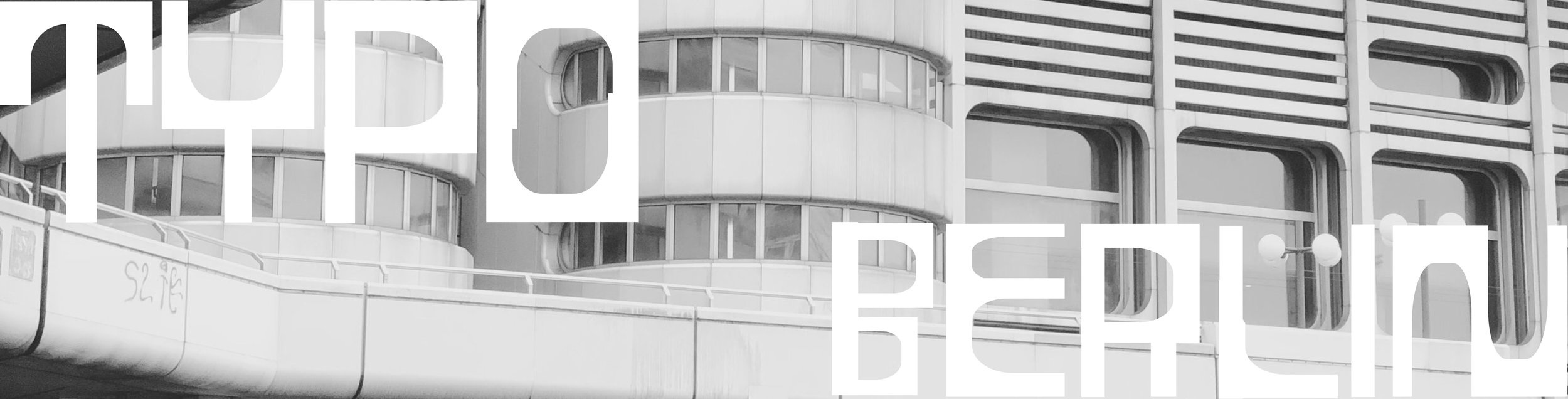
I created a bespoke typeface for my logo, using just two shapes, an arch and a column. This was inspired by the architecture of Berlin, namely the Bradenburg Gate’s arches and columns. The rest of the copy is set in Favorit.
Collateral for the project included two posters printed on cheap 3” x 6” black and white, laser paper, name tags for the conference, and a piece of wearable merchandise.
I created a bespoke typeface for my logo, using just two shapes, an arch and a column. This was inspired by the architecture of Berlin, namely the Bradenburg Gate’s arches and columns. The rest of the copy is set in Favorit.


Exhibition title wall, and spatial design for the museum exhibition.
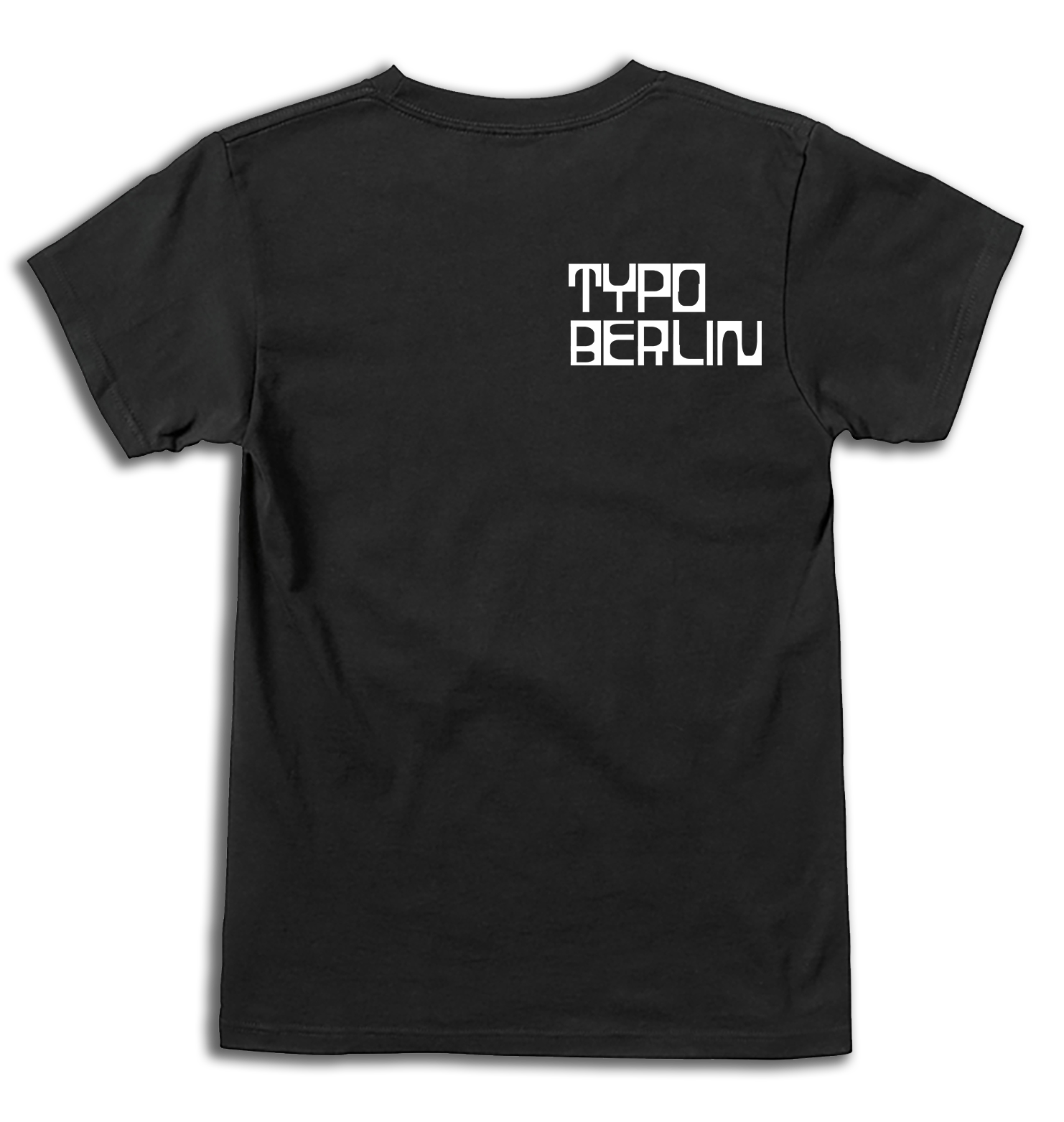
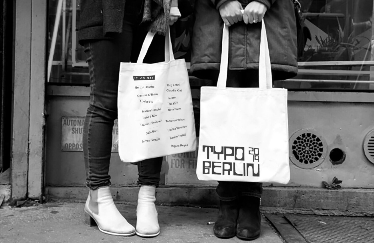
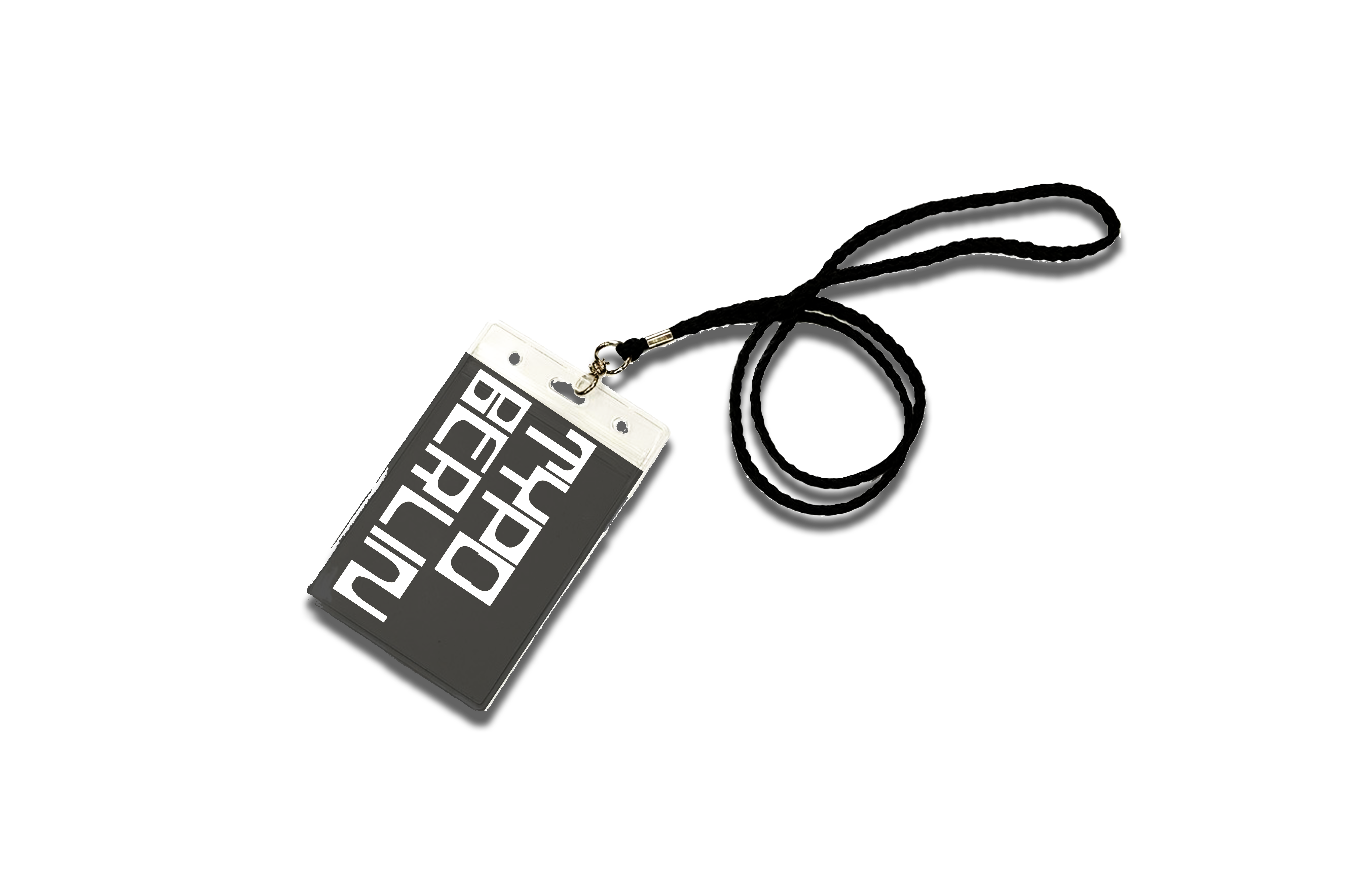


Collateral materials for the Typo Berlin conference. This includes t-shirts, tote bags, lanyards, and tickets.